Hello! I’m a huge fan of Logseq’s graph view, and it’s one of the reasons I was drawn to the software. However, my biggest pain points with the graph view are the lack of styling customizations and the fact that the graph doesn’t work the same on mobile devices as it does on desktop.
Customizations for the Graph
Unless I’m mistaken, there appears to be no way to customize the graph view. I would love to be able to push the styling of the nodes, edges, and text further, either with a dedicated menu interface or CSS. At the moment, the graph for one of my projects (which relies heavily on the feature) looks terrible when Logseq defaults to the “dark themed” graph mode:

I’ve tried looking at the source code to see if I could change the colours manually, but couldn’t make sense of it at all. The reason for the random colouring of nodes (at least in previous versions) is also unclear.
Hyperlinked, Clickable Nodes on Mobile (like on Desktop)
At the moment, the graph can be viewed on mobile devices (including tablets) but the nodes can’t be clicked on to access the page. This is an issue in the mobile apps and published graph pages viewed on mobile devices (example → open on your phone).
Here are other mentions of this issue:
- Logseq graph nodes don’t respond to touch input #7104
- Logseq graph nodes don’t respond to touch input #7953
- Clicking on iOS nodes in graph #4909
- Mobile app more capable
I found a web page that has a graph at the bottom with nodes that can be clicked on all devices: Intro to Coding for Designers — megu.space.
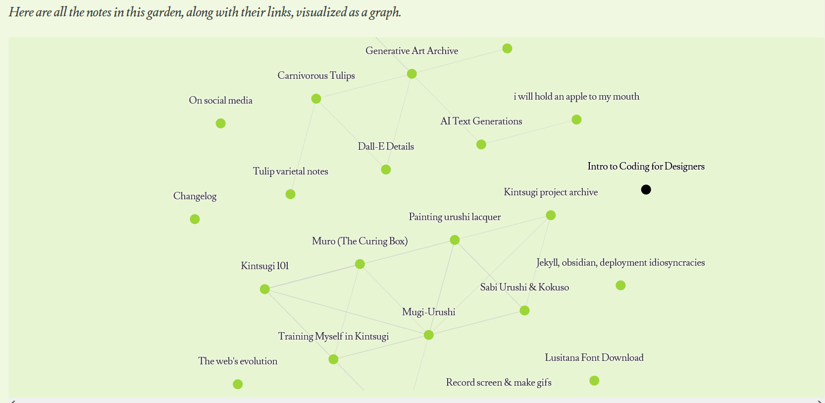
It looks like the site uses a digital garden Jekyll template modified for Obsidian to generate the graph.
Maybe this example could help with implementing the change? The devs are looking for PRs for this feature, but my own skills in this area are limited.