Would you consider a PR that renders the checkboxes as aligned with the bullets?
| Now: | Proposed: |
|---|---|
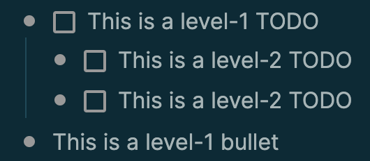 |
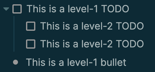 |
I’ve already implemented this in my custom CSS (below), and I figured it might be desirable for ~everyone.
The relevant lines are 394 and 395.
Would you consider a PR that renders the checkboxes as aligned with the bullets?
| Now: | Proposed: |
|---|---|
|
|
I’ve already implemented this in my custom CSS (below), and I figured it might be desirable for ~everyone.
The relevant lines are 394 and 395.
as a user, I would prefer this to remain a custom css (especially since it uses !important. as it would require more overruling when using other custom css snippets)
I personally prefer to see all bullets displayed as bullets for consistency.
maybe the ideal solution would be a ‘css snippet’ loader (maybe in the form of custom code-blocks that would be interpreted as css) so that it’s more convenient to manage and toggle css snippets ?
Thanks for the input! Helpful.
To be clear, I’d refactor the implementation so that it doesn’t use !important.
thanks for the clarification 
my main reservation is the consistency and clarity of the bullets, see this example with multiline blocks
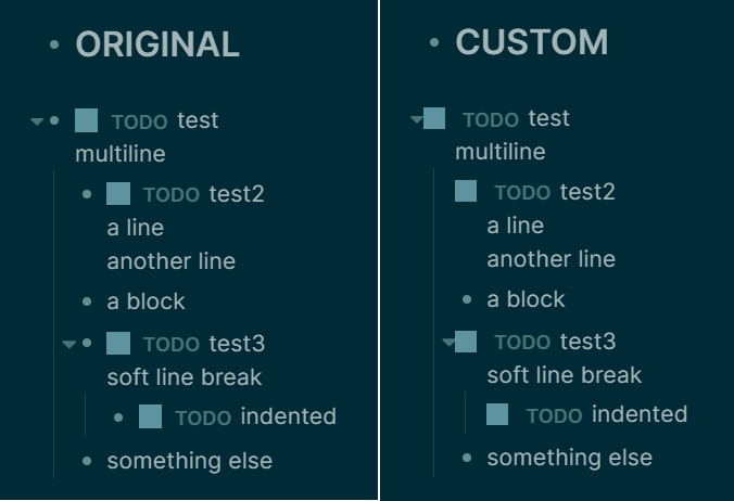
For my use-case, I find it useful to have a clear overview of my document’s structure (not specifically related to TODOs), in this regard the Original layout (on the left) works much better for me than the modified css (on the right). The bullets help me see what are my main sections.
In any case, if the majority wants to have this natively, I think tweaking margins in px may be troublesome when users have custom css/custom fonts. either use .em or maybe hide the bullet for TODO checkboxes rather than offsetting their position ?
That reasoning makes sense. I personally still prefer it my way, but I don’t care if it ends up being a default, a toggle-able option, or just implemented through custom CSS like I already have it.