I found out that it’s not easy to find and understand what is going on in the hierarchy if you have many parent Childs relationships. and I think it’s necessary to implement fold-unfold option for parents in the hierarchy section.
like this i would like to see hierarchy with folded “+” in default.
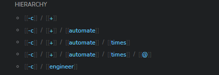
and i think is more INTUTIVE to see a/1 and then a/2 instead of a/1, a/1/x and then a/2.
100% agree. Folding hierarchy is easier to look and manage.
2 Likes
I think there is more than one way to do this in the UI. You could do it as more of a breadcrumb trails, but one you can progressively reveal. For example, you could have an “<” arrow, followed by the page name. Then each time you click the arrow, more of the breadcrumb trail is revealed, higher and higher up the hierarchy.
The general UX pattern is “Progressive Detail On Demand”, for the Hierarchies function. I think this pattern needs to be on the roadmap, if indeed it isn’t.
Right now, we are forced to look at the whole namespace tree too often. Many of us balk at that. We want the hierarchical organization, but we don’t want to be forced to look at it in the title, or to have it exhaustively visible by default in the Hierarchies section of the page.
Logseq has a ripe and ready UX for “Progressive Detail on Demand”. It’s the collapsible-outline view that characterizes the entire app. The end-of-page Hierarchies area can open up into hierarchy trees for all the hierarchies a page in is (ideally, it would have page properties that allowed it to be in more than one hierarchy).
The same UX could be used for a top-level “Hierarchies” page, similar to “All Pages”, but that only shows pages within established trees.
It’s possible that the Collapsible-Outline UX pattern won’t fit every situation where “Additional Detail on Demand” is needed. Breadcrumbs of some kind might be helpful. But there is a constant low-level hum for attention to this area of Logseq functionality.