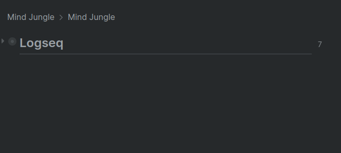
Currently, the breadcrumb bar does not contain the target/focused item. This make much confusion, esp. when sidebar boxes are collapsed into headers which contain only breadcrumbs.
Here’s a collapsed box:
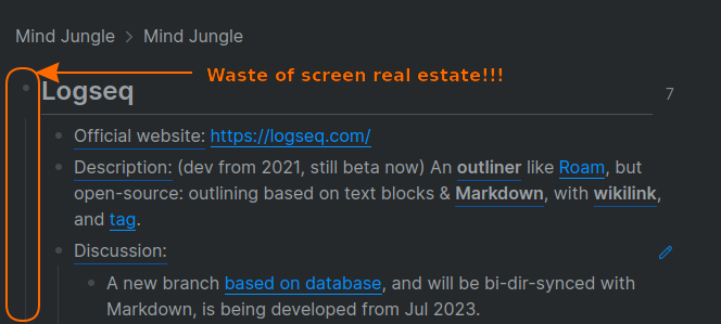
With its corresponding expanded box:
Suggestion:
- Breadcrumb bar should contain the target/focused item as the last non-link element.
- Long items should be partially truncated (with ellipsis
...) when displayed in breadcrumbs. Currently, some whole items are truncated, while lengthy items are still not truncated.
Note that currently there’s no confusion in the main edit pane because the fully collapsed view still contain the focused item. However, that focused item always occupies one indentation at the whole left side of that view, which is a waste of screen real estate. When we move the focused item up to the breadcrumbs, we can save that whole-left-side-indentation for children items.
Collapsed view in the main edit pane has no confusion:

But expanded view has a waste of screen real estate:


