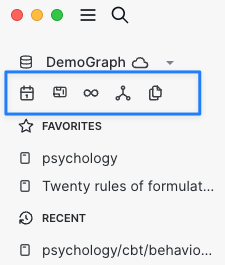
The longer I use Logseq, the more favorites and recent documents take up the left sidebar. For this reason I wanted to compress some of the icons/buttons for built in features like journal, whiteboards, flashcards, etc.
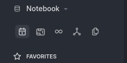
Here is what my sidebar looks like now:
I added this to my custom.css:
/* Put nav buttons on one row, no text */
.nav-header {
  margin-left: 2px;
}

.nav-header .flex-1 {
  display: none
}

.nav-header .item {
  margin-left: 4px;
  padding: 2px !important;
}

.nav-header .ui__icon {
  margin-right: 0px !important;
}

.nav-header {
  flex-direction: row;
}

.flashcards-nav .inline-block {
  margin-left: 	2px;
  padding: 0px;
}
danzu
January 16, 2023, 4:02am
2
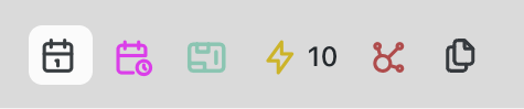
Some mirror customization to add colorful icons, adjust icons size and alignment.
/* Put nav buttons on one row, no text */
.nav-header {
    margin-left: 2px;
}

.nav-header .flex-1 {
    display: none
}

.nav-header .item {
    margin-left: 4px;
    padding: 4px !important;
}

.nav-header .ui__icon {
    margin-right: 0px !important;

}

.nav-header {
    flex-direction: row;
}

.flashcards-nav .inline-block {
    margin-left: 2px;
    padding: 0px;
    font-size: 12px;
    vertical-align: middle;
}


#left-sidebar .item>.ti {
    font-size: 18px;
    vertical-align: middle;
}

.tie-whiteboard:before {
    content: "\ea1d";
    font-size: 20px;
    color: #78C0A8;
}

#left-sidebar .ls-icon-infinity:before {
    content: "\ea38";
    color: #c8aa00;
}

#left-sidebar .ls-icon-hierarchy:before {
    content: "\edff";
    color: brown;
}

#awUI-calendar-menu .ls-icon-calendar-time:before {
    content: "\ee21";
    color: #db18ed;
}
4 Likes
DjeeAr
February 11, 2023, 8:32am
3
Could you consider a mouse over text.
laike9m
November 29, 2023, 6:57am
5
The linked CSS doesn’t work well in newer versions. Wonder if there’s a plugin for this (or updated CSS)?
laike9m
November 29, 2023, 7:11am
6
Actually, I find it easier to just hide it
nav[aria-label="Navigation menu"] {
    display: none;
}
_fl0
January 11, 2024, 6:08pm
7
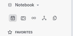
Hey, this is my working CSS to achieve the above condensed navigation menu:
/* nav buttons on one row, no labels */
.nav-header {
    margin-left: 10px;
}

.nav-header .flex-1 {
    display: none
}

.nav-header .item {
    margin-left: 4px;
    padding: 4px !important;
}

.nav-header .ui__icon {
    margin-right: 0px !important;
}

/* hide keyboard shortcut hint to fix hover style */
.nav-header .item .ml-1 {
    display: none;
}

.nav-header {
    flex-direction: row;
}

#left-sidebar .item>.ti {
    font-size: 18px;
    vertical-align: middle;
}

.tie-whiteboard:before {
    font-size: 20px;
}
3 Likes
I can confirm that this snippet is working fine for me on version 0.10.9. Using ‘Catppuccin Latte’ as a theme.
Many thanks