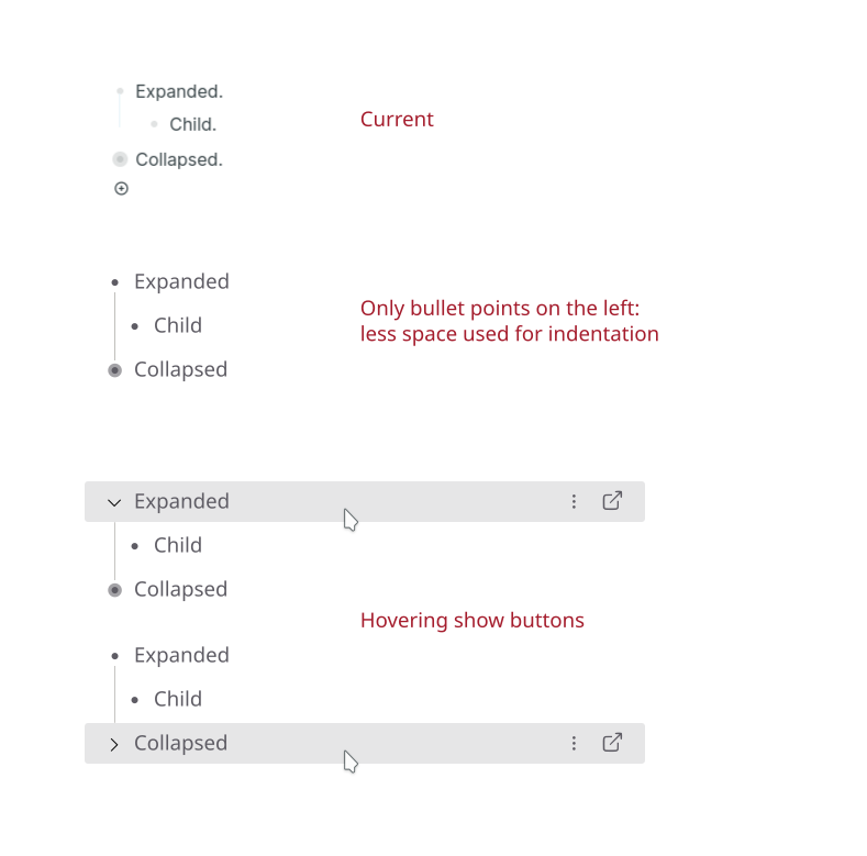
I find the interactions with blocks too confusing. Also, displaying both bullet points and the button to expand/collapse them on the left takes too much space when there are many levels of indentation.
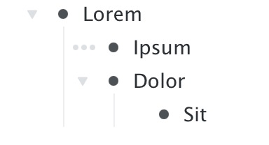
I tried to make it more intuitive:
I find the interactions with blocks too confusing. Also, displaying both bullet points and the button to expand/collapse them on the left takes too much space when there are many levels of indentation.
I tried to make it more intuitive:
I love the idea for navigation and selection
Great ideas! I love all of them except the first one, I am not sure of.
I do agree it would be nice to have less wasted space, but have you considered the accessibility of the design? I can see it being harder to distinguish compared to the current design
Distinguish what from what exactly?
From the previous point or nested points
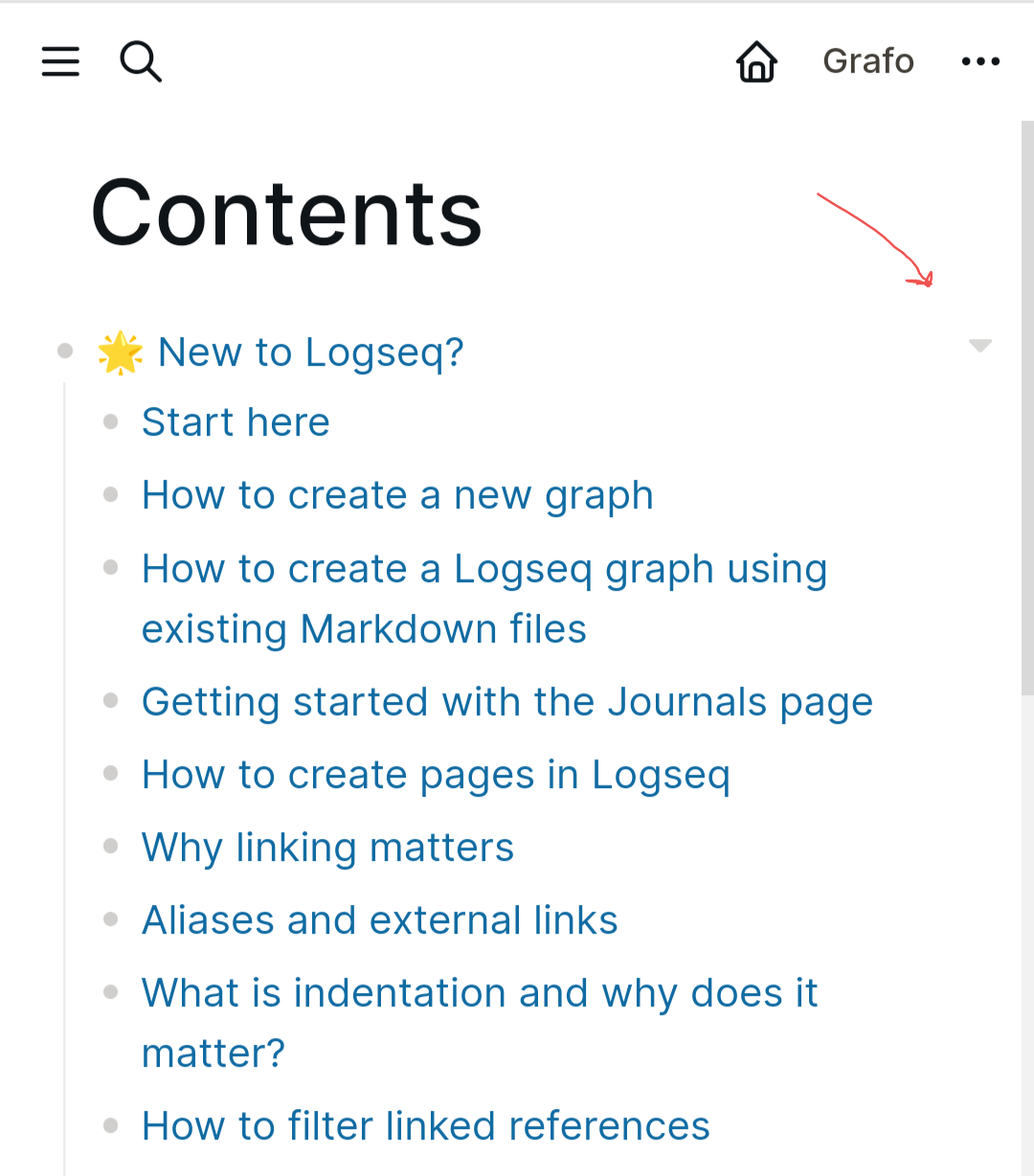
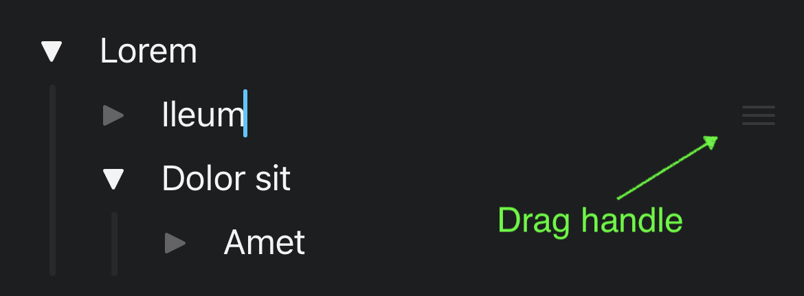
To be clear we already have this on mobile/narrow window. Check https://docs.logseq.com/ from mobile, it shrinks by moving arrows on the right. What I’m proposing is the same but with the arrows on the left and “open” on the right:
I just think that the space might be too small on the left
Yeah I got it, it could be adjusted but the point is not having two buttons there (bullet point and arrow) that force to use more space.
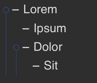
Try to shrink the window, it goes from top image to the one below:
Edit: maybe with my approach it could be made responsive to width but gradually, not with a leap like now.
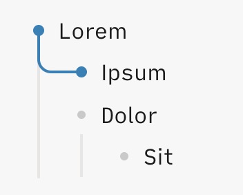
Drag to select is great!
Craft:
How other outliners deal with expanding/collapsing (Ipsum is the active line):
Workflowy:
The 3-dot thing brings up a menu:
Taskpaper:
Interestingly, Taskpaper also has a Focus in function, but it is only accesible via a keyboard shortcut
Bike:
I actually have to say i like the current design in (Desktop) Logseq with the bullet threading plugin a lot. Just the right-click-on-bullet menu is not discoverable at all (i forget that it exists regularly). But then again, all the functionality is available via the “/ command”.
Thank you for the detailed reply.
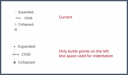
If by toggle you mean collapse/expand it is on the left, but combined with the bullet point (like in most collapsible lists).
These are very niche applications I never tried, I never heard about them before discovering Logseq. I clearly remember to be very confused for days on how Logseq outliner works and I still don’t understand why. You provided a possible explanation: it’s inspired by others but it is not a good argument to keep it, especially if Logseq want to target a broader audience.
I’m talking about the right click menu when the block is not being edited. At the moment in Linux it does nothing. What does it do in MacOS?
Moving a block is a destructive action that shouldn’t be so easy to trigger on mobile, where vertical swipes are used to scroll the view. I’ve seen a better solution by another app, I will share it as soon as I find it. But I’d keep the mobile version for another thread.
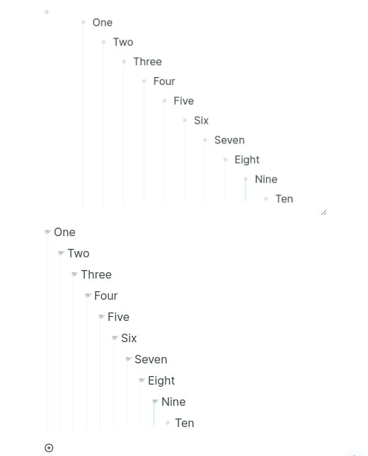
I specially agree to those two points. For the zooming in/out part I would like to add that the bullet indicator if nested bullets are available is very nice to work with now, because it is close to the beginning of the text (where you begin to read).
If that functionality would change to the right side this would generate a lot of extra needed eye movement just to see if nested bullets are there. I my point of view that should not even be an option.
I do like the 3-dots menu on the right. Specially if they are only visible on hoover.
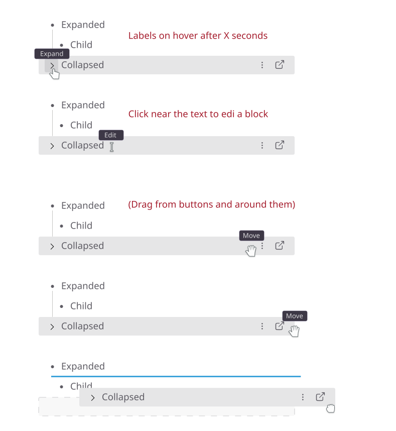
Thanks for the feedback, this is why it’s important that the block is highlighted on hover like in my mockup: you would move the cursor vertically on the right and keep looking at the content of the block. It’s an established pattern in many apps with a list.
Oh, you are right… it brings up different menus depending on the mode you are in. That’s super weird.
I get the motivation to reduce the clutter, but i don’t feel comibning those 2 makes the interface more intuitive.
Ha, that’s true! But breaking one of these established patterns would require coming up with a better, more intuitive pattern… i am not saying it can’t be done, but it’s a challenge.
If you have the chance, try Craft’s implementation, the problem you describe does not really occur.
This one doesn’t even show up on Linux and it’s provided by Logseq, meh. Anyway I don’t understand why it doesn’t show all options like the one in the bullet point.
Love the idea! My only suggestion is to have the three dots closer to the left. I have having 99% of my interactions be on one side and then 1% be on the other side of the screen. It makes moving from keyboard to to move the mouse to the other side a chore and time suck. I can’t remember the other I used to use that did this but it was so time consuming I literally quit using the app for that specific reason.
I like the idea of finding an alternative for the arrow to reduce tre trade-off of indenting.
@alex0 I do agree with some other replies though that clicking on the bullet point is (or is pretty close to) an established pattern. If I’m not mistaken I have used it at least in two different applications before: Workflowy and Dynalist. Probably in more applications though. This doesn’t mean it can’t be changed, it’s just that the cost of doing so is large enough to be a consideration.
Changing the bullet point into an arrow might look cluttered when viewing multiple levels at the same time, where bullets as well as arrow might be present. The mobile UI doesn’t have this issue. Perhaps having the same arrows, but all the way on the left is good for consistency between the apps?
Sync, a Reddit app for Android makes it easy to see different indentation levels by using thin coloured lines. This works well, but it’s probably better to keep the degree of functionality of the design independent from colours (and the ability to see them).
Hi, as I said, I don’t think we have an established pattern here, Workflowy and Dynalist are very niche apps, I have never used them and I see them mentioned only in the Logseq community.
I think we all want Logseq to be a “mainstream” app, at least on par of Evernote, Notion and Obsidian, not the just n-th iteration of outliners like Org-mode.
I am thinking about the other arguments and feedbacks, but not on this one about established pattern.
In general it should be clear from the UI what a button does and the bullet point making the view focused on it is very odd and unexpected.
Do we really want to make new users confused just because we want to preserve the pattern for those coming from Workflowy and Dynalist?
Better proposals are welcome but please think outside of the niche.
When that is your argument then there should not be an bulletpoint at all. Many outliners do not use bullets and only use indentation to distinguish between the different blocks.
I am not saying that bullets are wrong or something but sometimes I wish they were not there. For example when moving a graph to Obsidian or when editing a document with an external editor.
But the bulletpoint are here (and I think to stay) so using them for zoom or indicate that there are nested bullets beneath the current one is a great way to do that I think.
And I think Workflowy and Dynalist both are way more established programs then Logseq currently is. So calling them very niche apps because you do not use them is not correct if not somewhat unfriendly.
A bullet point is not necessarily a button you can click. When you can click a bullet point it is generally to collapse/expand list elements.