Drag to select is great!
- But i think the toggle and dot should stay on the left side, they have related actions attached to them.
- Similarly, focusing/“Zooming in” by clicking the dot is an established ui pattern (workflowy, roam do the same).
- Right click anywhere would remove access to the system right-click menu (text actions on macOS)
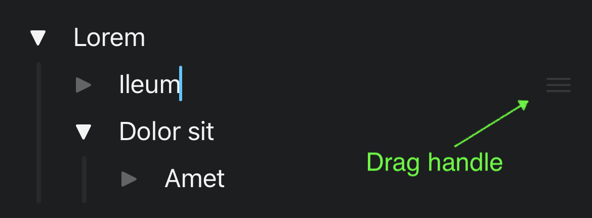
- I like the idea of re-thinking drag + drop, especially on mobile: Craft’s solution here is really elegant (see attached screenshot). I would actually move the toggle to the left (like on Desktop) and provide a drag handle on the right border, because it’s a much easier target to hit.
Craft:
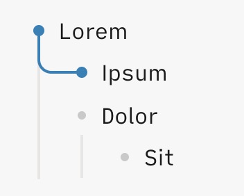
How other outliners deal with expanding/collapsing (Ipsum is the active line):
Workflowy:
The 3-dot thing brings up a menu:

Taskpaper:
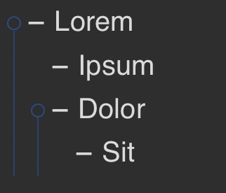
Interestingly, Taskpaper also has a Focus in function, but it is only accesible via a keyboard shortcut
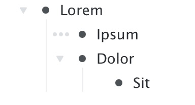
Bike:

I actually have to say i like the current design in (Desktop) Logseq with the bullet threading plugin a lot. Just the right-click-on-bullet menu is not discoverable at all (i forget that it exists regularly). But then again, all the functionality is available via the “/ command”.