Hello guys, I have a CSS question I can’t figure out. Here is the Contents Right SideBar Card and I want to position it to actually cover the “[Contents] [Page Graph] [Help]” section of the Logseq UI as I find it useless atm.
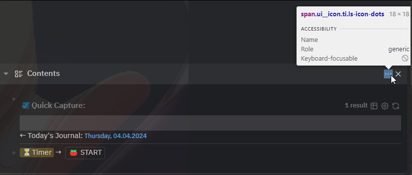
So when I trigger the “Toggle Contents in Sidebar” I get the Card positioned with fixed position in the mentioned area. But I have a problem: it seems that the Logseq UI Minimize, Maximize and Close buttons are overlapping with this Card’s dots button and the Close button.
What wizardry would I have to d to move these buttons at the begining of the header, first the Close button then the dots button just like MacOS usually has these buttons at the leftmost side pf a window title?
I assumed the z-index would not have effect on such global controls like the minimiz, maximize and close buttons. Here’s my css:
div.flex.sidebar-item.content.color-level.rounded-md.shadow-lg.item-type-contents {
  position: absolute;
  right: 15px;
  top: 3px;
  z-index: 999;
  width: 98%;
  background-color: var(--ls-primary-background-color);
}
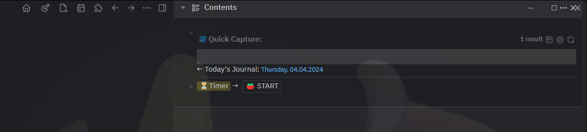
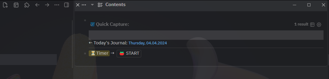
and here is the result:
I would rather have them brought to the left than removed completely but that would be a last resort solution:
Looking at the html with the inspector I see nothing specific only to the Contents Panel so it can be pinpointed with CSS only for this one panel. Apparently all the right sidebar panels have those same header and buttons …
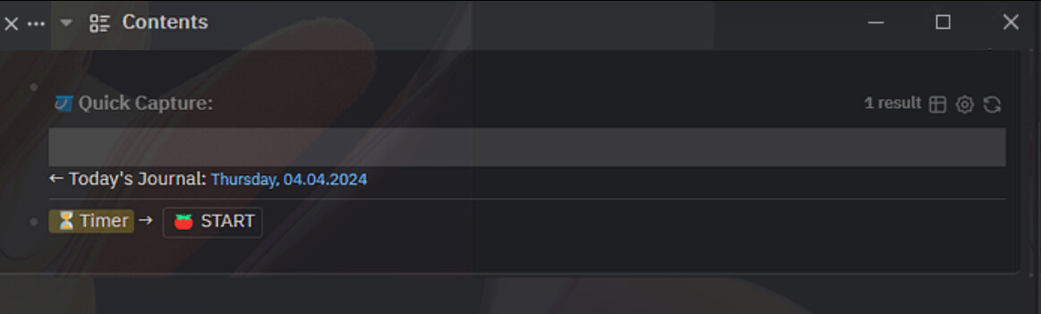
I don’t really know how to do what you suggest but the “reverse” word made me dig into it and managed to do this:
.flex.flex-row.justify-between.pr-2.sidebar-item-header.color-level.rounded-t-md {
  display: flex;
  flex-direction: row-reverse;
}
This makes all right sidebar cards / panels have the header elements’ order reversed which doesn’t look bad and I am fine with it, Now if I just managed to reverse order between the “X” and the “…” because that does bother me…
moaaa 
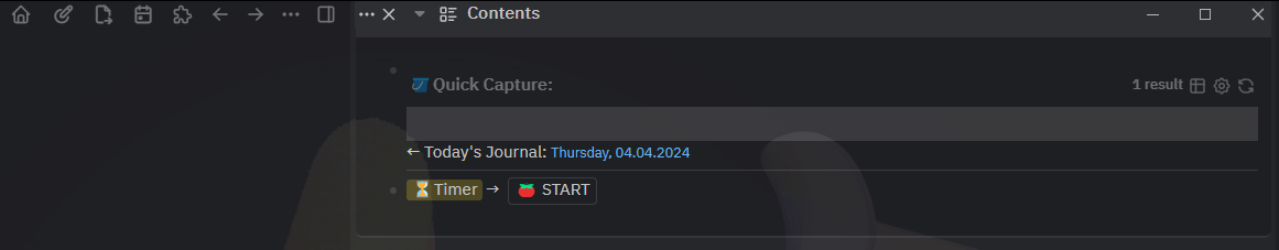
This was wayy simpler than I thought:
.sidebar-item-header  {
  display: flex;
  flex-direction: row-reverse;
}

.item-actions.items-center  {
  display: flex;
  flex-direction: row-reverse;
}
Now it only bothers me deeply that I can’t reach into the Quick Capture Bullet Edit Mode with Keyboerd …
It is even simpler:
.sidebar-item-header,
.item-actions.items-center  {
  flex-direction: row-reverse;
}
1 Like
Ok, I failed to mention that the full functionality of triggering the Contents Card is that I can access it without clicking with the mouse inside it. Is it possible to select the first bullet in the contents card right after showing it?