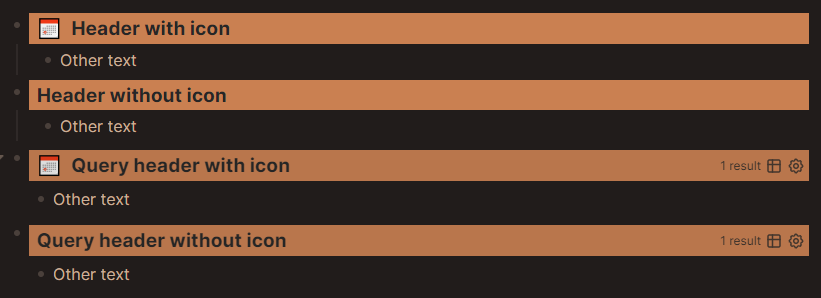
I ended up making my own custom headers. As “just make the text larger” isn’t something that really helped me split my content. (honestly whether that is in Word or Logseq lol)
So I managed to get it working both for my queries and for normal bullets.
Thanks!
I was doing something similar with :title [:h3 {:class "outstanding-tasks"} "📅 Outstanding Tasks"], but was still missing a few css options for line-height and similar so it still looked a bit ugly. I didn’t realize hiccup could just tag on classes like that.
Thanks! I’ll fiddle around with this some more. See if I can come to something a bit more modular.
Should probably start back from basics and make it easier to change/add to.
/* HEADERS
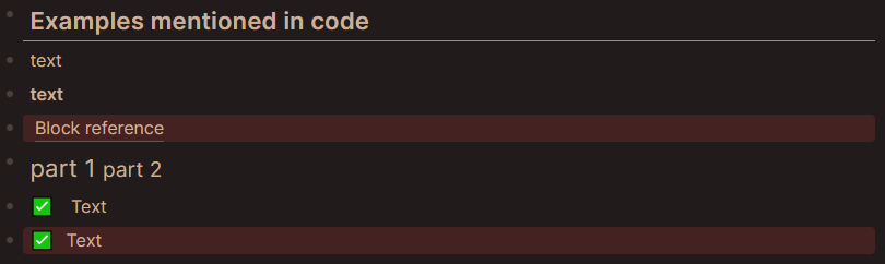
Can be used with any hiccup element.
- for example: [:span.h "text"]
- or for bold text: [:b.h "text"]
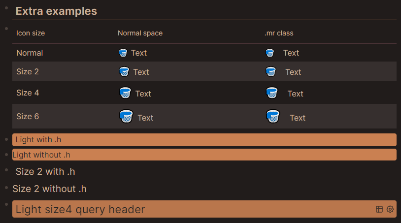
Can add extra's with .name (eg. b.h.light or b.h.light.size2)
For extra's that don't affect text, the text can be placed outside the hiccup to allow Logseq rendering
- for example [:span.h.dark] ((block id))
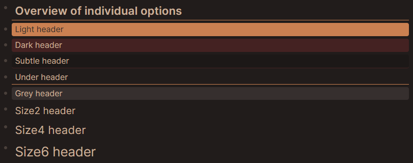
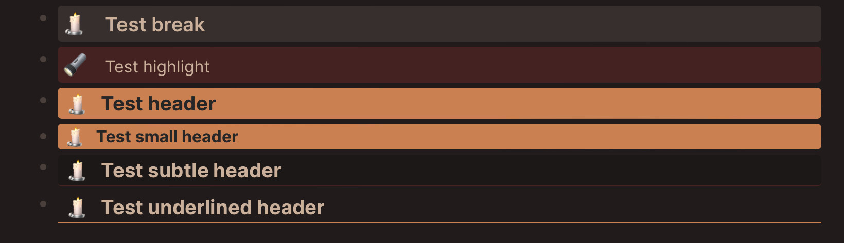
Background color and/or border:
- .light : text + background color
- .dark : background color
- .subtle : background color + bottom border
- .under : bottom border
Font size:
- .size2 : 1.2x root element
- .size4 : 1.4x root element
- .size6 : 1.6x root element
Can change font size of parts of header.
- for example: [:span.h.size4 "part 1" [:span.h.size2 "part 2"]]
Special .mr class for extra spacing. Mainly for icons
- for example: [:span.h.mr "✅"] Text or [:span.h.dark [:span.mr "✅"] "Text"]
- can also add font size modifier to change icon size.
Final notes:
- .h adds margin to the left and line-height.
- .h is therefore optional, but looks better for headers with a background and/or border.
*/
/* General header settings */
.h {
margin-left: 0.4rem;
line-height: 1.6;
}
/* Margin right for extra spacing after an icon */
.mr {
margin-right: 0.7rem;
}
/*Light Highlight */
.light,
.custom-query>.th:has(.light) .fade-link {
color: #262626;
}
div.block-content-inner:has(.light),
.custom-query>.th:has(.light) {
border-radius: 0.25rem;
background-color: #ca8051;
}
/* Dark Highlight */
div.block-content-inner:has(.dark),
.custom-query>.th:has(.dark) {
border-radius: 0.25rem;
background-color: #442222;
}
/* Grey Highlight */
div.block-content-inner:has(.grey),
.custom-query>.th:has(.grey) {
background-color: #362f2e;
border-radius: 0.25rem;
}
/* Subtle Highlight */
div.block-content-inner:has(.subtle),
.custom-query>.th:has(.subtle) {
border-radius: 0.25rem;
background-color: #1c1817;
border-bottom: 0.11rem solid #442222;
}
/* Underline "Highlight" */
div.block-content-inner:has(.under),
.custom-query>.th:has(.under) {
border-bottom: thin solid #ca8051;
}
/* Text Sizes */
.size2 { font-size: 1.2rem; }
.size4 { font-size: 1.4rem; }
.size6 { font-size: 1.6rem; }
I find that one quite hard. Because it leaves classes with intended use, which over time may no longer reflect actual use and that, for me at least, may lead to confusion.
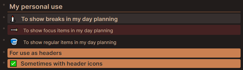
I quite liked the outcome of my focus coloring, or dark highlight header and am now using it for normal headers too.
Having to remember that it is called focus, is more difficult than remembering it is called dark.