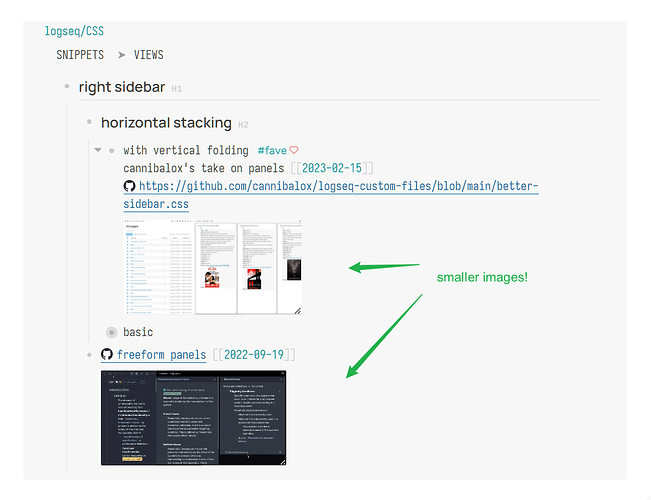
First, the “why”:
- To save precious screen estate when browsing.
- To avoid big embeds disrupting the flow of text / your rhythm of reading.
We can always click on the “enlarge” button to view the original image, or go into Wide Mode by pressing t w to watch videos in a bigger size.
HOW-TO
This is built upon ideas from other users such as all the amazing tips in this thread: Set default embedded media (video and image ) size - #6 by theBenForce
This post is noob-oriented — from one noob to fellow noobs😀 — and aims to cover as many use cases as possible.
( This is a tedious solution that separate CSS has to be added for every single case. It wouldn’t be as troublesome if a video-embed class would be added to the iframe element when the {{video }} macro is used, so if someone could volunteer… )
How does this work?
Everything below is supposed to be added in the custom.css file under /logseq in your graph’s folder.
1. Image thumbnails
.asset-container > img {
  max-height: 128px;
  width: auto;
}
Note: max-height is preferred over height because the latter will stretch out originally short images (for example a screenshot of two lines of text).
2. Small videos in default mode
First the two most common use cases — YouTube and local videos
2.1 YouTube
iframe[id^='youtube-player'] {
/* Add iframe[src*='youtube-nocookie.com'] if you use that */
  height: 135px;
  width: auto;
}
Explanation:
^=is “starts with”
in logseq currently only YouTube embeds have theidattribute and they all start withyoutube-playerfollowed by random numbers*=is “contains”
i.e.iframe[src*='youtube-nocookie.com']selectsiframeelements (meaning HTML embeds) that contain “youtube-nocookie.com” in thesrcattribute
2.2 Local Videos (updated: I took into consideration that there are 2 ways of embeds!)
For local videos embedded using the macro {{video <local path>}}, the video will be in an iframe. So, using MP4 and MKV as an example, the CSS will be:
iframe[src$='.mp4'],
iframe[src$='.mkv'] {
  height: 135px;
  width: auto;
}
Explanation: $= is “ends with” — should be obvious!
For videos added via the native syntax (for org-mode it’s something like [[../assets/video.mp4][label]], for markdown I’m not sure but maybe something like  ), you can just use the video element:
video {
  height: 135px;
  width: auto;
}
2.3 With the above knowledge, especially the bit about how *= works, you can work out the CSS for other streaming sites
Using Vimeo as an example:
iframe[src*='player.vimeo'] {
  height: 135px;
  width: auto;
}
2.4 Bilibili
(Skip this section if you have no use of it.)
You can use the same pattern for bilibili — iframe[src*='player.bilibili'] — But for the default embed, the timeline controls won’t appear unless it is more than 320p tall and more than 480p wide.
I still use the same size for bilibili because it’s still possible to scrub the timeline in Wide Mode, as screen space is more important to me. But if you find this annoying, say goodbye to the 320px on your monitor.
iframe[src*='player.bilibili'] {
  height: 135px; /* >=320 for timeline to appear */
  width: auto; /* >= 480 for timeline to appear */
}
2.5 Important tips
You can avoid repetition by stacking selectors, like so
video,
iframe[id^='youtube-player'],
iframe[src*='youtube-nocookie.com'],
iframe[src*='player.vimeo'],
iframe[src$='.mp4'],
iframe[src$='.mkv'] {
  height: 135px;
  width: auto;
}
2.6 Common slip-ups
- Every key-value pair in a
{}needs to end with a;(well except the last pair). If you’re having problems, you might be missing a;. - When you’re stacking selectors, remember to put a comma after each selector!
3. Big videos in Wide Mode
This will give you bigger videos in Wide Mode:
.ls-wide-mode video,
.ls-wide-mode iframe[id^='youtube-player'],
.ls-wide-mode iframe[src*='youtube-nocookie.com'],
.ls-wide-mode iframe[src*='player.vimeo'],
.ls-wide-mode iframe[src$='.mp4'],
.ls-wide-mode iframe[src$='.mkv'] {
  height: 540px; /* half of 1080p */
  width: 100%;
}
Explanation (assuming you already know about the stacking mentioned above):
- As with all the other numbers, 540px is just what I use. Use whatever you like!
100%is recommended forwidthbecause if you set a fixed number, the video will not adjust accordingly even if your side bar is open and covers the content!
This is the end, guys!
if you don’t need bilibili
The highest resolution for the bilibili embeds is 360p. So instead of a bigger blurry video I chose to save more space —
.ls-wide-mode iframe[src*='player.bilibili'] {
  height: 360px; /* highest resolution available anyway */
  width: 640px; /* 360p/(16/9) */
}
