Secondly, the collapse state is shared across all instances of an embed. So if I collapse an item in one area, it’ll collapse everywhere else that it’s embedded.
The way workflowy has done it with mirrors is about perfect and the projects are similar enough that I think this would be an excellent option for folks who desire this type of transclusion.
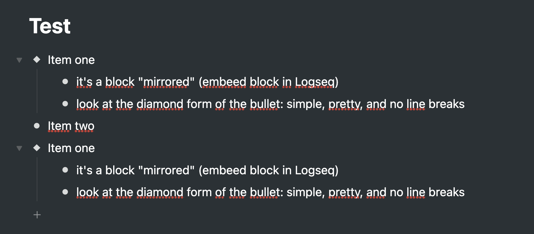
First, it indicates the block is an embed through the bullet itself, and instead of the window within a window look, it just shows the content you’d like to mirror.
secondly, the collapse state is independent.
It’d be nice to have these at least as options, as well as perhaps allowing to show a faint outline or maybe similar ui to a card to have the embedded part stand out somewhat.
Something like this would be excellent
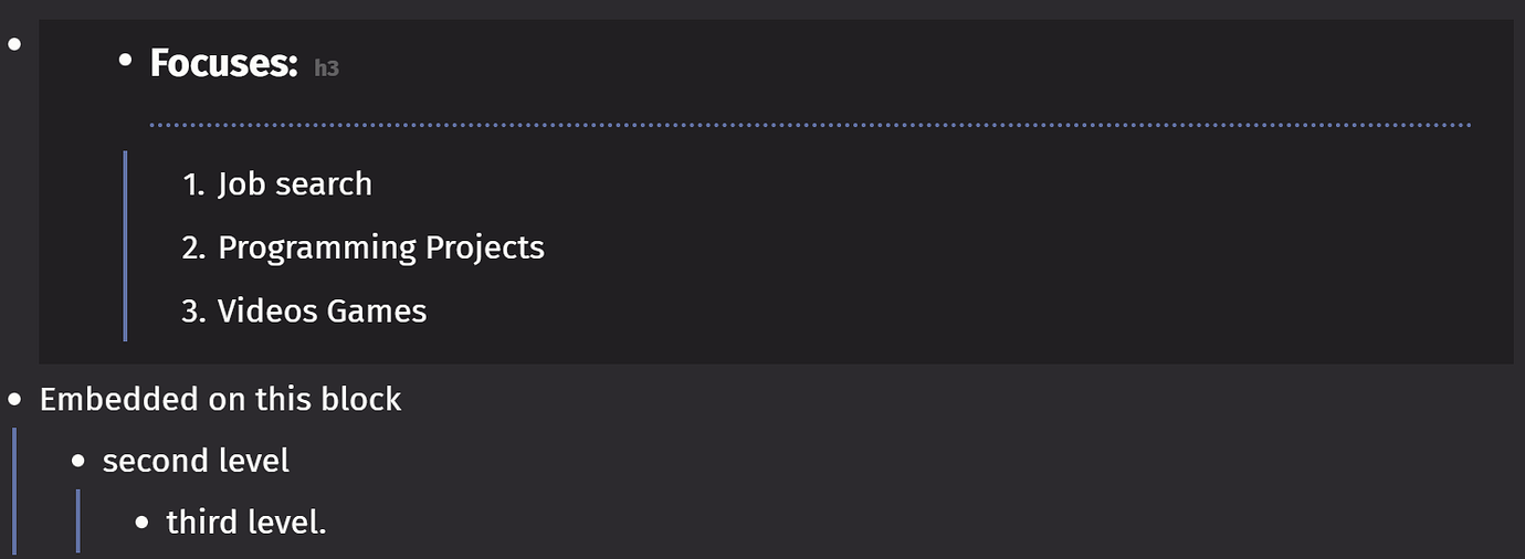
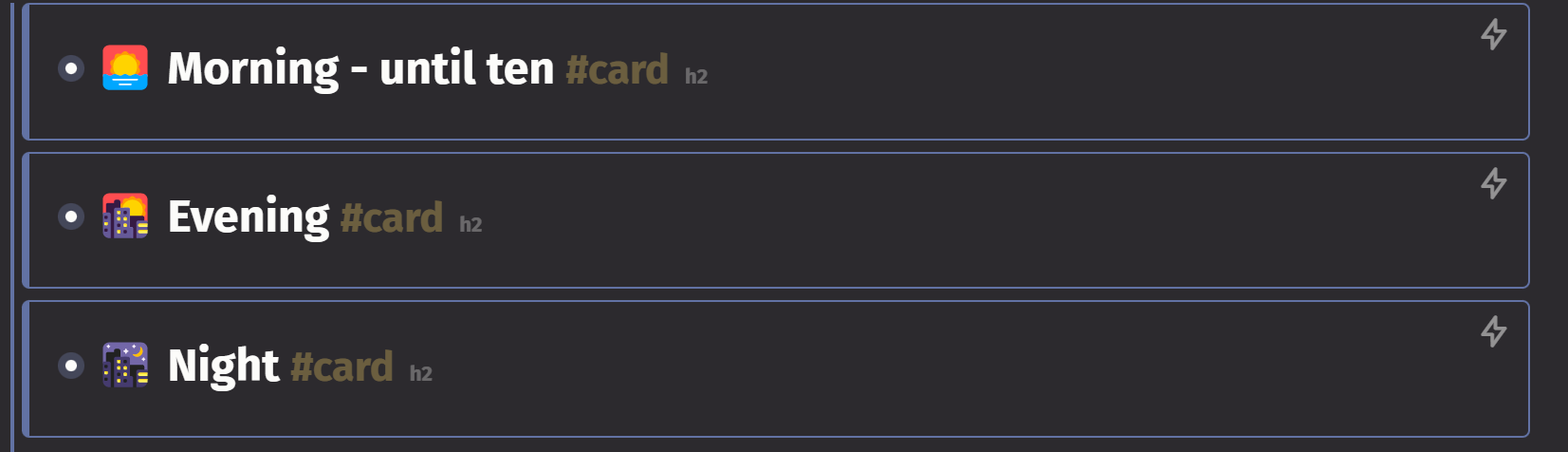
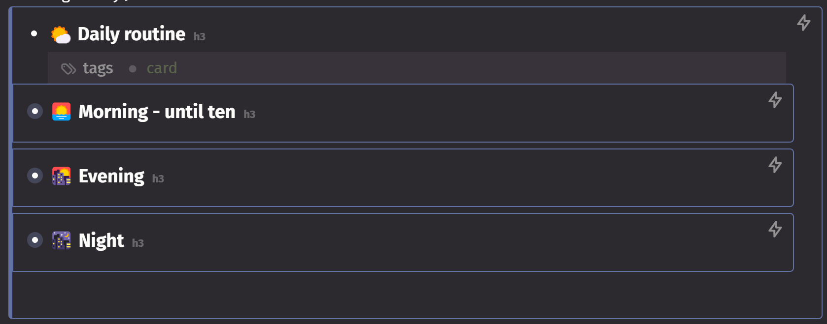
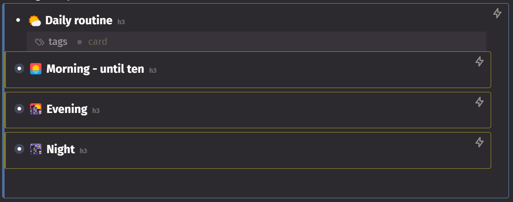
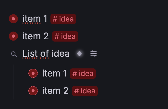
I’ll add that because I’m not using the flashcard funcionality at all, at least for my main graph, I just use the card tag to help organize things. I’m even using cards within cards and the this is displayed is actually perfectly aligned for use as a portal/embed indicator. I will show what it looks like below. The only difference I would make is maybe a 3 color embed level indicator, based on your theme. You will see that almost no extra indentation space is taken up by the outlines. The only improvement I could make would be to adjust the color of the outlines
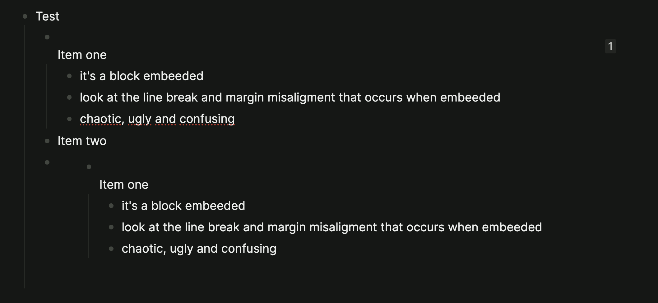
Agree this could be a lot cleaner. I’ve had to do some rather extreme and cumbersome custom CSS to get things looking the way I like, which, TBH has been quite difficult given the methods of testing/editing/navigating the html. Love that I have this much control over logseq, but also find myself spending way too much time trying to force it to look and act as I expect. In the image below, embedded pages have the big gray bar next to them.