Elements should only look interactive if they actually have an interactive function when users click on them. Currently two elements look interactive but I can’t determine their function, if any (desktop version):
- The Logseq logo in the upper-left corner, which gets darker when the mouse hovers over it
- File paths to local directories on the “All Graphs” page
Are these supposed to be interactive or not?
Hey Cobblepot,
if you click on the logo it directs you to the journal pages. At least that is what happens for me 
yup, I always assumed that’s what it is there for. Helps to onboard someone new as well, “wherever you are, click this icon to get to today and just start writing”
1 Like
For some reason, the Logseq icon wasn’t doing that for me, but it is now. 
Since the app opens to the journal or daily notes pages, I recommend adding a tooltip explaining this function, as it could be confusing to new users who don’t have any pages yet.
Should also address #2 in my OP.
2 Likes
Yes, seems to navigate you to your home page. Be it your defined page or journal pages if activated.
If it is not crystal clear what it does, would you mind adding at least a tooltip?
BUT
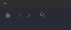
My suggestion would be to change this icon to a house. (Like the “Home” icon in browsers)
If you would like to have a Logseq icon in the UI, let’s change the overflow menu on the top right to that.
2 Likes