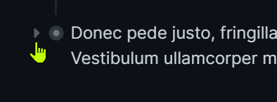
When a block is collapsed, the bullet gets an ‘aura’.
In order to expand the block, the user needs to hover over the bullet aura (not accidentally click it) and then the arrow appears that they need to click to expand the block.
This I consider bad UX because of the complexity of activities needed.
Easier is to keep the arrow visible when the block is collapsed, so the user can directly click on that to expand the block.
I agree to this and think it deserves not being ignored further. I don’t think it’d be that hard to provide an option in the settings at least but i would also add to this that the Size of these tiny little arrows can be a little too small, and a solution to modifying too should be provided as an option in the settings.
For eg, in the settings you could have : “Always show Collapsing Arrows” and “Adjust Collapsing Arrow Size: (Small, Medium, Large, XL)”
Try using Logseq on an Android phone or tablet even and you will see how it can become frustrating trying to guess where the arrows are and trying to land your hit. My fingers aren’t necessarily big either lol!! I guess we could call this “accessibility” options
Thanks very much to mentaloid for this css instruction! It makes a lot of difference to me in terms of visibility!
May I ask further – unfortunately this does not seem to work for me when I use a dark theme (in my case a Dracula version).
Does there need to be additional css to make this appear in dark themes?
As an alternative, is there a way to increase the contrast/brightness/color of the “glow” around a collapsed bullet so that the same glow would be visible on all themes?