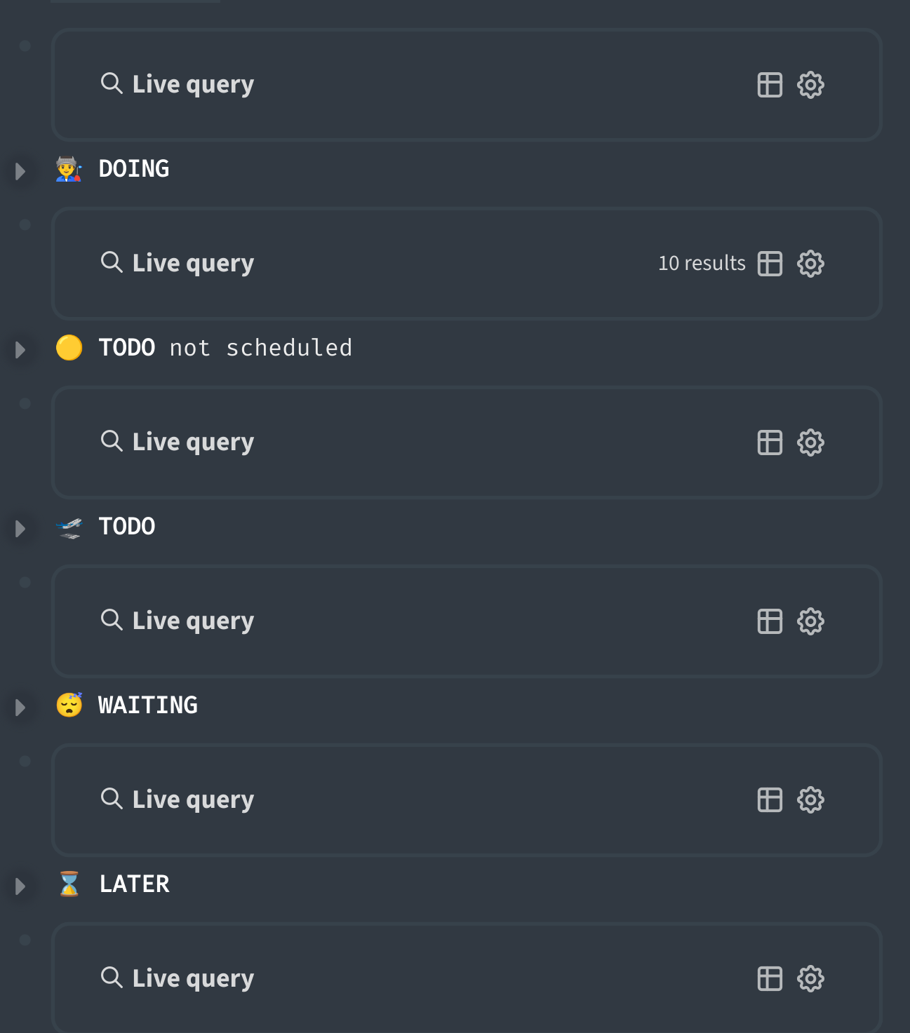
With new feature Live query now page with query looks bulky.
Screenshot 1 - before
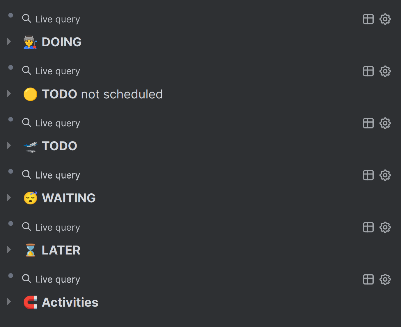
Screenshot 2 - after
Is the away to remove this big block with Live query?
Example of query
#+BEGIN_QUERY
{:title "👨🏭 **DOING**"
:query (and (task doing) [[work]] )
:collapsed? true}
#+END_QUERY
WQing
2
Hi, that look is from the custom theme you’re using. (Bad3r’s Nord theme I guess?)
The live query from the recent update shouldn’t look this big when collapsed.
1 Like
I’ve spend today messing around with CSS for this haha.
@WQing is correct about the theme thing though.
Here’s a few options:
Remove the whole block
.ls-block .custom-query
  >.th {
	display: none;
}
Put it on the same line as the title (fiddle with the margin values for alignment!)
.ls-block .custom-query
  >div >.flex >.content {
	margin-top: -30px;
	margin-left: 80px;
}
Remove the live query bit and put the results count, settings and table toggle in front (again fiddle with the margin as needed)
.ls-block .custom-query
  >.th {
	display: block;
}

.ls-block .custom-query
  >.th .flex-1 .ui__icon {
	display: none;
}

.ls-block .custom-query
  >.th .flex-1 .ml-1 {
	display: none;
}

.ls-block .custom-query
  >div >.flex >.content {
	margin-top: -30px;
	margin-left: 95px;
}
3 Likes
@WQing yes, you are right.
This is because of theme.
It was Dev theme.
Default theme and some other themes (Woz theme for example) are fine.
Block with
Live query much smaller now.
But to be honest I still do not like it, I do not need text
Live query here, it redundant.
I will check css from @Siferiax , thank you!
1 Like