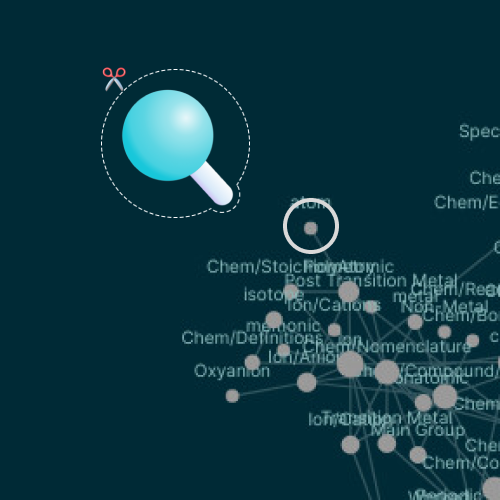
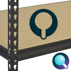
Graph elements as an uppercase Q

Android
Apple
Design notes
- Colors
- Upper left quadrant pays homage to existing application and logo (solarized dark)
- Palette swappable and gradient friendly
- Shapes
- Basic shapes form an empty canvas/framework (Google-doodle-able)
- Relational line emulates “capsule” shape found throughout submission template
- Letter Q
- Resembles a node and edge
- Rarest letter in the application name
- Q as in Qin
Values
- Intuitive Knowledge Management
- Information organization: highlighting the graph database structure
- Smooth: rounded edges and gradient colors
- Fast as lightning: the shortest distance between two XXXXXs is a straight XXXX. Logo suggests a point and line in the process of connection, as a freeze-frame capture.
- Collaborative & Open
- Edge represents an outward-reaching propensity
- Line direction (down and to the right) suggests reading. Apologies to those whose script is right-to-left and/or vertical
- Privacy & Security
- Visible background space forms a keyhole, suggesting privacy and security as a baseline.
- Accessible & Extensible
- Keyhole doubles as an input notch for expansion

- Industrial strength storage
- Snap in, no tools needed for assembly by end user
- Deviation from plug/outlet, puzzle, or lego brick motifs
- Empowering Creativity & Problem Solving
- Self evident through submission and all community participation
- These notes were outlined as a Logseq page

