It seems too late to submit, but I still want to share a few lastest concept designs based on ![]() Logs
Logs
The original wood
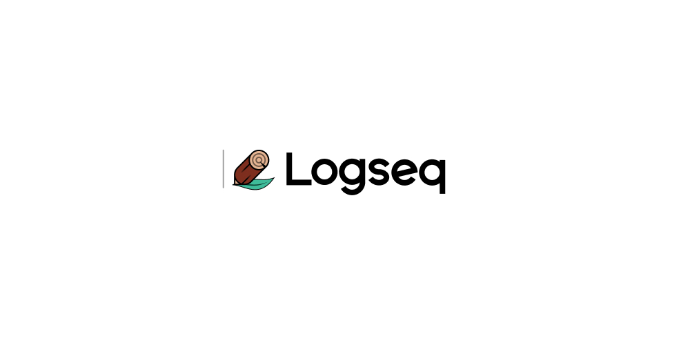
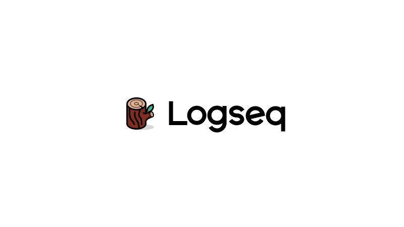
As a figurative expression of Logseq, I believe that the imagery of logs is the closest and most suitable choice for the application icon, which itself is a metaphor for logs as a logging tool for writing, creation and the origin of civilization, and the construction of all human knowledge. The ignition of fire, the use of wood axes, the creation of pencils, furniture, and even the birth of books are all closely related to logs. By using logs as the application icon, there is no need to specifically capture any letter from the application name “Logseq.” The growth rings on the log’s cross-section symbolize the best expression of “logging” and “sequences.”
Many trees form a forest. The collective presence of logs, branches, and even leaves represents the optimal metaphor for tree structures, outlines, connections, collaboration, and growth, with its meaning self-evident.

Branch of the Log
Merging the master and branches of the log into an L shape, represents connection, collaboration and growth。In this concept, the branches are actually also a connetion.
where the figurative version provides more details, such as the log’s annual rings and cracks look similar to the letter Q/magnifying glass, representing the concept of query; the keyhole on the log’s branches metaphorically represents a security lock.

The Return of Notepen
Logseq is a note-taking application, but its icon resembles a paw print, which makes it difficult for the general public to recognize. If we want to make it more popular, visually, shouldn’t it be more intuitive and convey sincerity to those who are unfamiliar with it?
Therefore, this concept first represents a pen, and then incorporates elements of logs, leaves, growth rings, searchability, and the brand letter ‘L’. Your thinking tool should naturally embody these aspects.