Awesome. Vote for this, it looks exquisite.
Introducing Myself: Hello! My name is Andrea, and I am a novice in the TFT space. I am also a designer and couldn’t resist submitting an entry for the logo contest.
Inspiration: The first place I went to find inspiration for the new logo was the Logseq website, where I admired The Thinker statue, placed as a backdrop to the product. The statue is loved by many, and to me, it is a visual representation of all the great philosophers who have ever existed. I thought about what kind of ethos this brings to Logseq’s brand, and I came up with this: The exercise of seeking knowledge is as old as human history. This sentiment brings a wonderful contrast to the reality of Logseq’s product, which would not exist without modern technology.
From there, I explored other ways in which humans have sought to understand the world. I landed on the History of Geometry Wikipedia page, which states that geometry and arithmetic were the precursors to modern math. And, what is more universal than math? From there, I knew I wanted to create some sort of geometric shape, so I drew an isometric cube as a metaphor for the mind. It represents all of the knowledge a person can hold, but also shows that Logseq is the key to accessing it intuitively. (Hopefully you see the “L” for Logseq.) It is nested inside a hexagon with a solid border, which represents strength and security, but also community, since there is never an end point. The slightly rounded corners give off a friendly vibe, which shows that Logseq is meant to be accessible, collaborative, and open. After all, it is only natural to grow our knowledge by working with others.
Thanks for reading! My twitter handle is @AndreaLeigh111. I am also open to collaborating, so if anyone would like to play with my design, please contact me and I can send you a .svg file.
Logsek Modern Logo - designed by a post-grad student
Hey everyone!!! Hope you are doing great. Logseq has changed the way we take notes and hence it has been my go-to app for note making. When I got to know about the logo making contest, I was excited to share my take on the Logseq logo, so here it is!!
What it conveys -
-
Familiarity: - Anyone who uses Logseq will instantly recognize that the logo is inspired from the nodes and it’s child nodes. The L shape so formed in this process is at the heart of the new logo, which signifies the word Logseek.
-
Collaborative & Open: - The logo signifies connectivity between ideas and ease of sharing. The red coloured line signifies the smooth passage of knowledge from one person to another.
-
Accessible & Extensible: - The logo’s bright & diverse colours signify the diversity of work one can do with Logseek , from basic things like note taking & to-do lists to complex tasks like kanban boards, pdf annotations, AI bot integration and the list goes on… thanks to the variety of plug-ins it has to offer submitted by wonderful community members like you
-
Intuitive Knowledge Management: - The logo also signifies the organized structure of Logseek’s note taking method.
-
Privacy & Security: - on seeing the logo from another angle, one can notice a smiley This detail shows trust that Logseek has build over the years through it’s brilliant privacy features.
Attached files include the Modern logo in action, which fits into the UI of every major OS and also look great on Web Browsers. The modern Look & feel makes Logseek attractive to new-comers on the platform
My twitter handle as on the dynamic island image : https://twitter.com/i_abrs
Thank you for going thru my post, I hope you liked it
Great designs so far. I really hope Logseq will choose one of these or other logos that are yet to come as a new official logo. Not to be disrespectful to the current logo but I always felt it was sort of random.
great to see the creator of my favorite icon from 2 years back
to be honest I prefer the original style because the new one reminds me of Adobe, but it’s still pretty!
I also love that the wordmark is open-ended, but I think “what will it become” is more exciting and forward-looking than “what comes before”. In other words, I think an open ending is more appealing than a shrouded past.
If “logseq” is placed on the parent, the result will look equally cute and quirky as it’s still off-centered. It can also be adapted for different uses by putting “blog”, “hub”, “docs”, etc. on the “child”, for example:
(sorry for the half-assed mock-up. i only used the screenshot tool. there are still outlines left in it and they’re not properly aligned.)
The result is taller and narrower than one line of “logseq blog”, which I think is more “logo-like”. I also think it makes more sense semantically.
Dear Sir / Madam,
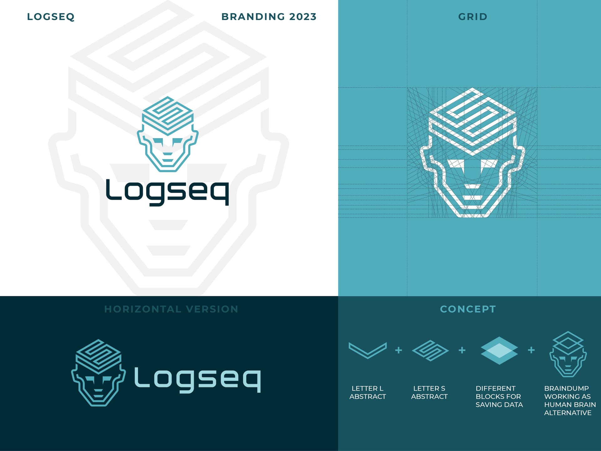
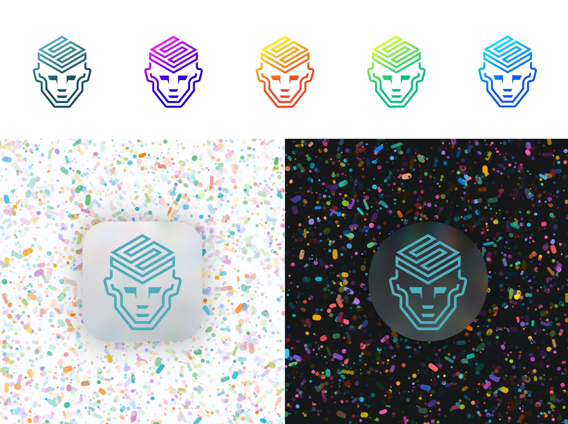
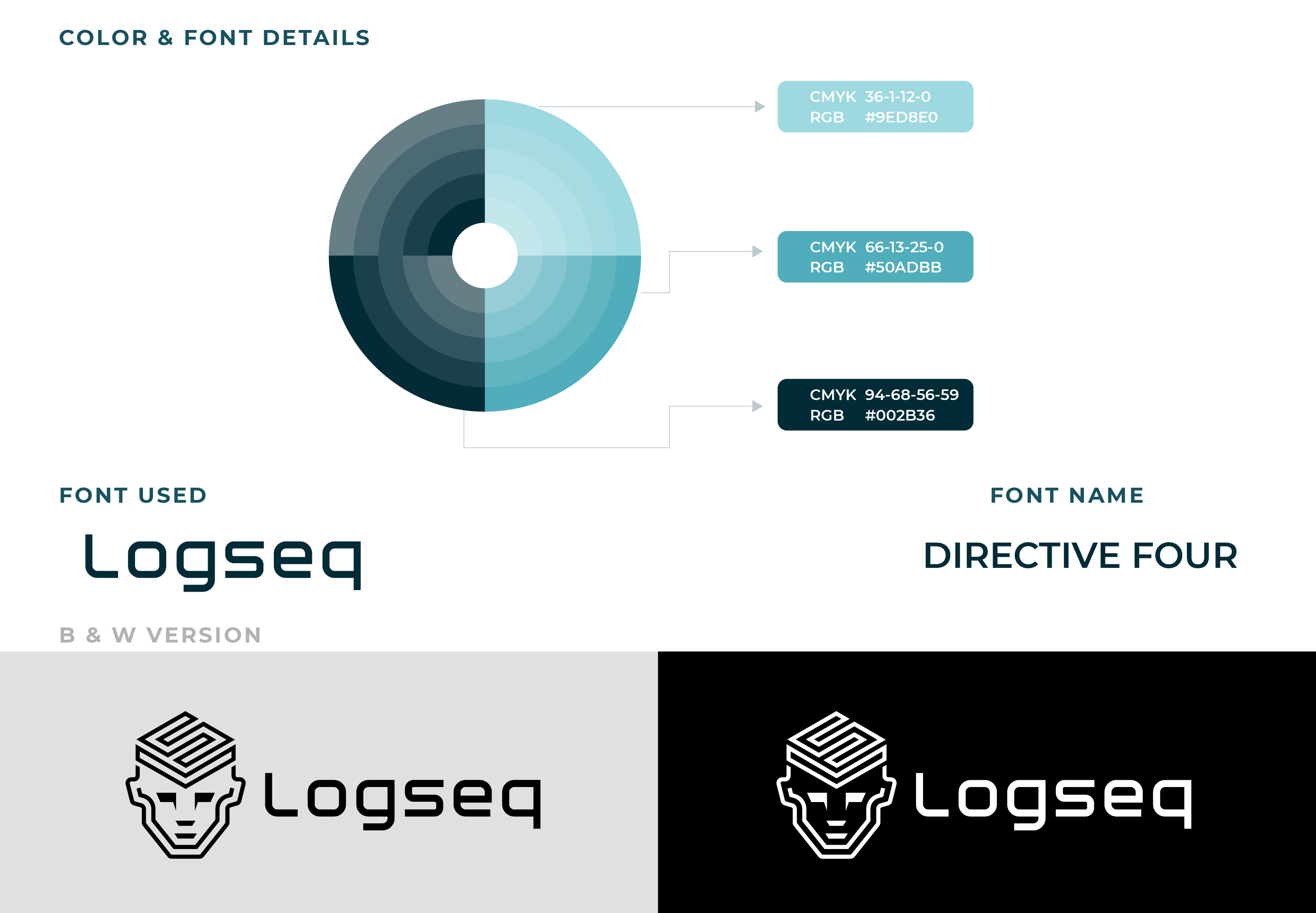
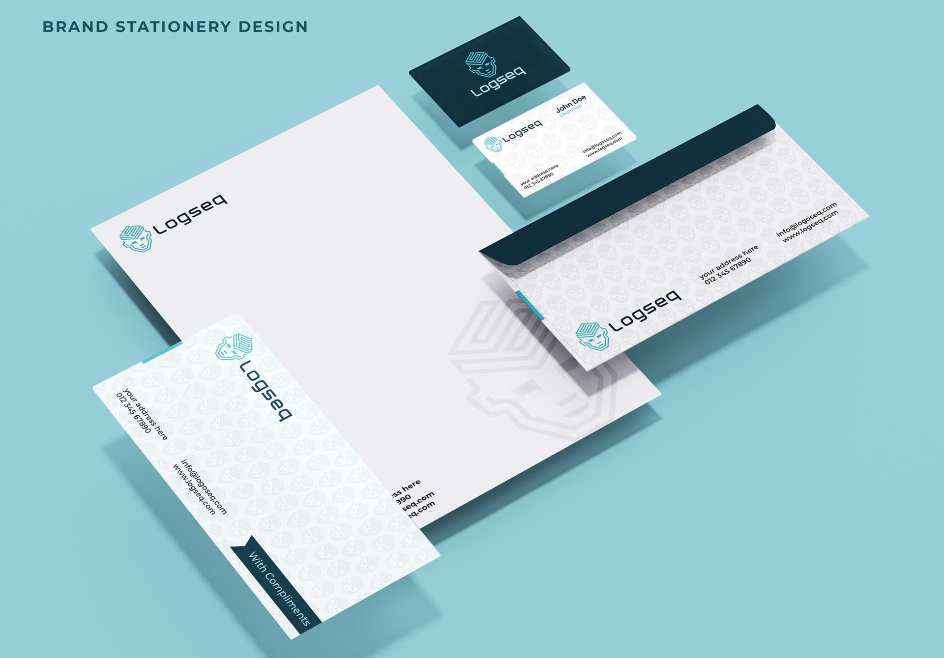
Inspired by the concept of the Logseq working process, I designed a minimal line art logo with the combination of the initials L, S, and human brain. Where you can see the L and S in a cubical shape working as human knowledge and thoughts, saving space as notes and images in separate blocks. Here I used “human brain dump” to denote that it worked as a human brain alternative where anybody can recall anytime from that saved data. This design is versatile enough to apply in any format. I hope you will appreciate my creation. Feedback will be appreciated regarding my thoughts behind the design. For a better preview, please check this image at 100% resolution. Thank you.
About Me:
I am a driven and flexible graphic designer with a proven record of delivering creative
and innovative design solutions. I have 10+ years of experience in the field of specializing
in Brand & Identity Design, Print Design and Advertisements. I started my career as Freelance
Graphic Designer after finished my Masters in Computer Application in 2009 from Jadavpur University.
Usually, my working hours everyday is more than 16hrs. My online presence as username
‘putul1950’, you can check it on google as well.
I worked with company like no. 1 Australian solar brand Solgen Energy Group and design full
brand identity for them. Also, I worked with Paramount Pictures for there new online feature.
Currently I am associated with two best online design platform, sharing my portfolio link bellow:
My twitter handle is @putul1950
Please Find the following presentation image of Logseq Brand identity design
This is something that makes sense for Logseq websites/pages independently from the new logo/icon
This makes total sense. Love it. Cheers!
This is frightening.
I’m using Logseq for about 1 year, and the most impressive thing about it is the Journals
, and the Graph view
:
-
Journals
really cure my fear of classifying which catalog a new note belongs to before I actually write it down -
Graph view
can connect the journals in another dimension after I wrote it. It’s really burden-less before and after writing things.
Really thanks to Logseq which saved me from selection phobia by the way!
So based on the two points, I designed a new icon for Logseq:
Let me explain it:
-
The main colors of the icon currently is less attractive and unsaturated, so I managed to find more saturate colors that will make the icon looks more satisfied.
-
With many thanks to the
Journals
feature, I designed the main part of the icon:- A vertical line and two big circles which represents the journals timeline and two journals on it
- Another circle connected with the lower circle shows you can easily connect logs with the journals, so you can easily find them.
- The three circles and the timeline form a shape of letter “L”, which represents Logseq.
This point also shows “information organization should be smooth and access fast as lighting” which is mentioned in the
Intuitive Knowledge Management
value. -
With thanks to the
Graph view
, I designed the background of the icon:- If you zoom in the icon, you’ll find there are 7 circles connected with each other actually, which represents 7 logs connected by
Graph view
(I have to say it’s inspired by @rob , thank you rob!). - If you zoom out the icon, you’ll find only 3 circles are more stand out(represents the icon mainly), if too many circles or lines appears in the icon, it will be a mess. I tried to keep the icon tidy and clean.
- The 4 looming circles and lines represents you just write anything in Logseq, Logseq will automatically connect your knowledge and form your own knowledge database, make you smarter and more wisdom.
- Represents the value of
Collaborative
andEmpowering Creativity
.
- If you zoom in the icon, you’ll find there are 7 circles connected with each other actually, which represents 7 logs connected by
-
I draw a border around the icon (maybe inspired by Xcode? lol) which represents
Privacy & Security
:- Your knowledge and writing things are always in a safe place.
Is the current logo also a contender? Personally I quite like it, to me it comes over as a playfull logo that shows a ‘don’t take things to seriously’-attitude that I like.
If it is a contender I will probably vote on that one.
^ we’re getting one step closer to adhering to godwin’s law
yes, sad to see no love for the logseq paw… I like the legacy logo, so here’s a minimal take on the paw that can be read as nodes (or dots, Ensō, planets, crop circles, dices, whatever suits your mood really).
Good idea! Thanks for the feedback
props
dots + line
Here is my concept map (since I don’t know how to use design software)
-
Original icon theme: The icon before Logseq is a footprint that tells the story of recording footprints and recording retained moments.
-
Theme of the current icon: Therefore, my icon is designed with the concept of time, stairs (the three small horizontal lines on the right are ascending steps), arrow direction, and add the initial L of Logseq.