It would look more consistent especially for people who switch between light and dark theme frequently (for some reason)
Agreed, it’d be great for a fourth option in this dropdown to be “Match theme” or something of the like:
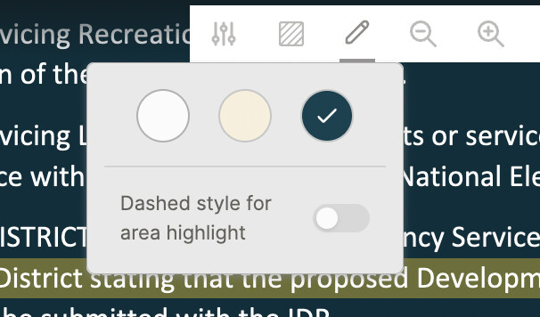
A typical design pattern for this is to have a circle split down the middle, with one half white and the other half dark.