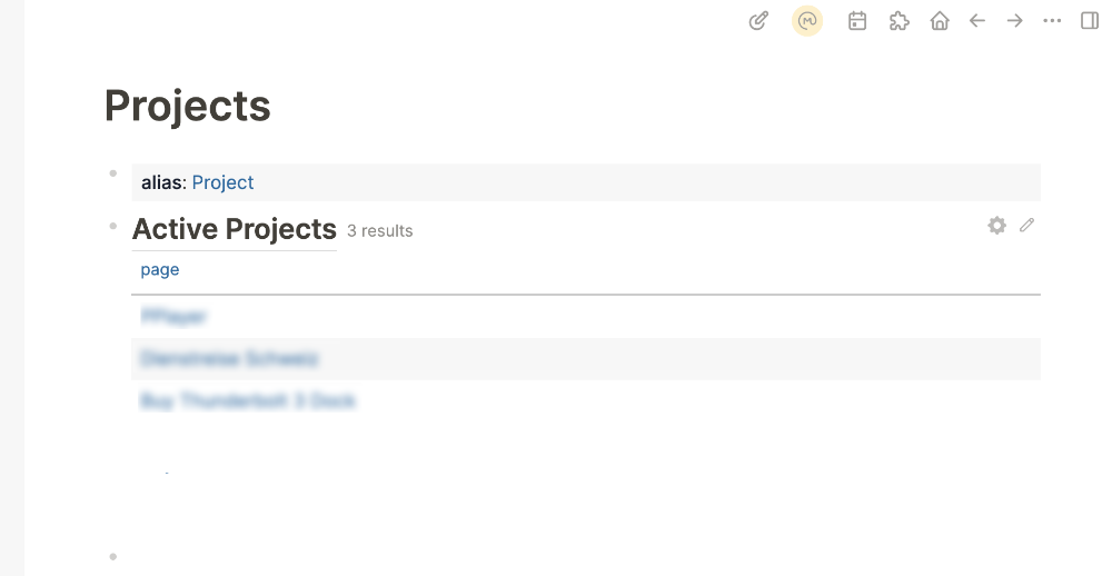
Hi, currently the query results look a bit cluttered and misaligned.
It would be nice to move all the settings to the properties dialog.
Place the button next to the edit button.
And align the title with the bullet point.
I like this idea. Looks a lot cleaner. Only worry is about the user friendliness of having no label for the settings icon as the icon isn’t too explicit of its functionality.
Most buttons in Logseq have no label and you could always add a tooltip.
And querys are buy itself not super user-friendly
I think if you got so far you probably figure it out.