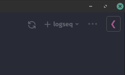
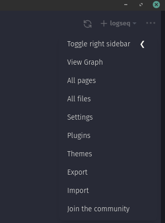
The two “buttons” on the top right: the overflow (…) and the hamburger (☰) menu behaves differently. And the hamburger menu is used to not change the layout.
If you would like to retain a quick toggle for showing/hiding the right sidebar (which is btw the first menupoint in the overflow menu), then please use a different icon. For me a left pointing chevron («) would be more natural for that kind of functionality.
Like this:

Or with the Toggle Right sidebar button removed from the main UI to declutter the UI (but here, the three-dots menu is opened):

i was writing something similar to this and topic suggestions led to here rightfully.
there is confusion between hamburger and three dots menu. they signal the same thing which is opening menu. but here one opens the sidebar. as suggested above an arrow or similar implementation would be nice. or as workflowy does hamburger symbol can be used at the other side of the screen to imply that it is different than three dots.
my second remark is about the +“graphname”+▼ section. + and ▼ implies the same thing and one is redundant. also i think this section should not be here at all. it only used once or twice. it can even be buried somewhere in settings at best in three dots menu.
