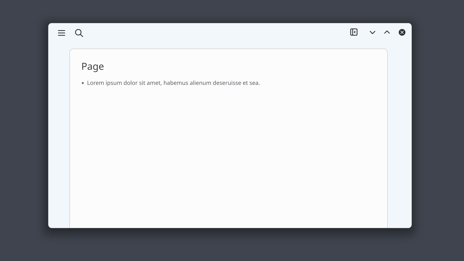
Inspired by a mockup recently shared by @futurized I drew this concept:
- don’t look at details like proportions, choice of icons, aesthetics etc, just focus on the workflow
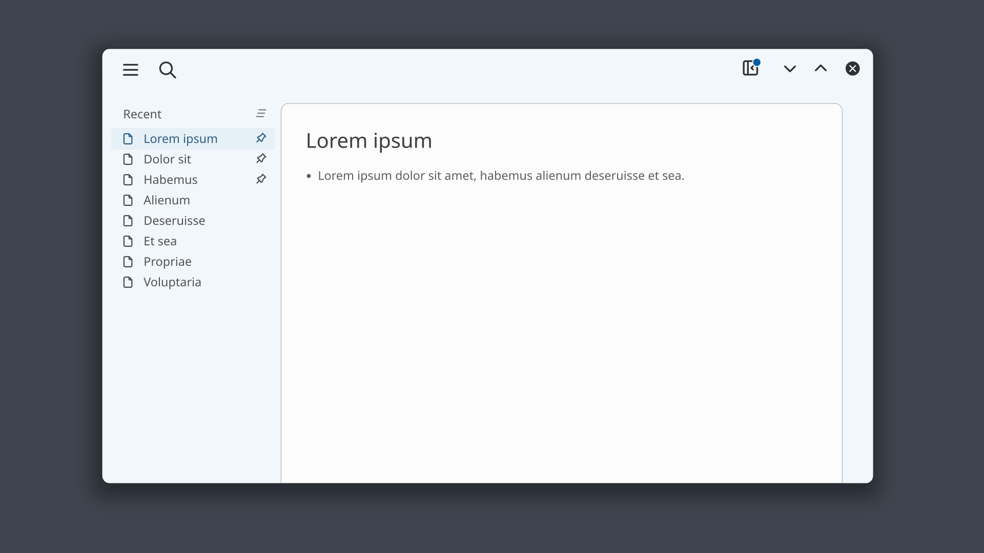
- the left sidebar has a list of recent pages that can be cleared with the button at top right
- pages can be pinned at the top and resist clearing
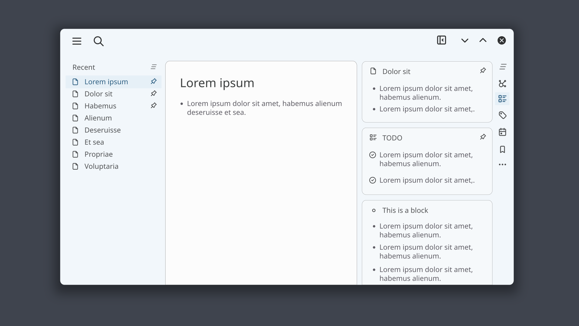
- panes in the right sidebar depends on the current page
- when the right sidebar is closed and the current page has panes specific for it an indicator is shown on the button to open the right sidebar
- panes can be pages, blocks or widgets like the page graphs or the ones by plugins
- each pane can be closed with a button, not shown in the image as it could appear on hover
- all panes can be closed at once with the clear button at the top right
- panes can be pinned to resist clearing
- important: pinned panes appear on all pages
- contextual panes (like page graph or current page TODOs) update their content when switching pages
I tried to keep it intuitive but still powerful. What do you think? Try to imagine the resulting workflow and please don’t look at details like where an icon is placed.