Main Content at 100% width is not looking good and is way too stretched on the screen width. Toggle Wide Off with T W works ok but, as one goes on with work, you do a T L, then a T R and all of a sudden the Narrow Width of the Main-Content is wayy too narrow, newspaper-column-like layout.
I was wondering if we can have a Javascript observer function (I believe this is what it is called) to check the state of any user toggling to narrow or to wide and, if not explicitly toggled, have the Toggle Wide Off if Main-Content’s Width is, for example, higher than 90%. This way some repetitive toggling would be automated and one could go on with his work without always adjusting the view.
For my part, I would be happy with a function that says: “if the width of the main-content element is larger than 90% of the screen, trigger a Toggle Wide Off (Toggle Narrow?)”.
Could this be easily achieved with Javascript?
Thanks.
A smaller width that is hard-coded in the CSS is NOK because, when you open the Right Sidebar to half-half of the screen, main-content becomes a newspaper-like narrow column that can’t be worked on properly. So then I need to type T W to get it as wide as possible in the allowed space (half screen). So, after taking whatever I need from the right sidebar, i toggle the right sidebar off and now that one full-screen-height narrow column stretches on 4 lines of full-width screen. It’s an awful experience.
Sidebars are useful when you use some information from there, otherwise they are just noise. I use the left sidebar quite seldom but the right sidebar gets a lot of use. It is busy with lots of Opened Cards and It would be very eye-straining to have it always on. So I use it to know what I need to work on (among other things) and open that Card in the main pane, then I hide the right sidebar so I can have an as close to a distraction-free environment as possible. That is when a full-width content-pane is NOK.
Hence, I would like to find a way to automate my own T W-ing all the time by having a function that does it for me like so and the easiest I can think of is judge by the main-content element’s width. If it’s less than 60% of the screen width (ex: when both the left and right sidebars are open) then do a “Toggle Wide On” and if it’s more than, say, 70% (ex: only left sidebar is open or no sidebar is open) then do a “Toggle Wide Off”.
Instead of opening/closing/stretching/minimizing the bars and messing with percentages and pixels, just hide the noise with visibility: hidden (and later visibility: visible). That also ensures that the content in the main pane remains still during toggling, thus zeroing eye-straining.
I don’t want the main-content width to be a static value, it makes sense to be dynamic and adapt to the layout. I don’t understand what you mean with visibility … it seems liek a CSS property…
I am merely trying to get Logseq UI to fit my workflow and my workflow involves toggling on and off the right sidebar often, working with different optimal widths of the right sidebar depending on Cards’ content types (if it’s only a TOC then narrow is ok but if it’s The Day Planner then it needs half screen, etc).
I gave it some more thought and, if I leave it Toggled Wide it is adaptive enough with all the sidebars to re-flow nicely. The only situation when Toggle Wide is not doing it for me is when the left sidebar si closed and the right sidebar is less than 25%. If I new the right name (similar to “rightbar.style.width”) for the main-content I can try to play with it myself and add some code when I set the rightbar width to different values…
ok, this doesn’t seem to be what I am after. When I set main.style.width at 70% it actually does it within that element, not in relation to the whole width of the UI like T W does…
The above approach works and I have implemented it for the right sidebar widths but I also have to take into account the left sidebar. My desired UI-situation is that if left sidebar is not visible and right sidebar is less than 25% --ls-main-content-max-width is set to ‘70%’, otherwise it’s 100%…
Now I need to turn this to an observer (right term?) so that anytime the left sidebar is not visible the width is reduced to 70% and in all other cases it’s 100%, but don’t really know how to do that.
The other option would be to create an EventListener that looks for the T L key sequence and analyze the visibility status in the Listener. Which would be a better approach?
Tried this but it doesn’t work and somehow rendered my other EventListener for cycling Right Sidebar widths unresponsive for the set key combo (`“Alt+w”):
Ok, then won’t show my code but I managed to make it to work with an EventListener. It’s not my first choice to try code myself but I can’t expect people in the forum to write code for me. At least I should put some elbow grease and strive to get there myself.
Just for a simple example case where an auto-adjusting width, instead of manually using T W to widen or make narrow the contents of the Main Work Area, would be useful. You have your contents in the Narrow preset, then toggle the Right Sidebar to read something in there but it’s too much text and the sidebar is narrow so you adjust it with the mouse, making it wider. The Center Pane, being in the narrow stance, gets squeezed too much to be usable for many situations. Now imagine you toggle the left sidebar on top of it to access a Favourite Page that you want to Shift-Click and send to the Right Sidebar. Your Center Column (Main Work Area) is at 70% of it’s possible width, which is not much because of the left sidebar and the resized rightbar. That 30% is precious space that could have been used. That’s why we have T R right? Sure, but how often would you manually re-adjust? If you always have to be taken out of flow when you are working on something just to readjust the layout of the UI to work fror you you would wish, too, that all this was automatic
I was advocating for a dynamically adjustable widths of the middle column (working pane) and the Right Sidebar to accommodate whatever contents might be there. The right sidebar I have managed to have with a shortcut at two different widths (the super wide wasn’t so useful) so, depending on what contents I am looking at in the right sidebar (ex: TOC, Legend - which can fit in a narrow column- or heavier content, tables, etc, which require wider span to be ergonomic.
This post is about getting the center column to full width if at least one sidebar is visible and a more confortable width of the center pane’s text if no sidebars are visible on screen (the same principle for which newspapers split text into columns ox some number of words instead of spanning the whole width of the paper).
 true that, i suppose.
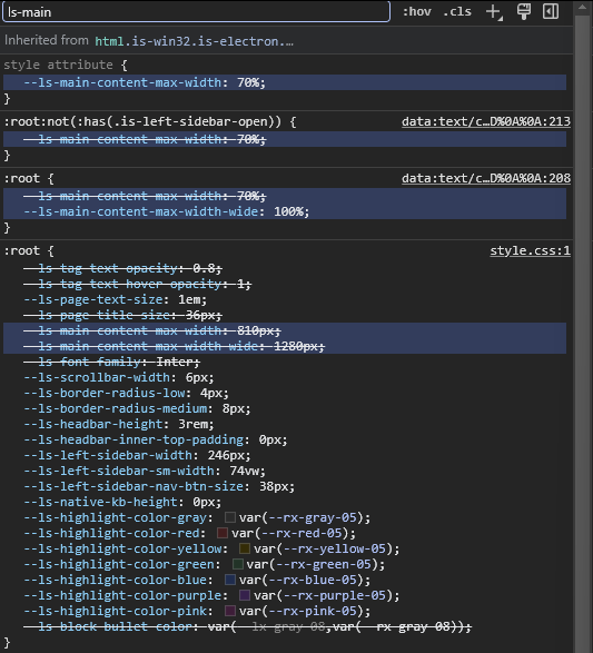