Is Logseq developing a multi-windowed mode?

曾记得 @tiensonqin ten 在 Discord 上说过有此计划, @anoffvu 也曾极力推荐。我觉得这个并无必要,下面是我一点设想,供您和其他开发同仁参考:

当我提到obsidian的并行多窗口挤压模式存在文本位置会不断被改变的严重问题时,有朋友则直接指出并行多窗口挤压模式不好,而偏爱浏览器的多标签窗口独占模式,我的基本想法如下:

  1. 并行窗口有无必要?对于笔记软件当然有必要。当整理第一层次/阶段的a笔记时,我们需要方便地同时看到或编辑第二层次/阶段的b笔记。
  2. 挤压模式好不好?挤压模式是并行窗口的必然结果,所以既然接受并行窗口,就没有好不好的问题,但是,如果处理不好文本位置,就会变成一个极大的麻烦,使得并行窗口这个优点变成弱点。
  3. 如果优化文本位置问题,并行多窗口挤压模式好吗?可以想见,即使改善了文本位置的问题,挤压式仍然不那么令人满意,这是该模式固有的问题。有理由主张,任何笔记的窗口都最好不要被在横向挤压,而可以在纵向限制显示长度。
  4. 并行多窗口的逻辑是不是有什么问题?并行多窗口的逻辑是,所有的笔记对于当前的编辑和阅读者来说都是地位平等的,于是即使一个窗口被固定,也只是避免被其他多开窗口取代,但无法避免被挤压空间(横向挤压实际等于被缩放窗口)。
  5. 我们的笔记编辑和阅读执行的是并行逻辑吗?不是。在同一时刻阅读和编辑笔记时,一般而言,有“编辑区-参照区”、“主要文献阅读区-其他文献参照区”等这样的“主要-辅助”结构。这个结构有两个要点:1.它的层次没那么多,不是像并行多窗口那样平等对待n多窗口;2.它区分主要和次要两个大区域,并且在在两个大区域(特别是次要大区域)内以上下挤压而非左右挤压的方式多开窗口,并且可以将这些窗口内的笔记在主次区域切换。可以看到,这其实是 RR 式双栏多窗口非挤压式的设计原则。
  6. 双栏多窗口模式有什么特点?最大的特点就是保证了主次大区域的空间的稳定,其次是保证在大区域内打开的小窗口不被左右挤压,而左右挤压的问题就在于会改变文本位置,即使这个问题经过优化,也不如上下挤压那样来的好。
  7. 总结:(1)并行多窗口挤压模式一定有其特别的好处,但处理不好就会造成极大的麻烦;因此,既然这是ob的特色,就把这个特色做好,不要把这个特色变成负担。(2)一般而言,我们的笔记活动需要的是简单的主次窗口区域,而不是对n多的笔记窗口都平等对待的并行窗口,当然肯定不要多标签窗口独占这样的陈旧模式。

I remember @tiensonqin ten saying this on Discord and @anoffvu highly recommending it. I don’t think this is necessary, but here are a few ideas for you and your fellow developers:

When I mentioned the serious problem with Obsidian’s parallel multi-window extrusion mode where text placement is constantly changing, and a friend pointed out that parallel multi-window extrusion mode is bad and prefers the browser’s multi-tabbed window exclusive mode, my basic idea is as follows:

  1. Is a parallel window necessary? It is certainly necessary for note-taking software. When organizing the A notes of the first level/stage, we need to easily see or edit the B notes of the second level/stage at the same time.
  2. Is the extrusion mode good? Extrusion mode is a natural consequence of parallel windows, so there is no problem with accepting parallel windows, but if text placement is not handled well, it can become a huge inconvenience, turning the advantage of parallel windows into a weakness.
  3. If we optimize the text location problem, is the parallel multi-window extrusion mode good? As we can imagine, even with improved text placement, extrusion mode is still less than satisfactory, which is an inherent problem with this pattern. It is reasonable to argue that the window of any note should not be squeezed in the landscape, but should be limited in the portrait.
  4. Is there a problem with parallel multi-window logic? The logic of parallel multi-windows is that all notes are equal to the current editor and the reader, so even if a window is fixed, it can only avoid being replaced by other multi-open windows, but it cannot avoid being squeezed (horizontal squeezing is actually the same thing as a scaled window).
  5. Do our note editing and reading perform parallel logic? It isn’t. In general, when reading and editing notes at the same time, there are “major-auxiliary” structures such as “editing area - reference area”, “main literature reading area - other literature reference area” and so on. This structure has two main points: (1). It does not have so many layers and does not treat n multiple Windows equally like parallel multiple Windows; (2). It distinguishes two large areas, the main area and the secondary area. In two large areas (especially the secondary area), more windows are opened by squeezing above and below instead of squeezing left and right, and the notes in these windows can be switched between the primary and secondary areas. As we can see, this is actually the design principle of RR type double column multi-window non-extrusion type.
  6. What are the characteristics of the two-column multi-window mode? The biggest characteristic is to ensure the stability of the space of the primary and secondary large areas, and the second is to ensure that the small window opened in the large area is not squeezed left and right, and the problem of left and right squeezing is that it will change the text position, even if the problem is optimized, it is not as good as the upper and lower squeezing.
  7. Summary : I have emphasized above that (1) the advantages and disadvantages of the primary and secondary binary structure and the parallel N-element structure for note-taking, but not for everything; (2) I do not deny the advantages of the parallel N-element structure, but it may be a disadvantage if it is not handled well and the basic functions are not well played when choosing this mode. Taking notes is a very focused and slow thing, not a massive, quick window opening or a K-chart.(1) Parallel multi-window extrusion mode certainly has its special benefits, but it can cause great trouble if handled poorly. (2) Generally speaking, we need a simple primary and secondary window area for note-taking activities, rather than a parallel window that treats more than n notes’ window equally. Of course, we certainly don’t want to monopolize such an old pattern of multiple tabbed windows.
1 Like

I’m not 100% clear on the meaning of parallel vs extrusion mode, but wanted to say:

  1. many thanks for translating your post so non-Chinese readers can participate!
  2. if the issue is whether people should be able to see and edit two notes side-by-side, rather than switching between windows using tabs, then I strongly agree that side-by-side note editing is essential for a notetaking app.
3 Likes

Agree, being able to view one note while actively editing another is good.
Better, would be able to view and/or edit both notes at the same time, side by side.
My ideal would be able to view/edit and navigate in one window pane, and do the same in the other pane.

Thank you for your attention. If you’re not sure, try Obsidian.

I am not emphasizing the opposition between parallel and extruded modes; in fact, in my argument, they are in a class of modes.

In fact, I have emphasized above that (1) the advantages and disadvantages of the primary and secondary binary structure and the parallel N-element structure for note-taking, but not for everything; (2) I do not deny the advantages of the parallel N-element structure, but it may be a disadvantage if it is not handled well and the basic functions are not well played when choosing this mode. Taking notes is a very focused and slow thing, not a massive, quick window opening or a K-chart.


谢谢您的关注。如果你不太清楚的话,可以试用obsidian。

我强调的不是并行的和挤压式的两种模式之间的对立,事实上,在我的论述里,它们是一类模式中的。以上我强调了(1)主次二元结构和并行n元结构对于记笔记这件事而不是所有事的优劣;(2)我不否认并行n元结构的优势,只是如果处理不好,如果选择这一模式还不搞好基本的功能发挥,反倒可能会成劣势。记笔记都是很专注和慢慢来的事情,不是大规模迅速多开窗口或者像看K线图那样。

Thank you for your reply. I’m not quite sure what you mean, are you saying that Logseq has not implemented multi-panel functionality yet? Here are a few thoughts that may help us further our discussion.

  1. About multiple Windows. Logseq uses a two-column, multi-window mode, with one column primary and one secondary. To the left is the main edit area, and to the right is the secondary edit/reference area.We can open multiple windows in the right sidebar by “Shift + Click” (including when searching for links to open). It doesn’t have to be Word (and there’s actually little evidence that it’s efficient) if multiple windows are just to open lots of pages at once. If we don’t want to see or no longer need some windows open in the right sidebar, you can either collapse it or close it directly. These Windows should not bother you.
  2. About multiple tags. The “Contents” and “Recent” in the right sidebar of Logseq are just multiple tabs. We can also keep a directory of frequently used notes or maps in the “Contents”. This is already compatible with the multi-tab functionality of traditional note-taking software such as Evernote, OneNote, etc. If we don’t add “shift”, any links will open in the traditional multi-tab window exclusive mode. As for browser-based multi-tabs, it’s the same multi-tab mode as traditional note-taking apps like Evernote and OneNote, which are multi-tab window exclusive. In Logseq, we can open any link in multiple windows in the right sidebar with “shift+ click”, or in the left side with “click”, which opens in multi-tab window exclusive mode.
  3. This is what editors do.” I have proved that the two-column multi-window mode is not without multi-window functionality, nor is it without multi-tab functionality. However, I would like to emphasize that note taking is not a universal editor, and there is more than one way to implement multi-window and multi-tab. It is ethical to consider what is the best window mode or logic for taking notes.
  4. This is what browsers do.” The notes app is NOT a browser. They have specific usage scenarios, or requirements. We rarely compare the contents of two pages carefully for long periods of time, or that’s not the norm, so multi-tab exclusivity is best for web browsing. However, it is normal for us to compare and edit two stages or levels of notes when taking notes, so a two-column, multi-window non-exclusive mode would be best. Of course, it is compatible with multi-tab window exclusive mode.

谢谢您的回复。我不太明白您的意思,您是说, Logseq 还没有实现多面板的功能吗?以下是我的一点想法,或许有助于我们的进一步讨论。

  1. 关于多窗口。Logseq 采取的是有主次之分的双栏多窗口模式。左侧是主编辑区,右侧是辅编辑/参照区,通过“shift+点击”(包括在搜索打开链接时)的方式,你可以在右边栏打开多窗口。如果多窗口只是为了想要同时打开许多页面,那么没有必须是 Word 式的(实际上也没有什么证据显示它很高效)。如果不想看到或不再需要在右侧栏打开的某些窗口,你可以折叠它或者直接关闭它,这些窗口应该不会对你造成困扰。
  2. 关于多标签。Logseq 右边栏的“目录”和“最近”其实就是多标签。当然你也可以维护一个常用的笔记目录或地图放在“目录”里。这本来就兼容传统笔记软件——诸如印象笔记、OneNote等——的多标签功能,如果你不加上“shift”,任何的链接都是以传统多标签的窗口独占方式打开。至于说到浏览器式的多标签,它与印象笔记、OneNote等传统笔记应用的多标签模式是一样的,它们都是多标签窗口独占模式。在Logseq中,通过“shift+点击”的方式,你可以将任何链接以多窗口的方式在右边栏打开,也可以直接的“点击”方式在左侧打开,而后者打开的方式就是多标签的窗口独占模式。
  3. 关于“这是编辑器都有的功能”的说法。我已经证明, 双栏多窗口模式模式并不是没有多窗口功能,也不是没有多标签功能。但是,我想强调的是,笔记应用不是 通用编辑器,多窗口和多标签也不只有一种实现方式,什么是对于做笔记这件事最好的窗口模式或逻辑,这是必须考虑道德。
  4. 关于“这是浏览器都有的功能”。笔记应用不是浏览器。它们有各自特殊的使用场景或者说需求。我们很少会长时间仔细对照两个网页的内容,或者说,这不是我们浏览网页的常态,所以多标签窗口独占模式对于浏览网页会是最佳的。然而,我们在记笔记时,将两个阶段或层次的笔记对照和编辑,却是常态,所以双栏多窗口非独占模式会是最佳的,当然,它也兼容多标签窗口独占模式。

text reflow issue

in OP’s post, I believe the ‘extrusion’ and ‘squeezing’ issues refer to text automatic reflowing (how the app treats text overflow). I might be wrong, but I think that’s the gist of 'extrusion 'in his post.
The issue with obsidian’s multi-pane + automatic text reflow : if you change the width of a pane/window, the text will reflow (line breaks position change), thus it’s easy to get lost. on the other hand, using a fixed width without reflow forces horizontal scroll if the pane is too small.
in obsi, this behavior is also present when you try to edit and view the same doc side by side.

my take :

structure vs free-flowing

In regard to the points above, I think free-flowing multi-panes (obsidian style) is not the best solution.
I like the structure imposed by the 2 vertical panes :

  • main content
  • sidebar content

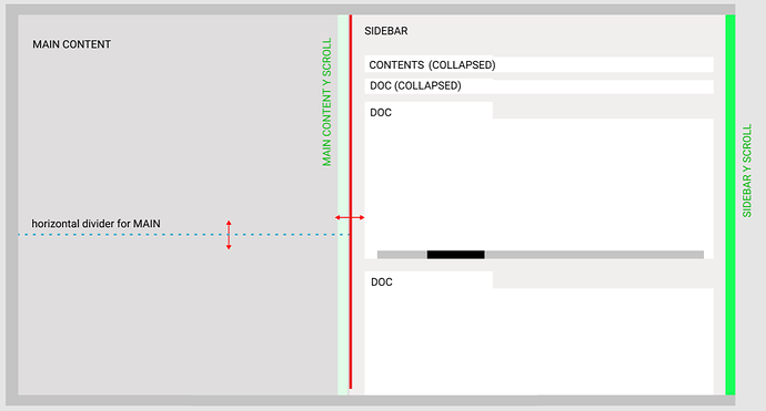
optionally, the sidebar could be resizable by dragging its edge : it would change the width of both pane, causing text reflow, unless we specify a fixed-width for text in the settings ?

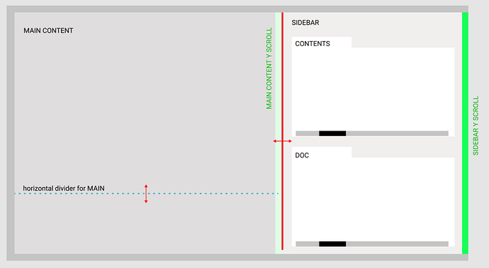
add a horizontal splitter

I would love an horizontal splitter for the main content : similar to text editors (vs code, word…) where you could split a long document in 2 sections to see the top bullets and the bottom bullets simultaneously… or alternatively load another document/list into the bottom divider.

sidebar : collapsible sections/tabs + dedicated scrollbar

Currently, the right sidebar can ‘stack’ multiple elements : contents, recents, graph view, docs, etc… I think this is a GREAT feature (similar to tiddlywikis story river view) : if you open multiple docs inside the sidebar, you get a scrollable history.
what can be done to enhance the curent sidebar :

  • restore the sidebar dedicated scrollbar to make full use of that scrollable ‘history’ of opened docs
  • treat titles as collapsible ‘tabs’ : this alleviates the need to scroll a lot to find past elements
  • make the sidebar draggable/Extensible (in width)
  • each section (doc) of the sidebar should have its own x-scrollbar

here’s some figma mockups to bring the discussion forward


4 Likes

Thank you for your great ideas! I couldn’t agree more.

You understand exactly what I mean about the squeeze-windowed mode. In fact, since this is Obsidian’s basic window display logic, it’s a shame that it does it so badly, every time a window is scaled or squeezed, its text position changes, and every time it’s different!

Most of the improvements to the sidebar you have proposed, in my opinion, have been implemented in Roam Research.

  1. Restore the sidebar dedicated scrollbar to make full use of that scrollable ‘history’ of opened docs. This is a question I raised with the developers as soon as it was changed. It seems that some developers don’t quite understand the purpose of the sidebar and think that the sidebar is just for table of contents. However, Logseq’s leader have promised to restore this feature.
  2. Treat titles as collapsible ‘tabs’ : this Angelica Angelica alleviates the need to scroll a lot to find past elements. Currently, on RR, pages that open in the sidebar don’t show Linked Reference by default unless you click on the number of the reference link. This reduces a lot of interference because a lot of times we just want to edit new notes in the sidebar from the main edit area, rather than delving into the new one in detail.
  3. Make the Sidebar Draggable /Extensible (in width). This is what Logseq’s leader promises. Let’s look forward to it!
  4. Each section (doc) of the sidebar should have its own x-scrollbar.This is useful for pages with a lot of code or formulas that are not easy to wrap, but these large number of scrollbars do create redundant elements, especially for plain text notes. Hopefully there will be a compromise solution.

谢谢您伟大的想法!我十分赞同。

你充分理解了我关于挤压式窗口模式所说的话的意思。事实上,既然这是 Obsidian 的基础窗口显示逻辑,却做得如此糟糕,是令人遗憾的,每一次窗口缩放或被挤压,其文本位置都会不重样对改变!

你所提出的对侧边栏的改进建议,在我看来大部分在 Roam Research 实现。

  1. “restore the sidebar dedicated scrollbar to make full use of that scrollable ‘history’ of opened docs”。这个问题我第一时间就向开发者提出。看起来,有的开发者不那么理解侧边栏的作用,他以为侧边栏只是单纯用来放目录的。不过, Logseq 的领导已经承诺恢复这个特色。 @tiensonqin
  2. “treat titles as collapsible ‘tabs’ : this alleviates the need to scroll a lot to find past elements”。目前,在 RR 上,在侧边栏打开的页面默认是不显示“linked reference”的除非你点击参考链接的数字,这就减少了许多干扰,因为许多时候,我们想要的只是对照主编辑区的笔记在侧边栏编辑新笔记,而不是细致研究后者。
  3. “make the sidebar draggable/Extensible (in width)”。这是 Logseq 的领导所承诺的。让我们一起期待!
  4. “each section (doc) of the sidebar should have its own x-scrollbar”,这对于有大量代码或公式而不利于换行显示的页面是有用的,但这些大量的scrollbar确实也会造成冗余元素,特别是对于普通文本笔记来说。希望有个折中的解决方案。

thanks for the details on Roam! I’m mostly on the same page as you. I had the same issues with obsidian’s panes, so it was easy to understand your post, even if ‘extrusion’ is a bit confusing (in english, extrusion usually refers to a modeling or construction process, where you push/pull material to create a shape)

  • regarding point 1) : restore the sidebar scrollbar. If ou need the scrollbar now, you can use this css :
/* == adds a scrollbar for the right-sidebar ==*/

.cp__right-sidebar-inner::-webkit-scrollbar {
  background-color: #000;
}
.cp__right-sidebar-inner::-webkit-scrollbar-thumb {
  background-color: #17171c;
}
.cp__right-sidebar-inner::-webkit-scrollbar-thumb:hover {
  background-color: #2c3235;
}
.cp__right-sidebar-inner {  
    overflow-y: auto;
    overflow-x: hidden;
    height: 102vh !important;
    padding-right:10px;
    padding-top: 24px;
    margin-bottom: 24px;    
    margin-right:0px;
    scrollbar-color:var(--ls-scrollbar-thumb-color);
    scrollbar-width:auto;   
}

this adds a second scrollbar that will scroll only the sidebar, it’s not pretty since you will have 2 scrollbars close to each other, but it works.

  • point 4): I agree that too many scrollbars is waste of space (and it looks ugly) : maybe it is possible to activate the scrollbar only for selected sections ? a single x-scrollbar for all sections of the sidebar is a bit limiting imo, I prefer to be able to adjust each sections individually (because I would prefer to keep the ‘contents’ in view, and simultaneously scroll inside long code blocks in the right sidebar
1 Like

Thank you, I did not realise/know that I could edit in both primary and secondary pane :100: :+1:
AND I can edit and navigate in both!
it gets better and better as I learn more :slight_smile:

Edit: using SHIFT-CLICK to open links in the secondary pane and navigate in secondary pane

1 Like

Sorry for my poor English and glad for your kindness.

I’ve tried your code and it doesn’t work. The code in my custom.css is as follows:

body {
    font-size: 13px;
    font-weight: 400;
    letter-spacing: 0;
    line-height: 1.6;
    text-transform: none;
    color: #182026;
   font-family: Georgia,微软雅黑!important;
}


/* == adds a scrollbar for the right-sidebar ==*/

.cp__right-sidebar-inner::-webkit-scrollbar {
  background-color: #000;
}
.cp__right-sidebar-inner::-webkit-scrollbar-thumb {
  background-color: #17171c;
}
.cp__right-sidebar-inner::-webkit-scrollbar-thumb:hover {
  background-color: #2c3235;
}

.cp__right-sidebar-inner {  
    overflow-y: auto;
    overflow-x: hidden;
    height: 102vh !important;
    padding-right:10px;
    padding-top: 24px;
    margin-bottom: 24px;    
    margin-right:0px;
    scrollbar-color:var(--ls-scrollbar-thumb-color);
    scrollbar-width:auto;   
}

I think I need to explain to you the main problem with point 1.

The problem is NOT that the left and right sidebar should each have a scroll bar, BUT that, when the cursor hovers over the right sidebar, the left sidebar page can scroll (as you scroll to the end of the right sidebar page, the left sidebar page continues to scroll!). It was almost unbearable. Do you have a solution to this problem?

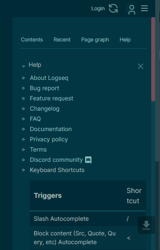
weird that it doesn’t work… it should add a grey scrollbar in the sidebar. (in my snapshot, it’s the PINK one)


with this scrollbar, when you are hovering on the right sidebar, the scroll should stop at the end (the right sidebar should not scroll), unless you hover back to the left pane again and come back to the right (in that case, the ‘endless scroll’ will happen, because it thinks you are still in the left side)

what if you try this instead ? (remove my previous code)

.cp__right-sidebar-inner {  
    overflow-y: auto;
    overflow-x: hidden;
    height: 100% !important;
    padding-right:10px;
    padding-top: 24px;
    margin-bottom: 24px;    
    margin-right:0px;
    scrollbar-width:auto;   
}

Thank you very much! I tried the new code and found that there was indeed an extra scroll bar in the right sidebar, but:

  1. The old scrolling behavior is still the same: hover over the right sidebar, scroll to the end of the right page, then continue scroll to the left page !
  2. Can we have a scroll bar like RR, where the left panel has a scroll bar to its right and the right panel has a scroll bar to its right, and they are independent of each other:

1 Like
  1. 并行窗口有无必要?对于笔记软件当然有必要。当整理第一层次/阶段的a笔记时,我们需要方便地同时看到或编辑第二层次/阶段的b笔记。

There are many modes for me when editing my notes. Currently, I am in a web browser, which is the side-by-side mode. In this mode, I am replying to your post while editing the content. Both of them are important.

However, in this mode, I do not need to go to my reference data base searching for citations. It’s more like creating my own thoughts. And I find it is an invaluable procedure.

However, there are some other cases where I need to go to my previous notes/thoughts. In such scenarios, a multiply window is very important to avoid context switching between the contexture environment. In my case, I need to go through a giant code data base, at the mean time, I need to think about the definition of fundamental ideas which requires me to constantly go back to books containing hundreds of pages.

  1. 挤压模式好不好?挤压模式是并行窗口的必然结果,所以既然接受并行窗口,就没有好不好的问题,但是,如果处理不好文本位置,就会变成一个极大的麻烦,使得并行窗口这个优点变成弱点。

I do not understand “挤压模式”. In my case, the user can just jot down any ideas into the editor and let the editor display the content. This can be done nicely using visual-line mode, which just creating a single-line paragraph into multiply-lines. However, I do see the point when the display is not wide enough to create such a visual lines mode.

  1. 如果优化文本位置问题,并行多窗口挤压模式好吗?可以想见,即使改善了文本位置的问题,挤压式仍然不那么令人满意,这是该模式固有的问题。有理由主张,任何笔记的窗口都最好不要被在横向挤压,而可以在纵向限制显示长度。

  2. 并行多窗口的逻辑是不是有什么问题?并行多窗口的逻辑是,所有的笔记对于当前的编辑和阅读者来说都是地位平等的,于是即使一个窗口被固定,也只是避免被其他多开窗口取代,但无法避免被挤压空间(横向挤压实际等于被缩放窗口)。

In my opinion, there’s no parallel process when you write things. I cannot write while reading another different context. The mind is so focused and it is only able to do one thing at one time shot. The parallel window is not a parallel process for me. When I need to slow down, or when I feel I need to scan more contexture in the reference, I just need to shift my eye bow a tiny bit to shift the working mode from writing a piece of information to absorb a bit of information. The core value of the multiply window is to reduce such friction when you switch the mind in between the different modes.

  1. 我们的笔记编辑和阅读执行的是并行逻辑吗?不是。在同一时刻阅读和编辑笔记时,一般而言,有“编辑区-参照区”、“主要文献阅读区-其他文献参照区”等这样的“主要-辅助”结构。这个结构有两个要点:

Sometimes, searching for the right information is so intense that there is no need to leave the space to write things. In this mode, all the resource is distributing to the searching function within my editor. The point is that I have a special key-binding that will always guide me to the document that I was working on.

My editor also provides such functionality to resort to different kinds of window layout and it has a bookmark feature to let the computer remember the pre-defined context. This is a great stress reduction thing that my editor provides to me. It free any stress from forgetting where I am working on, which encourages me to do more searching thus creating more ideas.

  1. 总结:(1)并行多窗口挤压模式一定有其特别的好处,但处理不好就会造成极大的麻烦;因此,既然这是ob的特色,就把这个特色做好,不要把这个特色变成负担。(2)一般而言,我们的笔记活动需要的是简单的主次窗口区域,而不是对n多的笔记窗口都平等对待的并行窗口,当然肯定不要多标签窗口独占这样的陈旧模式。

I am still happy with my current editor setup. I do not know how much effort Logseq can provide to its user. But it is always a delight to see other people’s points of view. Thanks for sharing this.

Thanks for your sharing, very insightful thoughts! I want to clarify my points about multi-windows and multi-tabs:

  1. Logseq is a note-taking app, not a general-purpose editor, and we can’t expect it to do all the important things, even some are closely related to note-taking. So it had to be designed in moderation, which meant that some features, even those that were important, might be sacrificed.
  2. If you don’t know what I mean by “squeeze mode,” maybe it’s because you haven’t tried Obsidian. In fact, I think the window mode is more suitable for your needs.
  3. Logseq does not have multiple windows and multiple tags? It isn’t. It differs from the n-bit parallel window mode in that it provides a primary and secondary area, where you can open your multiple windows and any tabs in the primary area.
  4. I don’t understand exactly your last comment that you love your own editor mode since you didn’t show us it, I guess it’s an editor similar to vscode. I admit it’s fine, and I admit it in the post, except that I think, first of all, it’s not the best window mode for note-taking (just not the best rather than the worst), and second of all, thus we need to overcome the problem of window compression if adopt it. However, I found that the two-column multi-window mode provides both multiple windows and multiple labels, but does not have the problem of window compression resulting in constantly changing text position.

Finally, I would like to say that with deep thinking people like you, we can really explore more possibilities.


  1. About multiple Windows. Logseq uses a two-column, multi-window mode, with one column primary and one secondary. To the left is the main edit area, And to the right is the secondary edit/reference area.We can open multiple Windows in the right sidebar by “Shift + Click” (including when searching for links to open). It doesn’t have to be Word (and) There’s actually little evidence that it’s efficient) if multiple Windows are just to open lots of pages at once. If we don’t want to see or no longer need some Windows open in the right sidebar, you can either collapse it or close it directly. These Windows should not bother you.
    2.About multiple tags. The “Contents” and “Recent” in The right sidebar of Logseq are just multiple tabs. We can also keep a directory of frequently used notes or maps in the “Contents” . It’s compatible with the multi-tab functionality of traditional note-taking software such as Evernote, OneNote, etc. If we don’t add “shift” functionality, Any links will open in the traditional multi-tab window exclusive mode. As for browser-based multi-tabs, it’s the same multi-tab mode As traditional note-taking apps like Evernote and OneNote, Which are multi-tab window exclusive. In Logseq, we can open any link In multiple Windows In the right sidebar with “shift+ click”, or In the left side with “click”, which opens in multi-tab window exclusive mode.
  2. This is what editors do.” I have nothing more precious that the two-column multi-window mode is not without multi-window functionality, nor is it without multi-tab functionality. I would like to emphasize that note taking is not a universal editor, and there is more than one way to implement multi-window and multi-tab. It is ethical to consider what is the best window mode or logic for taking notes.
  3. This is what are built over time.” The Notes app is NOT a browser. They have specific usage scenarios, or requirements. However, it is normal for us to compare and edit two stages or levels of notes when taking notes, so that a two-column library is customizable and customizable. multi-window non-exclusive mode would be best. Of course, it is compatible with multi-tab window exclusive mode.

I like the left sidebar above, similar to Obsidian.md. It would be helpful for me to have a few notes pinned to the sidebar for quick reference. I understand Roam Research has something similar as well.

Logseq has just one sidebar, Roam has a sidebar on the left for favorites / “contents” and a few menu items, and a resizeable side panel on the right for providing the ability to do side-by-side editing.

I like this setup and think Logseq should consider separating (1) a small panel for favorites/contents and menu items and (2) a collapsible side panel for use when users want to do side-by-side editing

4 Likes

Multi window available in the latest update of Logseq, so have closed this FR. Thanks for the post