Hey there folks! I’m a relatively new Logseq user, but I figured I’d toss my hat in the ring.
I’m a front-end dev by trade, so graphic work isn’t necessarily my forté, but I couldn’t pass up an opportunity to contribute back to what seems to be an incredible community of great people.
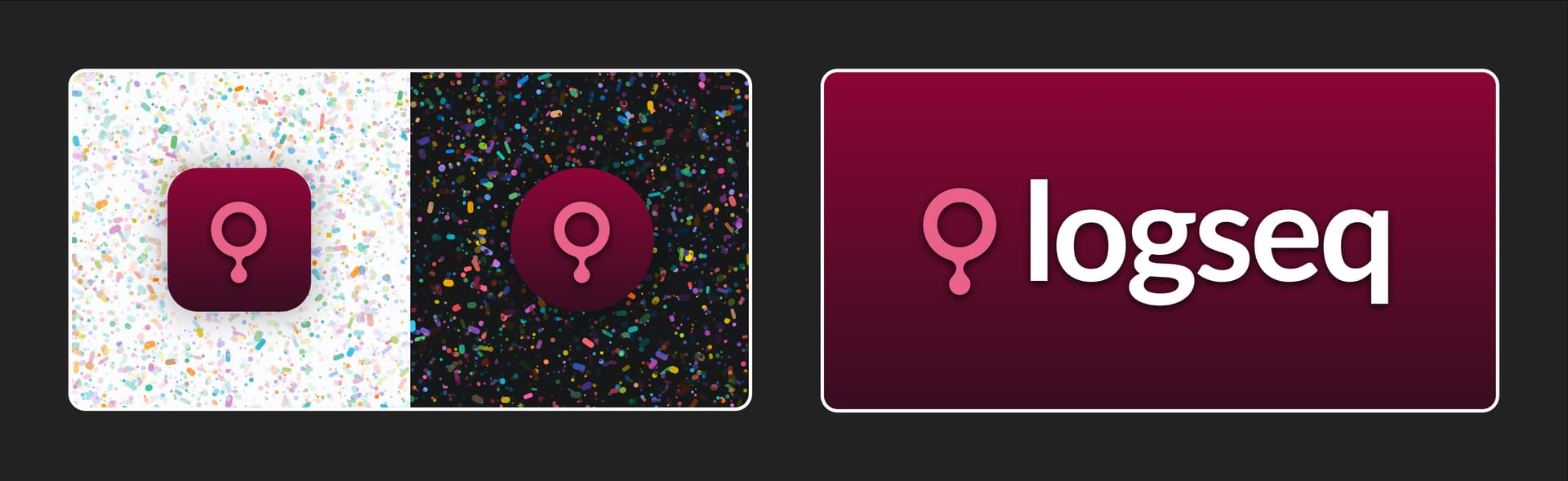
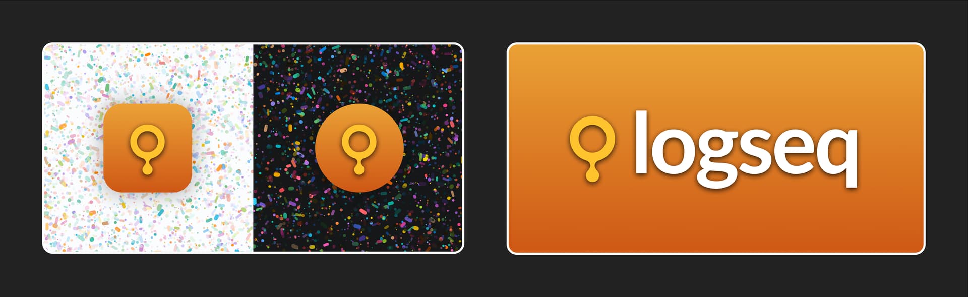
Iconography needs to be simplistic, memorable, and pack a whole lot of meaning into a concise, multiplatform package. Logseq’s values encompass a wide variety of really important perspectives, and I wanted to create something representative of the key values that attracted me to the community.
The three primary components of my concept are as follows:
- The magnifying glass: representing Logseq’s robust data management and search
- The drip: representing how ideas flow from each other
- The keyhole: representing a secure, safe place for the information in your life
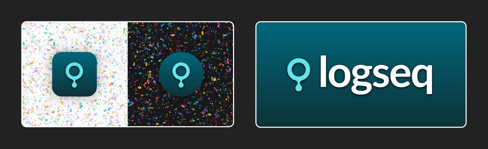
Reduced version
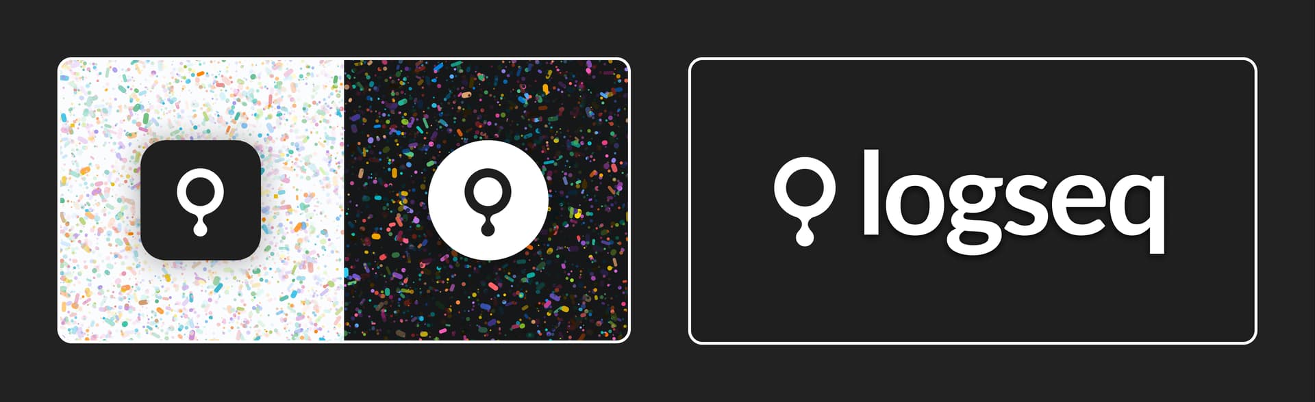
Alternate colors
Congrats on so many great submissions! I’m looking forward to voting for my favourites.