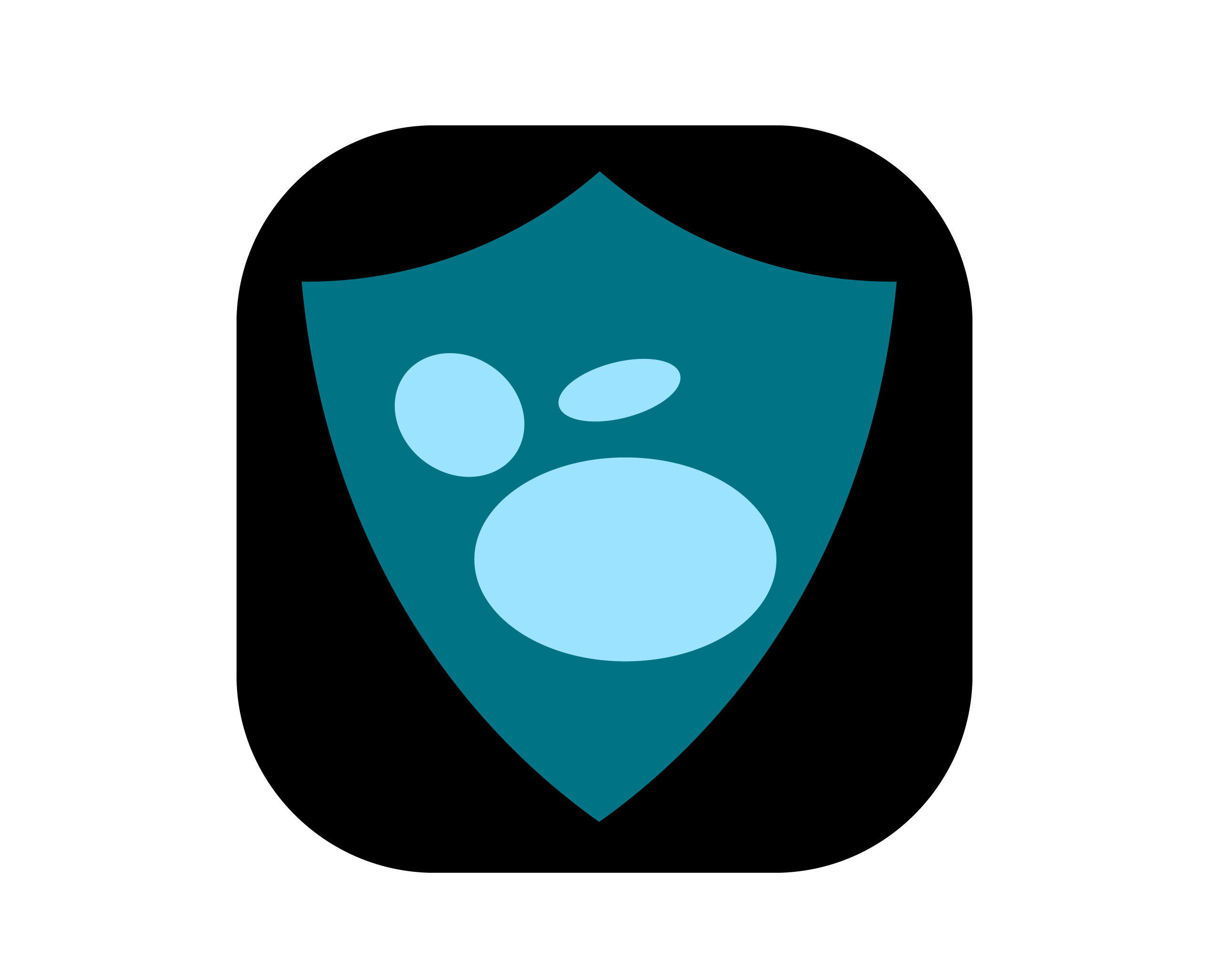
The inspiration for my design concept is from Loseq’s value that’s radiates trust and security on data in its custody. The shield element symbolizes protection.
Twitter handle - @jodakh440
The inspiration for my design concept is from Loseq’s value that’s radiates trust and security on data in its custody. The shield element symbolizes protection.
Twitter handle - @jodakh440
This is so cool! I really like the rings idea, and the combination of the organic and tecnological
This is amazing, so well done for such a simple concept, and I love the breadown of all the pieces ![]()
I love this, the lambda is pretty core to our business as a clojure org ![]() if that was just a coincidence, then even better!
if that was just a coincidence, then even better!
The worst thing about this submission is I could never just choose one ![]() these are all great, and I love the backstory behind them!
these are all great, and I love the backstory behind them!
Don’t be so hard on yourself, I would have guessed this was done by a professional! I think it’s really cool, a completely different vibe than most submissions, but I love that.
It’s a really cool idea, and I think it’s executed tastefully. Thanks for submitting it!!
I. freaking. love. this.
This is such a nice balance of simple shapes and deviated expectations, well done
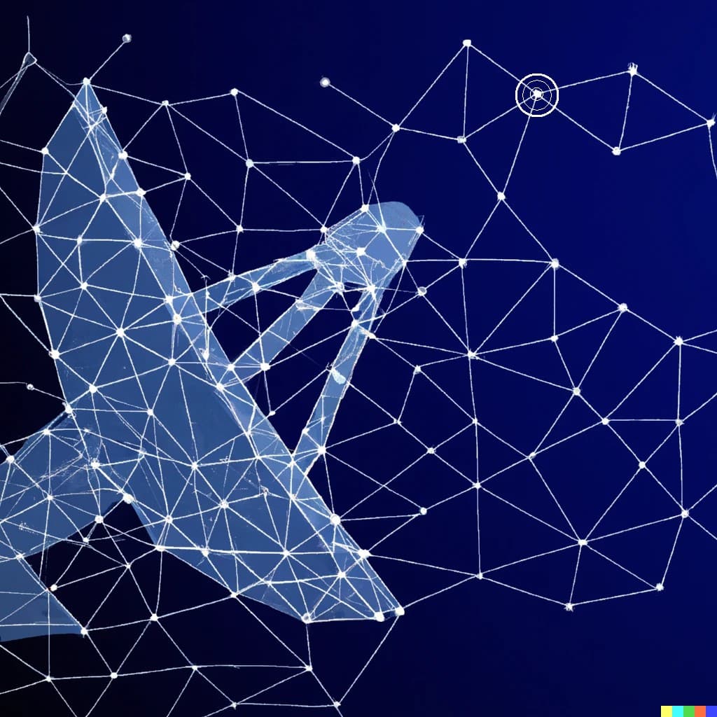
Dish antenna/telescope made of the very nodes/stars that give the structure and focus to identify what is needed.
looks like there is an issue with the images. Please edit the post and re-upload the images.
I’m sorry but I can assure you that antennas make many people uncomfortable ![]()
Hello everyone,
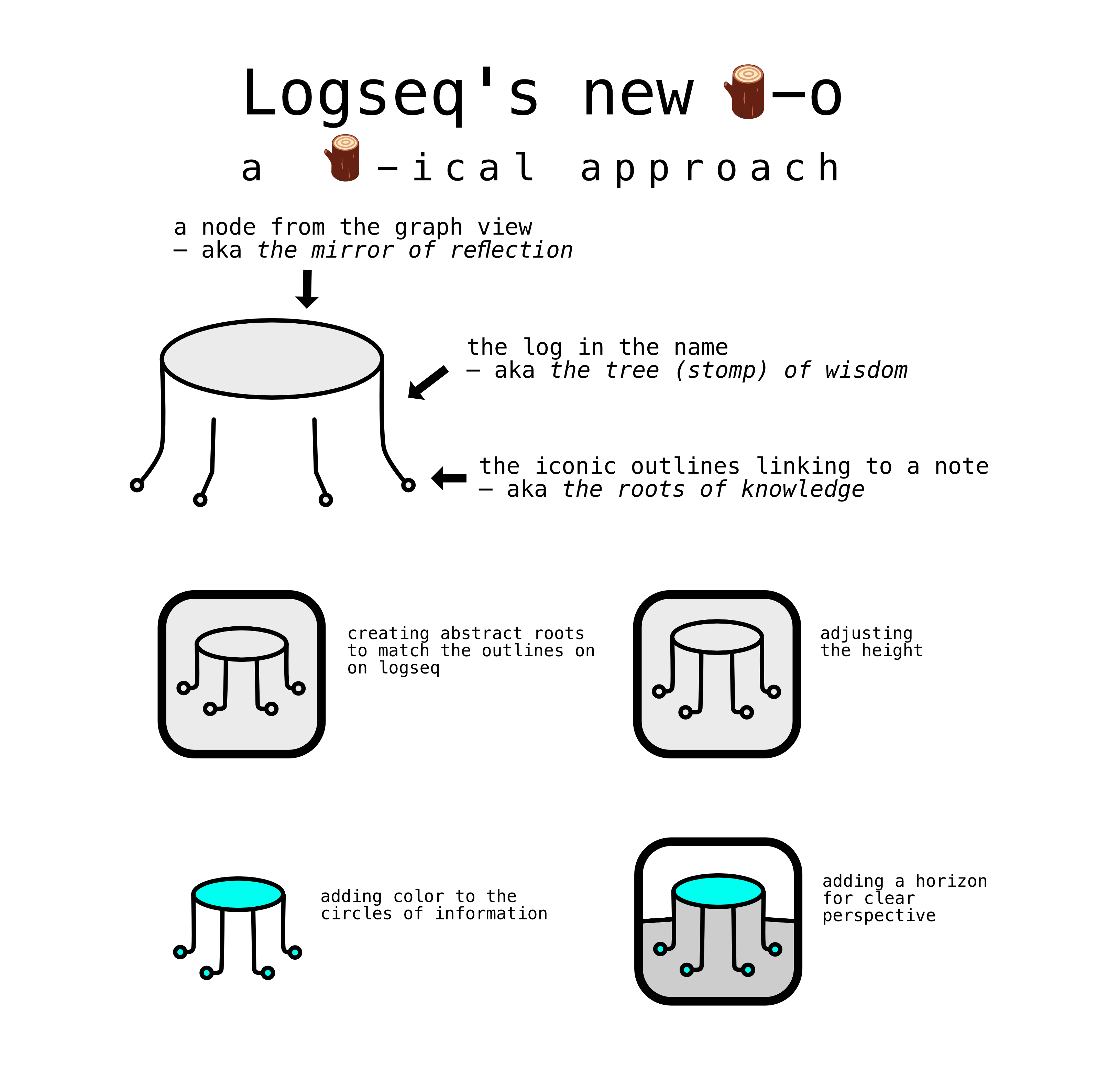
for my submission, I reviewed the follow up suggestions made by the team and tried to maintain a balance between creating an abstract logo and incorporating a literal LOG🪵-reference. (+ with the bonus of being easily adaptable to various color schemes, gradients, shadows)
The primary objective was to design a logo that reflects the various levels of knowledge management offered by Logseq:
The outlines as the smallest entities (micro)
The node as the hub in which the outlines converge (meso)
The graph-view as a perspective on a larger world/horizon/ecosystem in which the nodes coexist (macro)
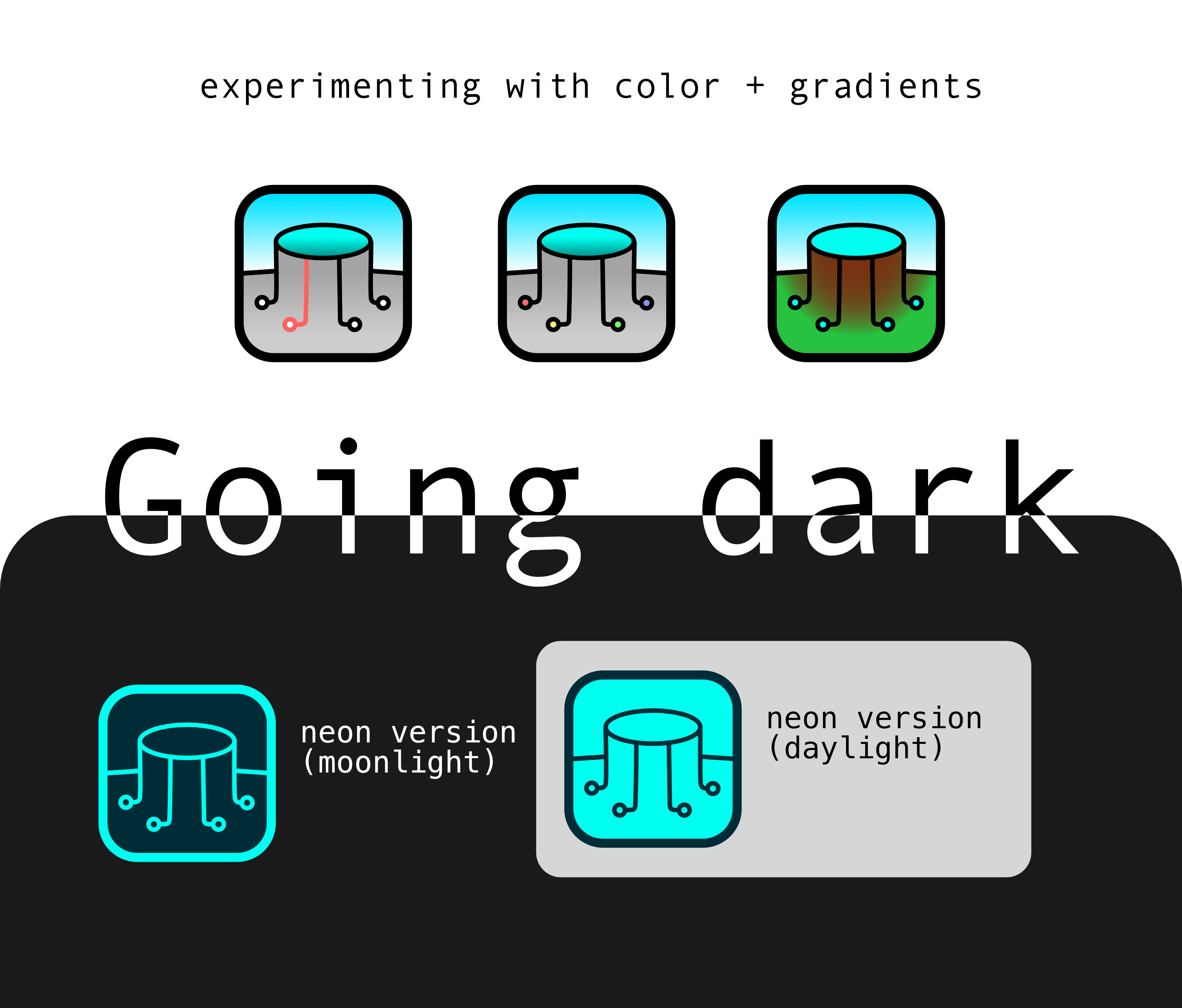
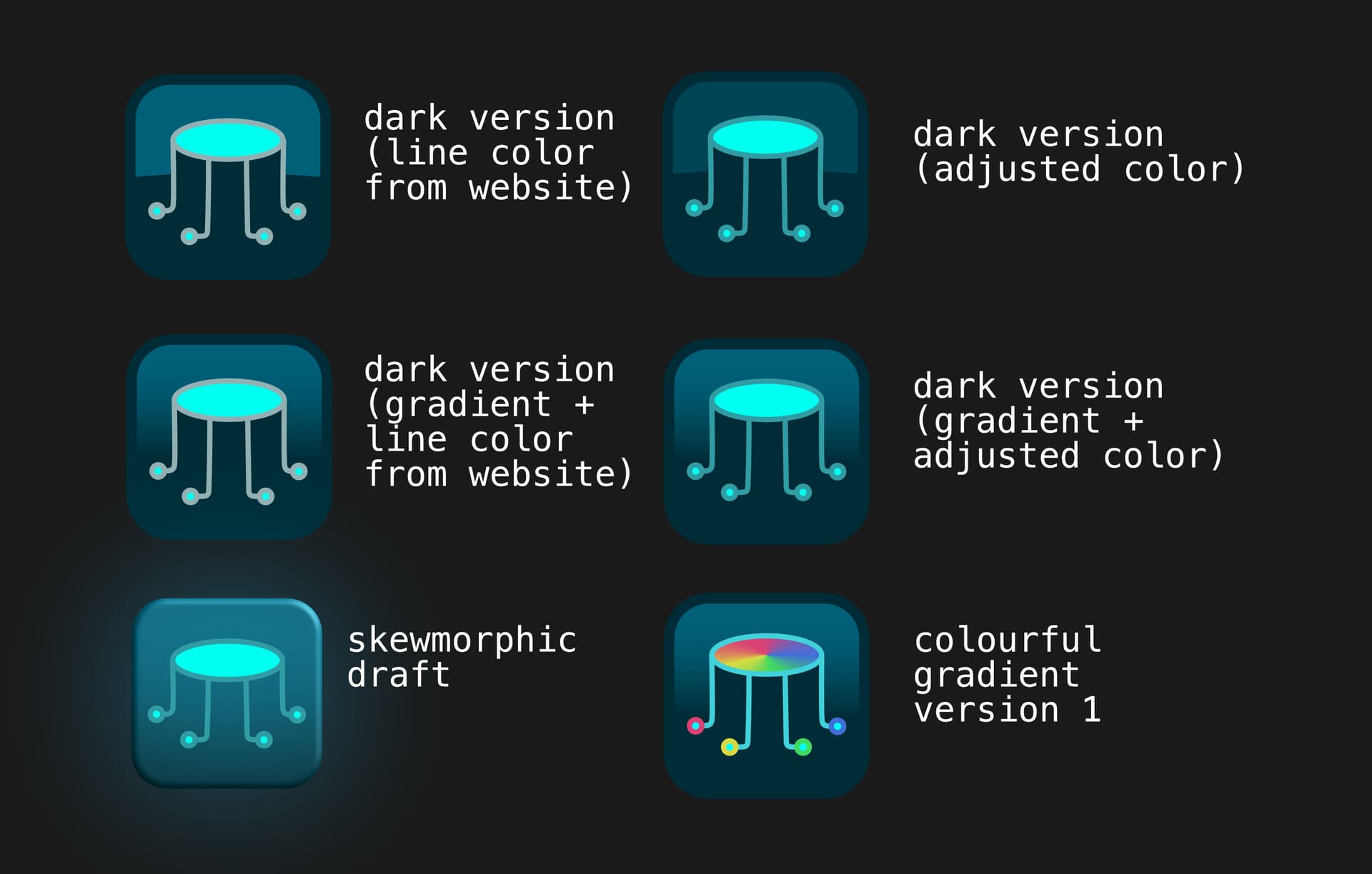
So here it is! Sorry, I had so much fun with the colour schemes that I ended up making so many options. It is basically the same logo though ![]() I hope you like it.
I hope you like it.
This is a neuron, symbolizing connectivity and creativity, with echos of the current logo.
FWIW here’s another version: 
I want to add another entry to the already great suggestions. Great Idea for a Contest like this - and certainly many great contenders.
My thougts behind my try are:
With this logo, logseq wouldn´t just be another second brain app - it would be THE second brain app.
Hope you like my thinking. I am still not sure for where my votes is going, so many great ones…
Hello Everybody,
Day by day, this competition is becoming more exciting and interesting to see the creative designers all over the globe. Everybody’s putting their best effort into designing Logseq’s new identity.
As Ben well said, the Logseq community internally discusses the emoji of the log they usually use to refer to the Logseq on social media platforms.
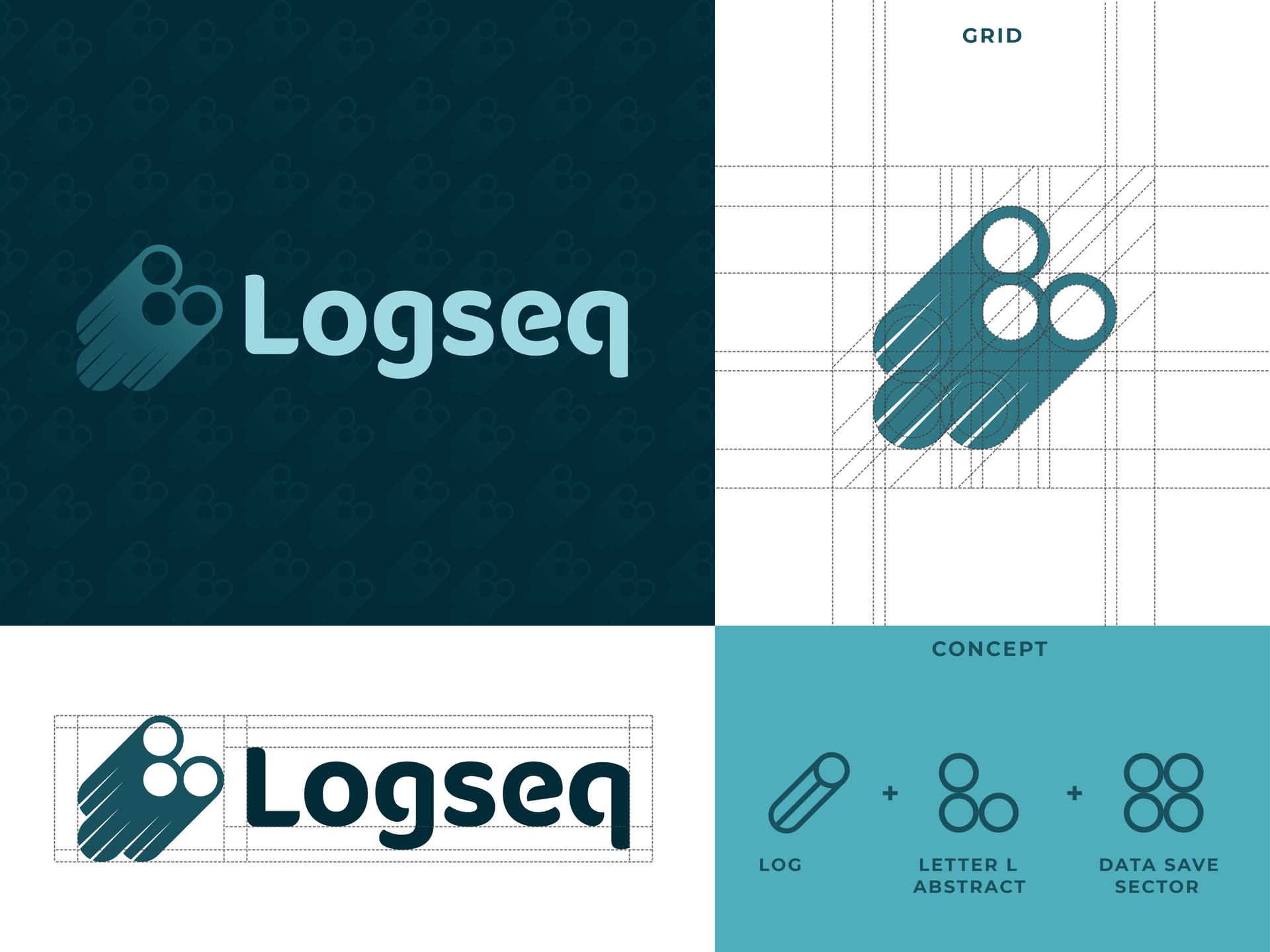
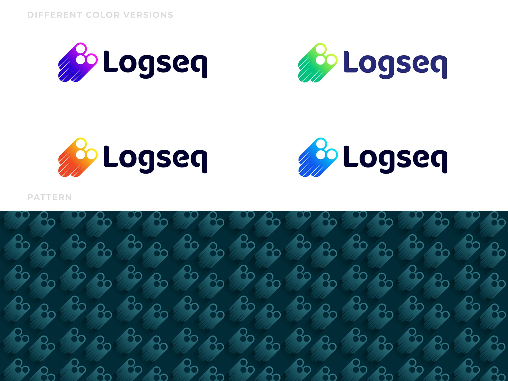
So here I tried to explore the log idea to design a meaningful, bold icon, though it is difficult but not impossible. I used three logs to make the abstract shape of the initial ‘L," which also gives a touch of the Logseq working process, which is saving data in different sectors.
I will be thrilled if the logseq community and internal staff make some comments about my effort. I hope everybody will appreciate my creation and the thoughts behind the design. Thank you
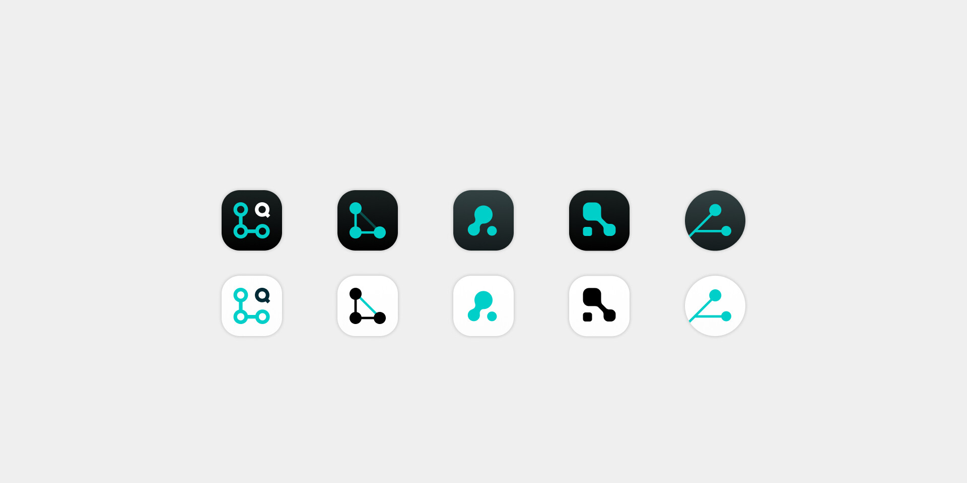
Hi everyone, I’m posting a comment here because I received an invitation from Jakob Tengler on My Figma work. It’s nice to see that someone has quoted my work. As a long-time Logseq user, I created this logo in January 2021, and here I would like to add and share some personal opinions:
For me, the two impressive elements of Logseq that are are:
The former is represented by the famous OBSIDIAN and and the niche Anytype, while the latter is represented by RoamResearch, Remnote and Tana.However, only Logseq and Siyuan Note currently combine both features (although Siyuan Note’s file format is not Markdown).
In my opinion (2021 to date), the reason why Logseq has become the main note-taking tool for users in the PKM application market is mainly due to its ability to combine both these features effectively.
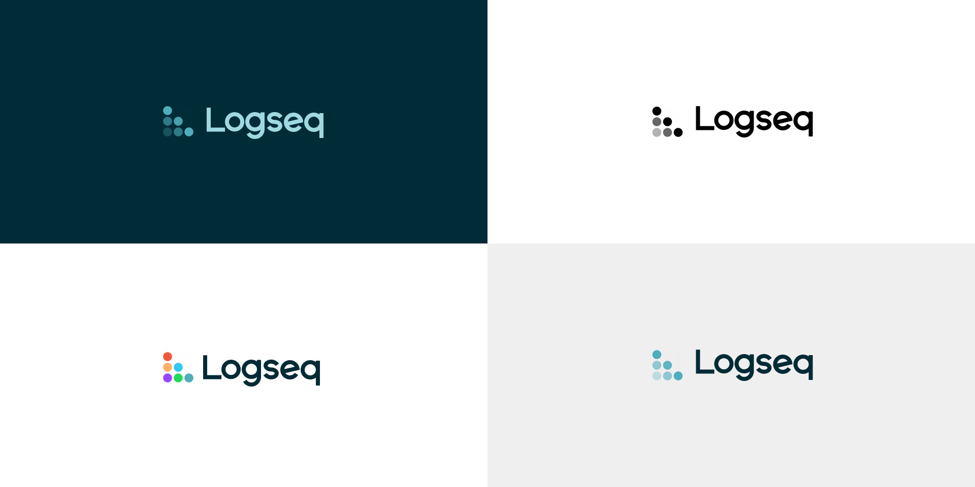
Inspired by existing application icons and names, the word Log was extracted from “Logseq” as the core figurative element, and the circle was extracted from the paw,summarized as a minimalist dot, Then, it was repeated and expanded into multiple dots, arranged and combined into the shape of the initial letter “L” of Logseq as a metaphor for logs and sequences.
The core features of this logo are:
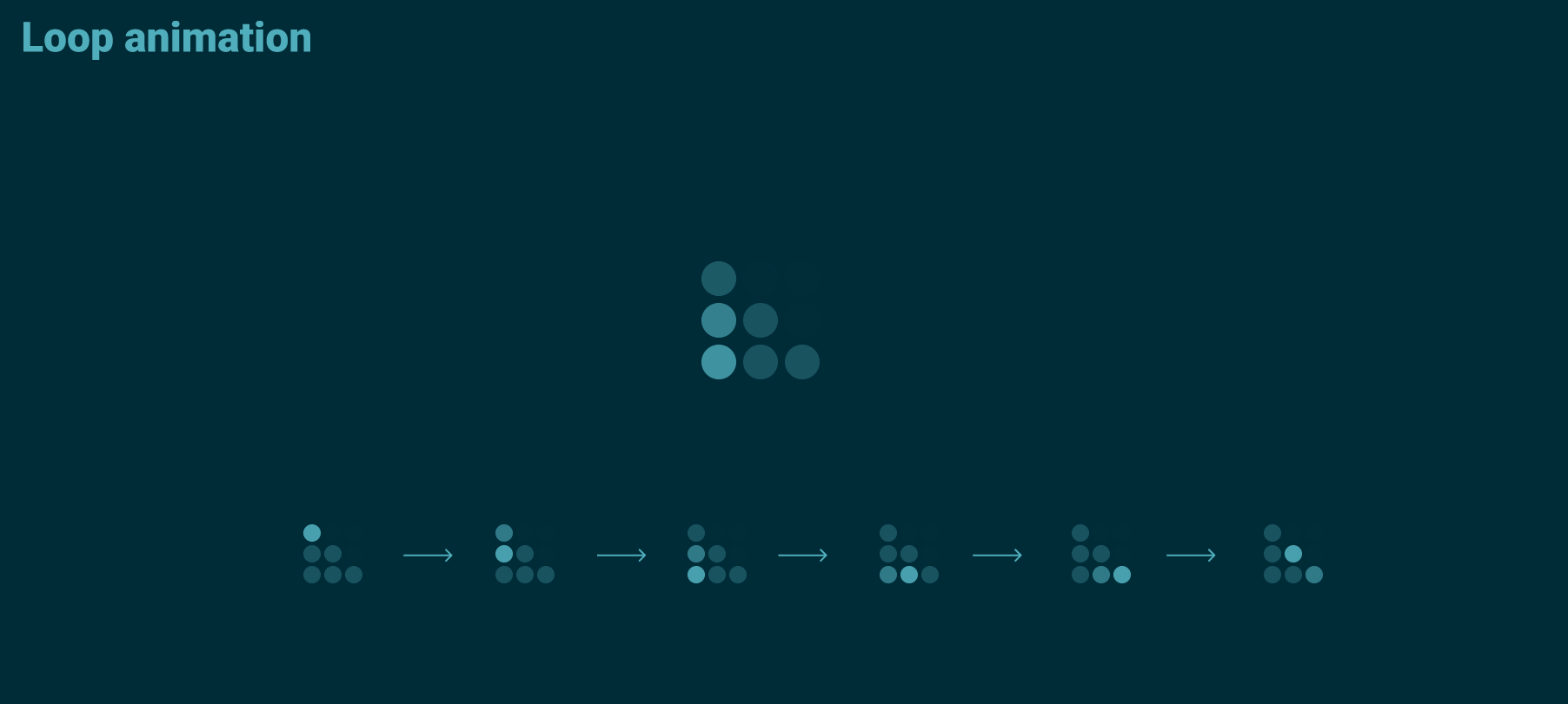
The loop animation evolved from the logo can be used as the loading screen:
Standard Monochrome Graphic Of The Logo:
AppIcon on mockup:
Derived version:
After “screaming Logseq” with a detailed literal representation (where I explain my take on Logseq, so I won’t repeat that info again), here is a ![]() -metaphor approach with bold lines and shapes, that combines the natural with the abstract. Not being a designer, I didn’t manage to do justice to the concept, but at least I was able to express it.
-metaphor approach with bold lines and shapes, that combines the natural with the abstract. Not being a designer, I didn’t manage to do justice to the concept, but at least I was able to express it.

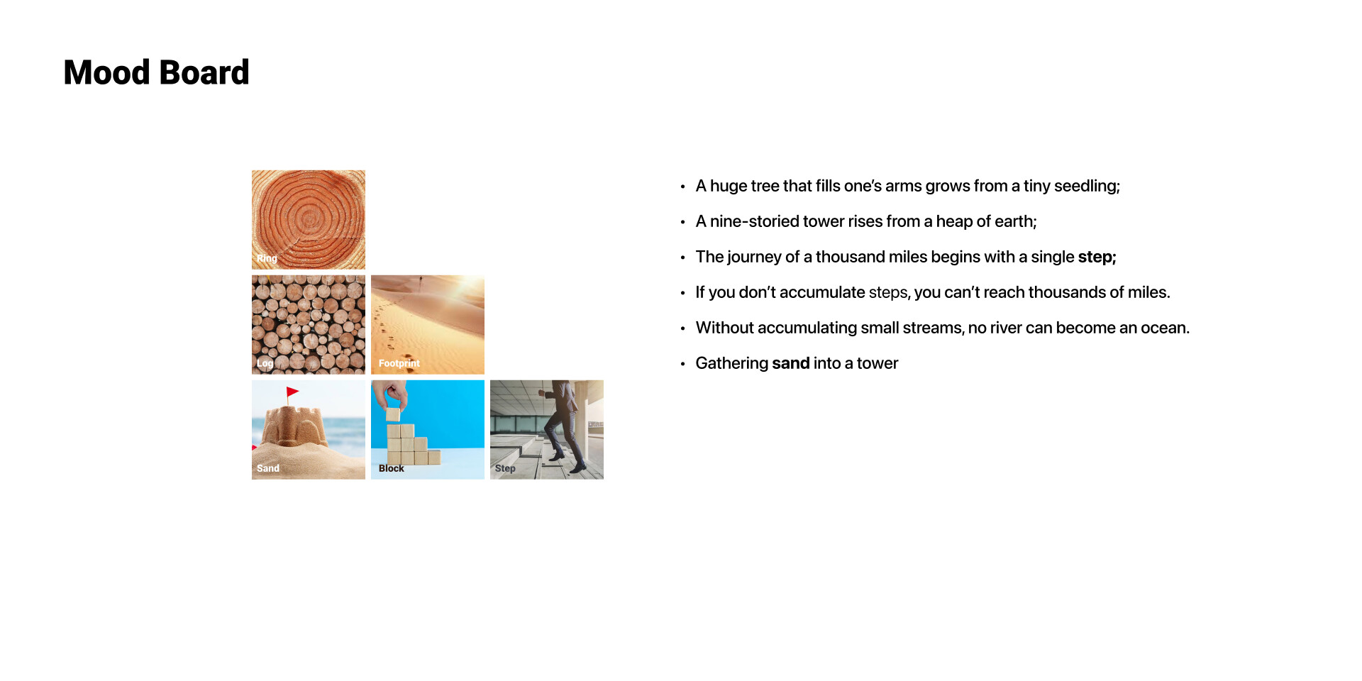
This is the log of a sycamore (or seekformore) tree. If you look carefully, you can find:
A tree is a special being. Not because of its shape, but because of its function:
Here is a version without the optional elements:
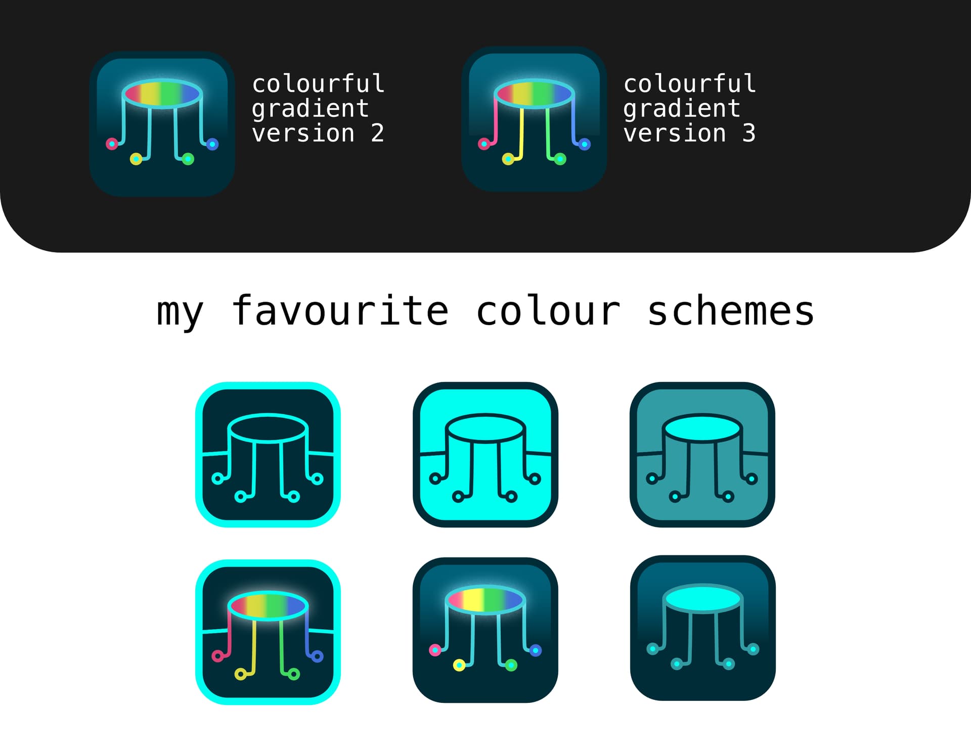
Hey there folks! I’m a relatively new Logseq user, but I figured I’d toss my hat in the ring.
I’m a front-end dev by trade, so graphic work isn’t necessarily my forté, but I couldn’t pass up an opportunity to contribute back to what seems to be an incredible community of great people.
Iconography needs to be simplistic, memorable, and pack a whole lot of meaning into a concise, multiplatform package. Logseq’s values encompass a wide variety of really important perspectives, and I wanted to create something representative of the key values that attracted me to the community.
The three primary components of my concept are as follows:
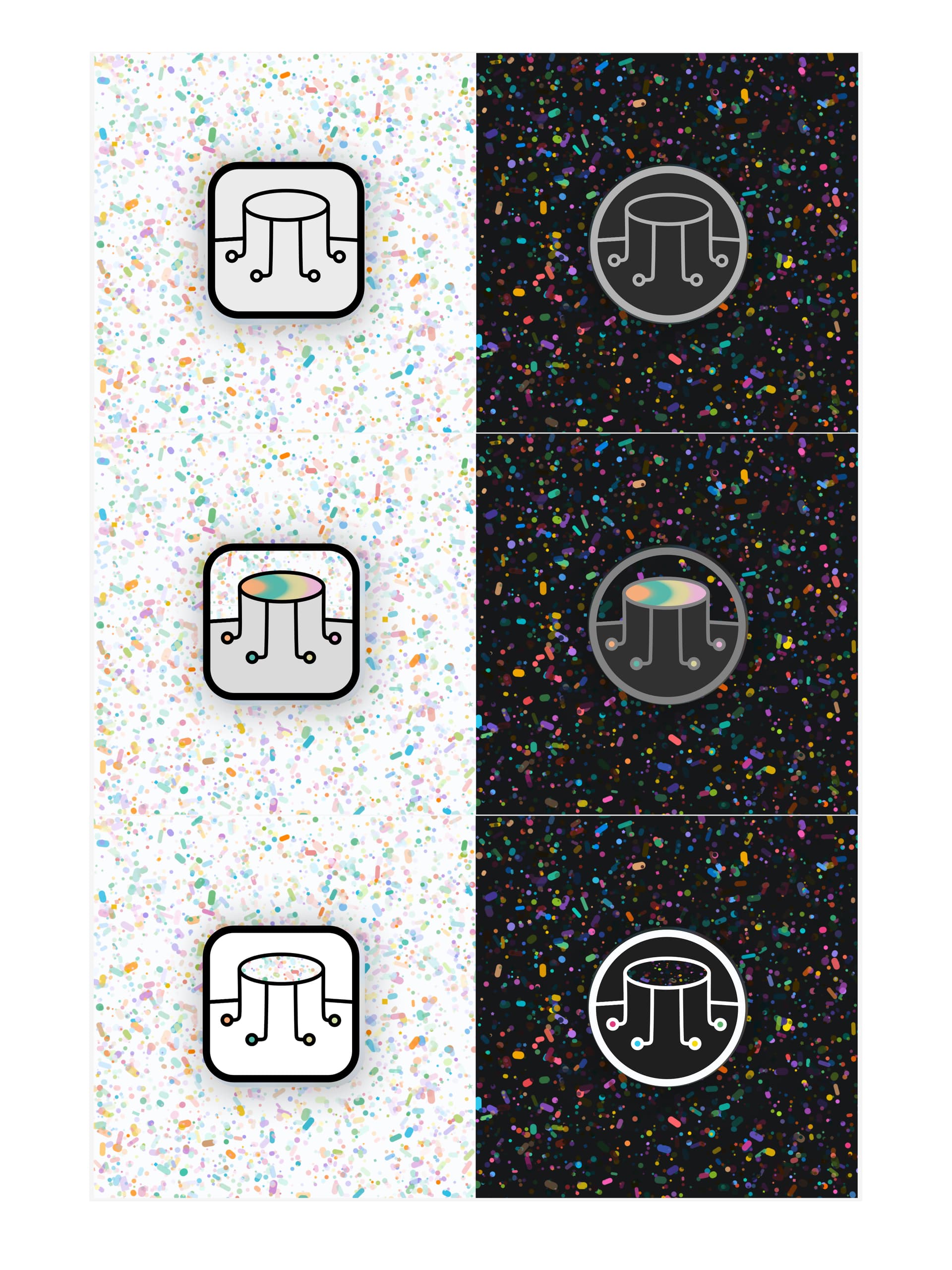
Reduced version
Alternate colors
Congrats on so many great submissions! I’m looking forward to voting for my favourites.
This is far and away the best one yet. I’d be happy to just use this one as it is now. Some of the others have some great ideas, but none of them feel ready-to-go in the way that this one does.
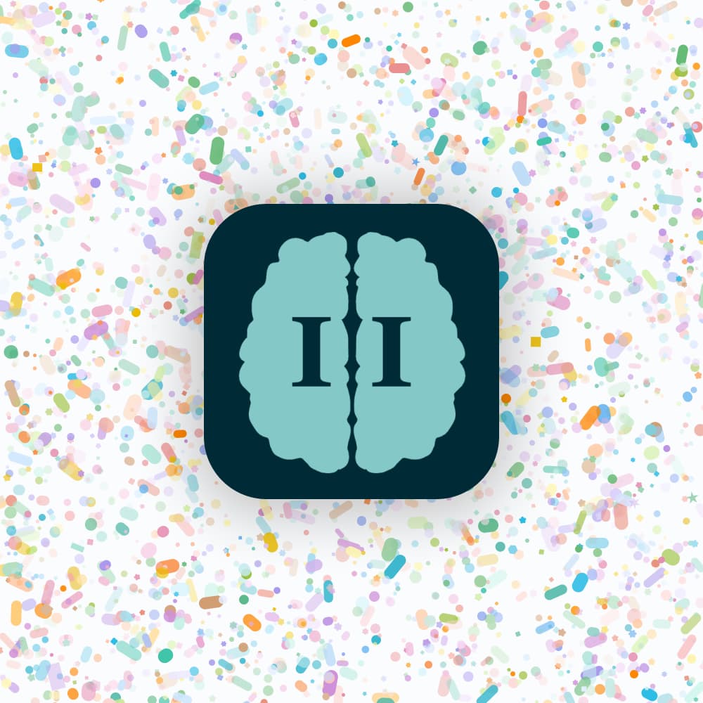
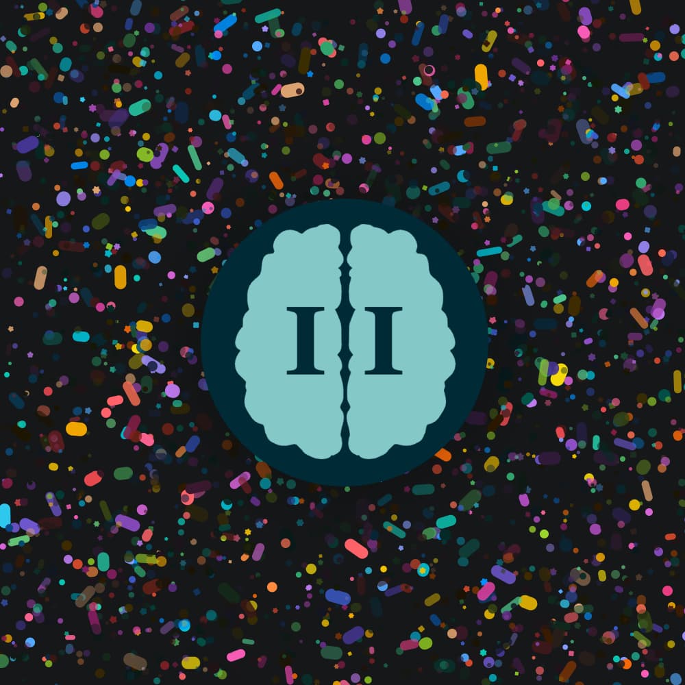
Great initial idea (brain maze made regular…), but a bit scarying and too masculine face.