This is far and away the best one yet. I’d be happy to just use this one as it is now. Some of the others have some great ideas, but none of them feel ready-to-go in the way that this one does.
2 Likes
Great initial idea (brain maze made regular…), but a bit scarying and too masculine face.
2 Likes
Very goodlooking but a bit too childish to reflect the power of Logseq to be, yes, funny and creative BUT ALSO reliable and chaos-solving!
1 Like
One in the top 5 of course, but a bit too cold, makes me think about a technical-only stuff. Yet Logseq is pure pleasure: since it makes fireworked brains like mine able to deliver results without being forced to throw complexity to the bin to manage so!
1 Like
Just trying out something for this waah.
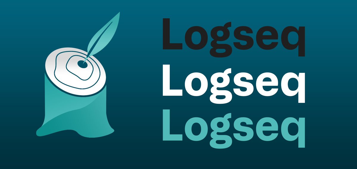
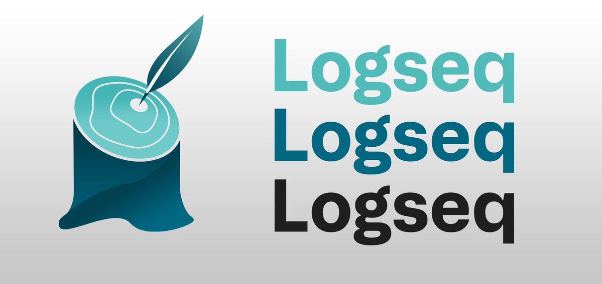
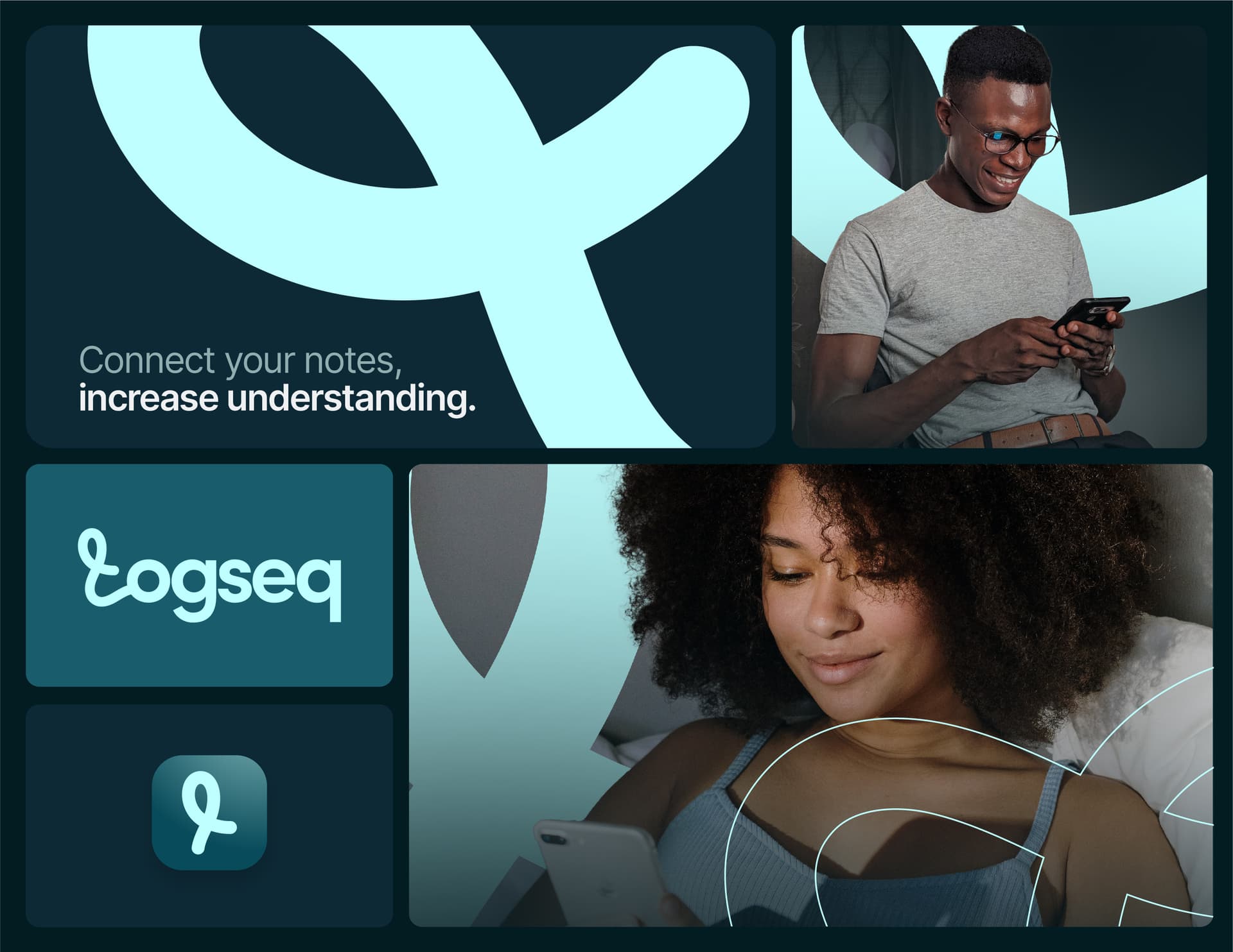
Main Logo Design


Banner Design
This logo is derived from the words ‘logging’ and ‘seeking’ as my interpretation of the origin of Logseq name. For me, it’s a combination of consumption and creation, of research and writing and of course the main identity of Logseq itself as ‘log’. The leaf represents the pen for writing and also inspires the idea of seeking something to log new ideas. The reason behind the leaf being in the middle is because the tree ring in the middle are considered the first year of growth of a tree. It symbolize the growth of the Logseq community. The additional rings signifies the continuous growth of the company and also its users by consistently logging and seeking.
3 Likes
Hi everyone!
It’s great seeing all of the logo designs, many different and creative directions!
Here’s my proposal:


Twitter: @Robert_Bloom
4 Likes
Hi all,
It gives me a lot of joy to make my first post on this site, which is to share my original logo design for Logseq. This is my quick design of the logo. My concept combines three different elements: fractals, fingerprints, and hexagons. Each of these parts was picked for what it means and how it relates to taking notes.
Fractal, which are abstract idea that show a pattern that keeps changing and spreading out, are like the process of taking notes and learning new things. As we learn more about a subject, we build on what we already know, making a tree of knowledge with more and more branches, just like a fractal.
Each user of our app has a unique identity, which is represented by the Fingerprint. As no two fingerprints are the same, each person’s way of taking notes and absorbing information is also unique to them. This makes learning and growing a more personal experience.
Now, let’s move on to Hexagon! Hexagon is the bestagon. This six-sided shape, which is known for being strong and efficient, is a playful nod to the hilarious movie at [Hexagons are the Bestagons - YouTube]. The hexagon in our logo looks like the way honeybees use this shape, which is a good way to show how organized, efficient note-taking can be. And keep in mind that if hexagons are “buzz-worthy” for our flying friends, they are definitely “buzz-worthy” for our note-taking!
In short, the logo represents a constantly changing fractal of information, shows how unique each of us is like a fingerprint, and promotes good organization like a hexagon. I hope this design meets the goals of our note-taking app and the standards of its users.
I found out about this contest too late, so all I could think of was the idea, while i’m still not satisfied with the visual.
Thank you for taking my idea into account, and I can’t wait to hear what you think!
3 Likes
Thank you for your support! I also enjoyed the ideas shared by others.
1 Like

12 Likes
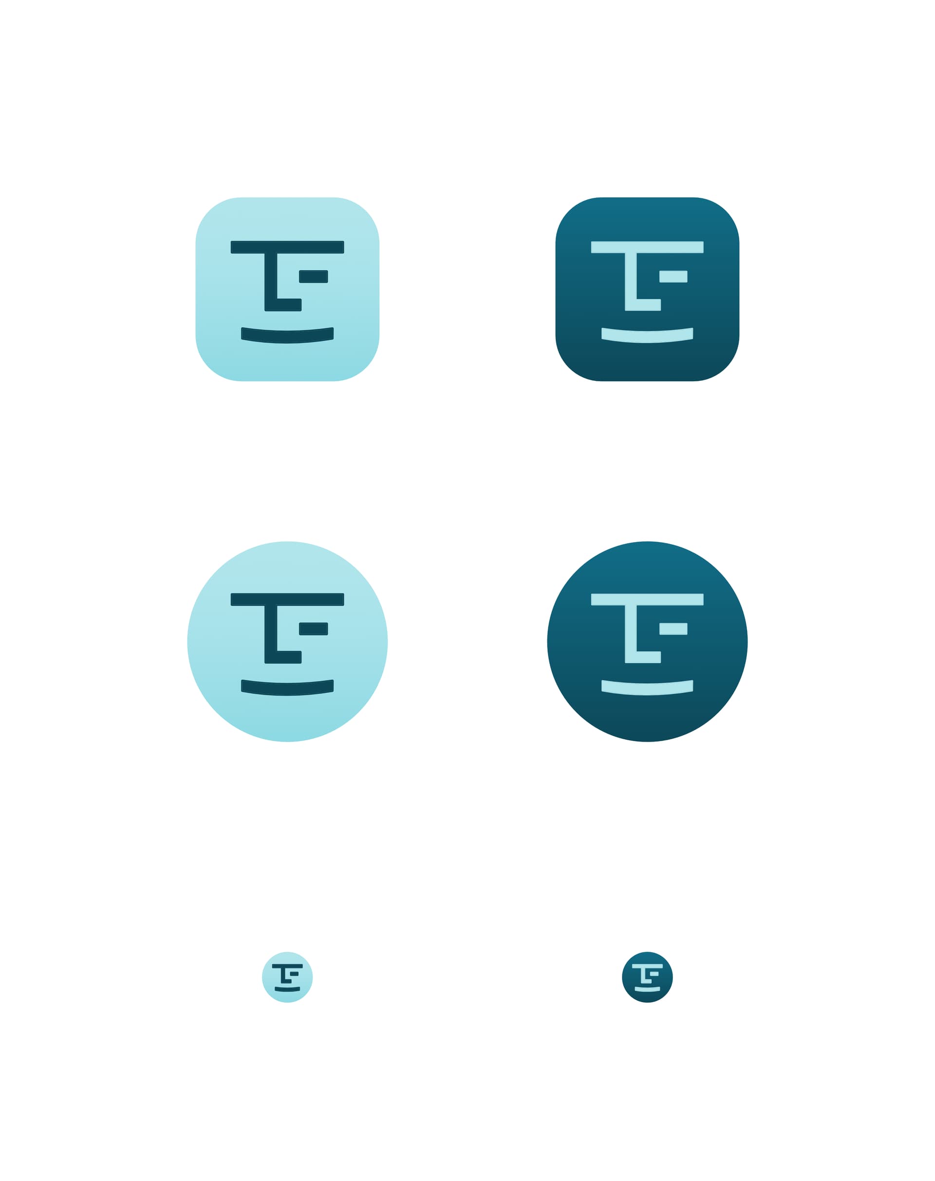
Graph elements as an uppercase Q
Android

Apple

Design notes
- Colors
- Upper left quadrant pays homage to existing application and logo (solarized dark)
- Palette swappable and gradient friendly
- Shapes
- Basic shapes form an empty canvas/framework (Google-doodle-able)
- Relational line emulates “capsule” shape found throughout submission template
- Letter Q
- Resembles a node and edge
- Rarest letter in the application name
- Q as in Qin
Values
- Intuitive Knowledge Management
- Information organization: highlighting the graph database structure
- Smooth: rounded edges and gradient colors
- Fast as lightning: the shortest distance between two XXXXXs is a straight XXXX. Logo suggests a point and line in the process of connection, as a freeze-frame capture.
- Collaborative & Open
- Edge represents an outward-reaching propensity
- Line direction (down and to the right) suggests reading. Apologies to those whose script is right-to-left and/or vertical
- Privacy & Security
- Visible background space forms a keyhole, suggesting privacy and security as a baseline.
- Accessible & Extensible
- Keyhole doubles as an input notch for expansion

- Industrial strength storage
- Snap in, no tools needed for assembly by end user
- Deviation from plug/outlet, puzzle, or lego brick motifs
- Empowering Creativity & Problem Solving
- Self evident through submission and all community participation
- These notes were outlined as a Logseq page
2 Likes
Alright - after 5 weeks and over 100 submissions, we will be officially closing the submissions thread! A huge thank you to everyone who participated, who decided their time and creative energy to out project ![]()
I’ll leave the thread comments open this weekend, but will launch a voting thread on Monday with our teams top picks. At that time, we will close comments on this thread.
And if you’re just skating in after the deadline, you can still try posting late submissions ![]()
Again, thank you, thank you, and thank you! There is a bunch of amazing artistist talent displayed in this thread
3 Likes
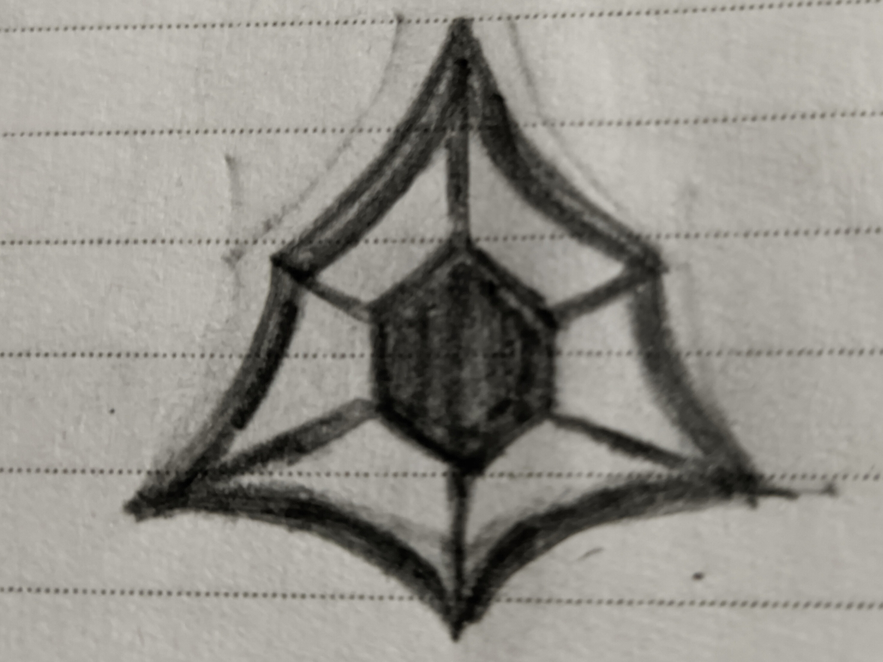
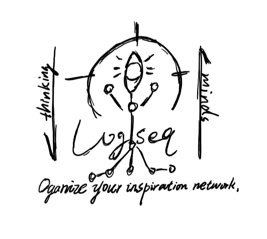
Hi, I’m a long time lurker and user of logseq. I drew a sketch of one of my ideas in a paper as I don’t have skills of any vector design software. I tried using inkscape but I couldn’t draw certain objects. Hope you’ll consider this idea as an amateur design and improve on it as you wish.
The concept is very simple:
which major problem in note-taking does logseq solve?
In my opinion it’s connecting the information. This design illustrates two different shapes connected with each other representing the ability of logseq to connect any kind of information.
1 Like
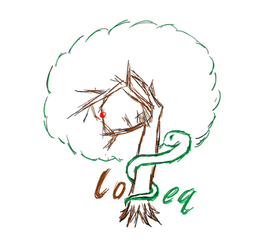
It seems too late to submit, but I still want to share a few lastest concept designs based on ![]() Logs
Logs
The original wood
As a figurative expression of Logseq, I believe that the imagery of logs is the closest and most suitable choice for the application icon, which itself is a metaphor for logs as a logging tool for writing, creation and the origin of civilization, and the construction of all human knowledge. The ignition of fire, the use of wood axes, the creation of pencils, furniture, and even the birth of books are all closely related to logs. By using logs as the application icon, there is no need to specifically capture any letter from the application name “Logseq.” The growth rings on the log’s cross-section symbolize the best expression of “logging” and “sequences.”
Many trees form a forest. The collective presence of logs, branches, and even leaves represents the optimal metaphor for tree structures, outlines, connections, collaboration, and growth, with its meaning self-evident.

Branch of the Log
Merging the master and branches of the log into an L shape, represents connection, collaboration and growth。In this concept, the branches are actually also a connetion.
where the figurative version provides more details, such as the log’s annual rings and cracks look similar to the letter Q/magnifying glass, representing the concept of query; the keyhole on the log’s branches metaphorically represents a security lock.

The Return of Notepen
Logseq is a note-taking application, but its icon resembles a paw print, which makes it difficult for the general public to recognize. If we want to make it more popular, visually, shouldn’t it be more intuitive and convey sincerity to those who are unfamiliar with it?
Therefore, this concept first represents a pen, and then incorporates elements of logs, leaves, growth rings, searchability, and the brand letter ‘L’. Your thinking tool should naturally embody these aspects.

6 Likes
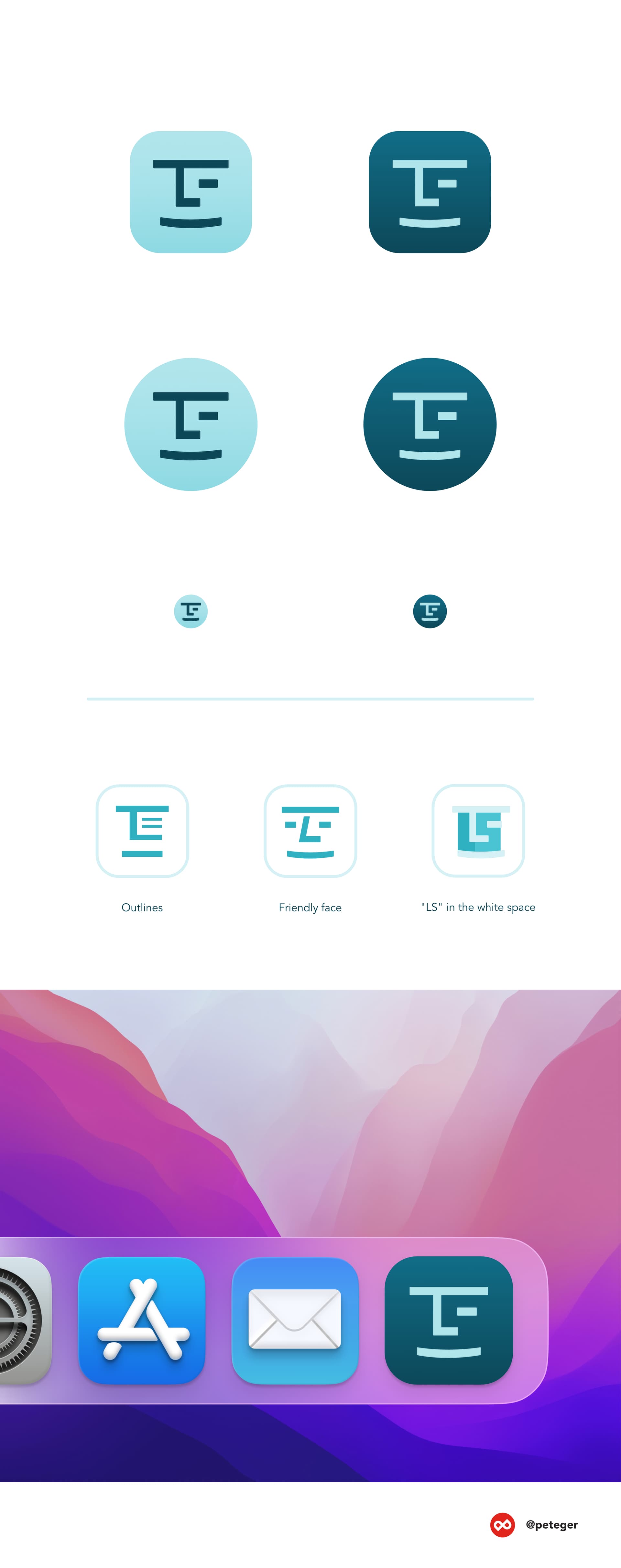
Hi there! ![]()
I’d like to share my last-minute logo idea with you. It features a friendly and confident face and creative use of white space.
I hope you like it! ![]()
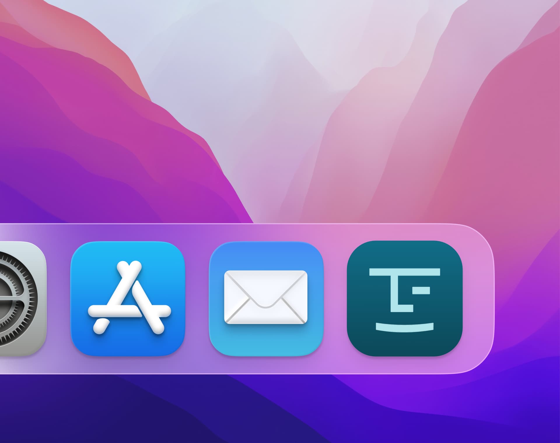
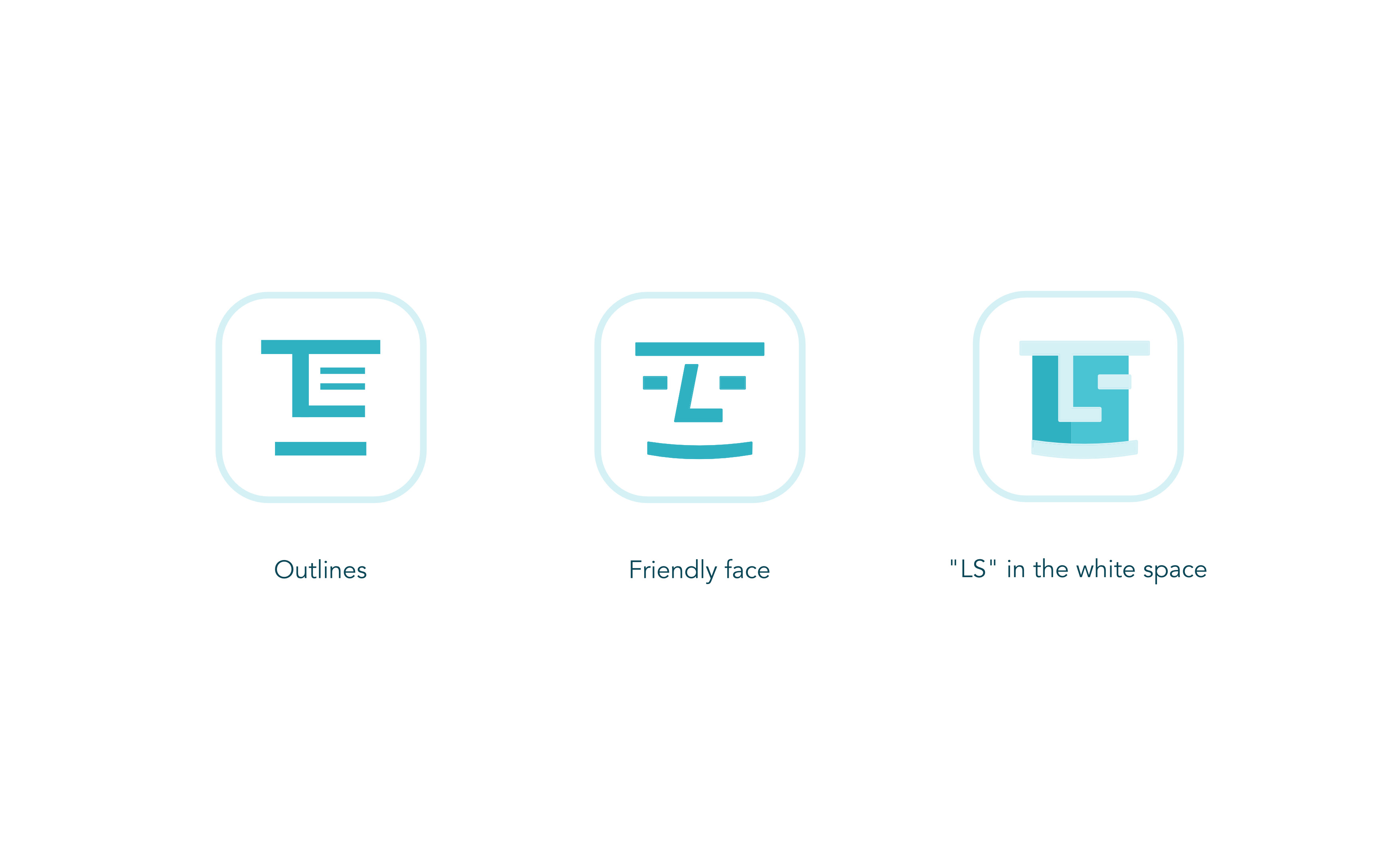
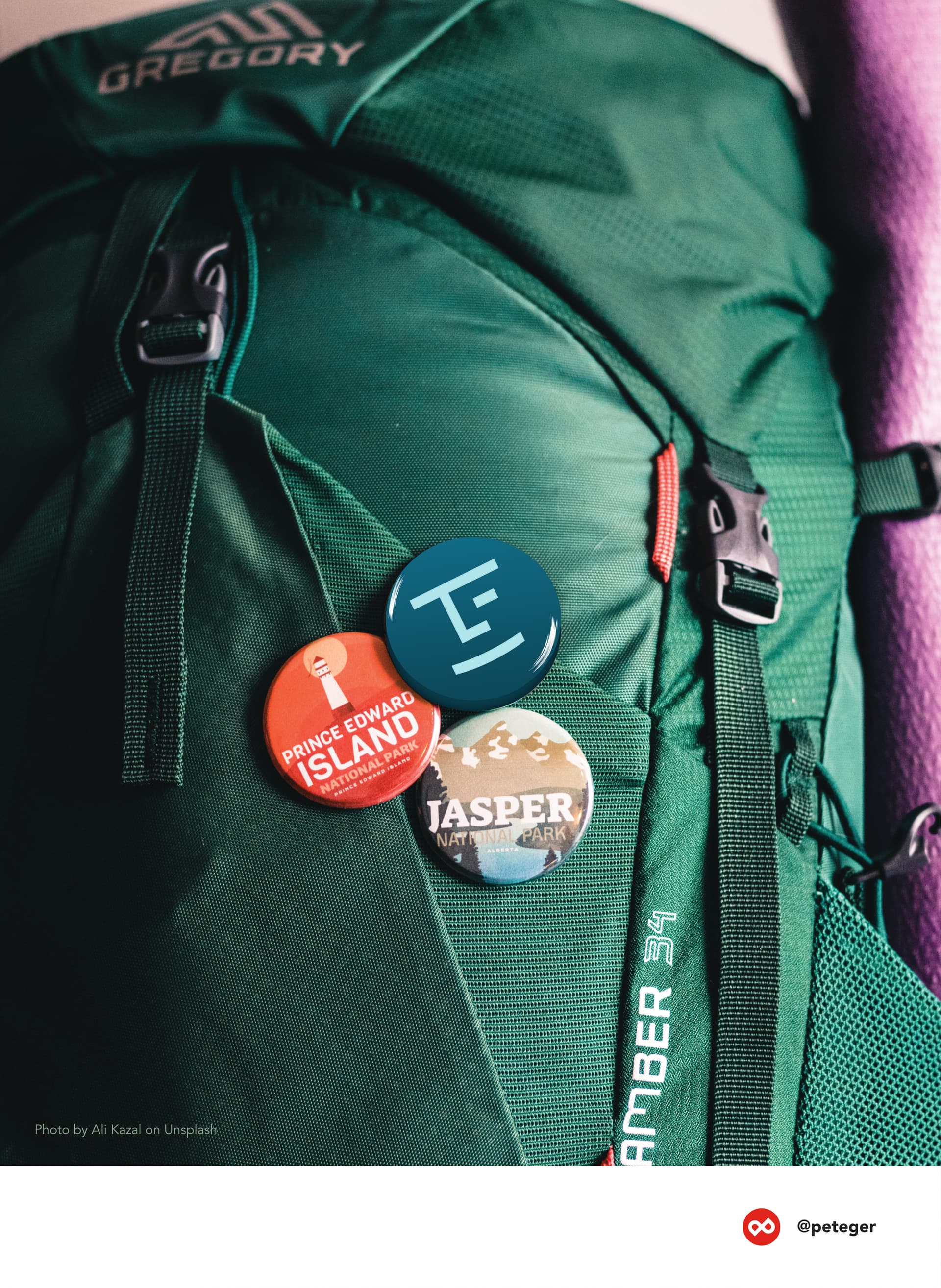
7 Likes
I am thrilled to present to you the logo concept for Logseq, where I sought to create a captivating mark inspired by the timeless beauty of wood grains on logs. Throughout the design process, I remained committed to preserving the existing color palette, ensuring brand consistency and recognition.
In this concept, the logo embodies a perfect blend of modernity, reliability, diversity, and timelessness. The mark, with its elegant representation of wood grains, symbolizes the enduring nature of Logseq’s note-taking capabilities. It speaks to the app’s reliability and establishes a sense of trustworthiness in the minds of users.
The dynamic composition of the logo emphasizes the versatility of Logseq, adept at accommodating a wide range of user needs and preferences. By incorporating clean lines and a modern aesthetic, the design aligns with Logseq’s commitment to technological advancements and innovation.
One of the key strengths of this logo concept lies in its ability to transcend time. The timeless quality of the wood grain-inspired mark ensures that the logo remains impactful and relevant, even as design trends evolve in the future. It serves as a testament to Logseq’s lasting presence and unwavering commitment to its users.
3 Likes
Second logo concept for Logseq, where my main inspiration derived from the scribbles people often make while taking notes. In this concept, I have creatively adapted the essence of those scribbles into a unique letter mark, specifically for the letter “L” in Logseq.
The design retains the existing color palette, ensuring brand consistency and recognition. It captures the essence of modernity, reliability, diversity, and timelessness that Logseq embodies.
The letter mark, derived from the concept of scribbles, adds a touch of playful energy and spontaneity to the logo. It resonates with the organic nature of note-taking, while still maintaining a clean and modern aesthetic. The dynamic composition of the mark showcases Logseq’s versatility, accommodating a variety of user preferences and needs.
By incorporating the scribble-inspired letter mark, I infuse the logo with a sense of individuality and personalization, reflecting the diverse experiences and styles of Logseq users. It represents the app’s adaptability to each user’s unique way of taking notes.
The timeless quality of the logo ensures that it remains relevant and impactful over time, despite evolving design trends. It effectively combines the harmonious blend of nature and technology, signifying Logseq’s seamless integration into users’ lives.
6 Likes
Third logo concept for Logseq, where the main inspiration derives from the scribbles people make while taking notes. In this concept, I have creatively adapted those scribbles into an abstract circular shape, which forms the focal point of the logo.
To complement this unique mark, I have carefully selected a blue color palette that enhances the overall design and aligns with the brand’s values. Blue, a color associated with trust, reliability, and professionalism, establishes Logseq as a dependable note-taking app. The calming and soothing qualities of blue create an atmosphere of tranquility and clarity, fostering an environment conducive to productive thinking and organization.
By incorporating the scribble-inspired circular mark in shades of blue, we capture the essence of Logseq’s purpose - capturing and exploring creativity, facilitating learning, and fostering personal growth. The dynamic interplay between the abstract shape and the chosen color palette represents the continuous flow of ideas and information within Logseq.
Furthermore, blue as a versatile color complements a range of design styles and adapts well to both modern and classic branding. This versatility ensures that the logo remains visually appealing and relevant, reflecting Logseq’s commitment to adaptability and longevity.
Together, the combination of the scribble-inspired circular mark and the blue color palette establishes a powerful visual identity for Logseq. It conveys trustworthiness, professionalism, and a commitment to fostering creativity and knowledge.

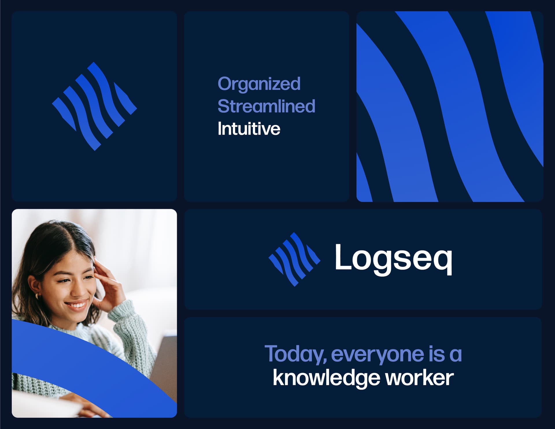
Forth logo concept for Logseq, where the main inspiration stemmed from the “linear” logomark with clean lines. In this concept, I have taken this linear concept and infused it with wavy lines, creating a unique and captivating mark that truly sets Logseq apart.
The wavy lines add a sense of dynamism and movement to the logo, symbolizing the continuous flow of ideas. By incorporating these wavy lines, we bring a touch of playfulness and energy to the design, while still maintaining a clean and professional aesthetic.
One of the strengths of this mark lies in its timeless appeal. The combination of the linear and wavy lines creates a balance between structure and fluidity, representing Logseq’s ability to seamlessly adapt to users’ needs while remaining reliable and dependable. This timeless mark ensures that Logseq’s logo will remain visually appealing and relevant, regardless of shifting design trends.
The choice of a blue color palette further enhances the logo’s impact and reinforces the brand’s messaging. Blue is known to evoke feelings of trust, reliability, and professionalism, which are essential qualities for a note-taking app like Logseq. Additionally, blue has a calming effect and promotes a sense of focus and clarity, enhancing the user experience when using the app.
By combining the psychology behind the color blue with the dynamic and timeless mark, we create a visual identity that resonates with Logseq’s target audience. The mark’s ability to communicate the fluidity of ideas, combined with the trustworthy and calming nature of the blue color palette, establishes a strong and memorable brand presence.
4 Likes
I’m glad the event is over perfectly. Share the rest of my draft ideas, lol
-
Religion-like symbols
- store flash ideas & thinking in logseq, which will be fed back with minds & inspiration.
- trees formed by bidirectional links, important blocks like glowing eyes in mind.
- organize your inspiration network.
-
Snake Fruit Tree
- G is tree, S is snake, make up logseq.
- from intertwined tangled branches still able to gaze at apple, from intertwined tangled links still able to gaze at important block.
-
Logsidian
- Just a joke
 I love logseq!
- Just a joke
4 Likes
2 Likes
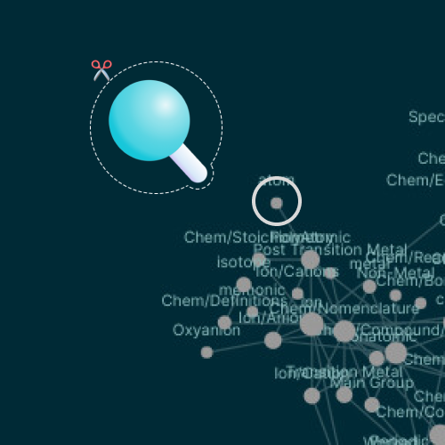
Thank you ![]() the problem I see is that it resemble a Q and a magnifying glass less than the original that already didn’t a great job at that; it resemble more a
the problem I see is that it resemble a Q and a magnifying glass less than the original that already didn’t a great job at that; it resemble more a @.