Hi everyone,
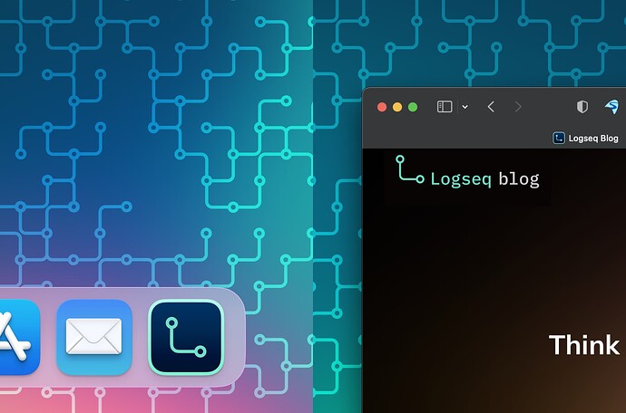
I created my first Logseq icon in November 2021, and it’s stayed on my dock since then.
Now that there’s a contest and all, I took the chance to reinterpret it, making it even simpler and (in my opinion) more elegant and versatile.
The basic original rationale still stands: it’s an “L” shape, made by the connection between a node and its child. “Connection” being a very powerful core symbol.
Both colors have been chosen from the Radix library, and the typeface used for the wordmark is IBM Plex Mono (open source).
Speaking of wordmark, you’l notice the apparent off-centering. That’s intentional, for three reasons:
- That’s the way text aligns with bullets
- It gives the logo a bit of a personality
- It calls one’s attention to what comes before — which, in this case, is open-ended.
Well, I hope you like it. Hit me up if you want to use it. I’ll give you a transparent PNG.
Cheers!


