Submitting a second entry following the Log and the abstraction moving away from the graphs and letters:)
As mentioned, its hard to make a log visually interesting, however, we don’t just want a log and we don’t want to conflate 10 different elements in it otherwise it becomes rigid and inflexible. As such, I provide the evolution of the log:
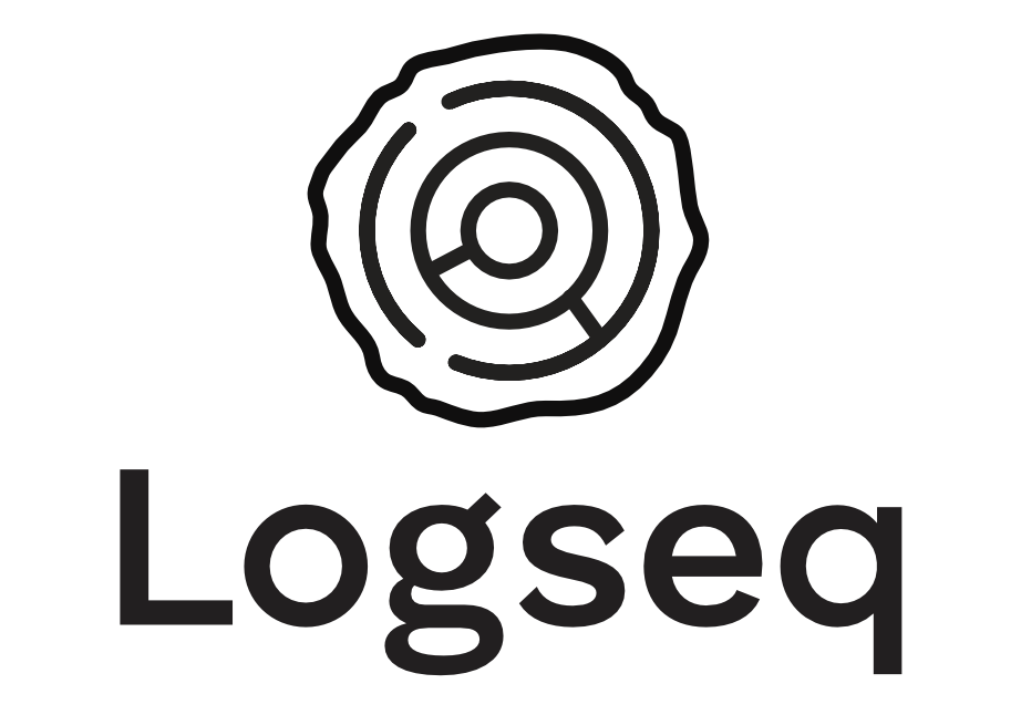
Clear, minimal, simple logo that has potential for animations, extensions, and recognisability.
The logo itself comes from the year rings (as others have provided as well), but preserving the ordered and ‘technological/digital’ circular lines providing that all-desirable organic-technological feel to it.
Once the meaning settles, the shapes are not even as vital, the backdrop log can shift to a stone slab, a cornfield, anything really - as long as its organic or natural. Here we get the brand flexibility to expand into other stories/areas/software. In itself the brand language is the refined year rings x the organic base for it all, which translates to the compiled and compound knowledge gathered within what is the result of the human / brain / whichever metaphor you prefer.
I don’t have the skills to make the gradient so I offer here the app icon as a necessity, but with 3D effects, such as making it look like an engraving into the background or with a glow, and gradients could certainly improve it if someone had the skills:)

As mentioned before, I imagine the organic base to be able to change up with the central design language remaining consistent. For example, (I wish I had better dall-e prompting skills) a more photorealistic log could have the same engraving, or a stylised low poly log could as well:

I also vouch for a mascot, I mentioned in the Discord #design channel before, I propose the Bonobo monkey that is known for its intellect, adaptability, and collaboration:)
also my twitter handle has changed sorry its: @benjaminsearle_
much love to the community <3 so glad to see all the great ideas and enthusiasm