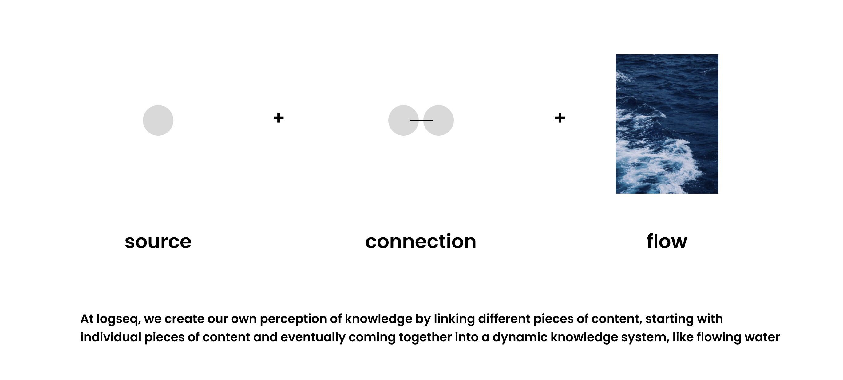
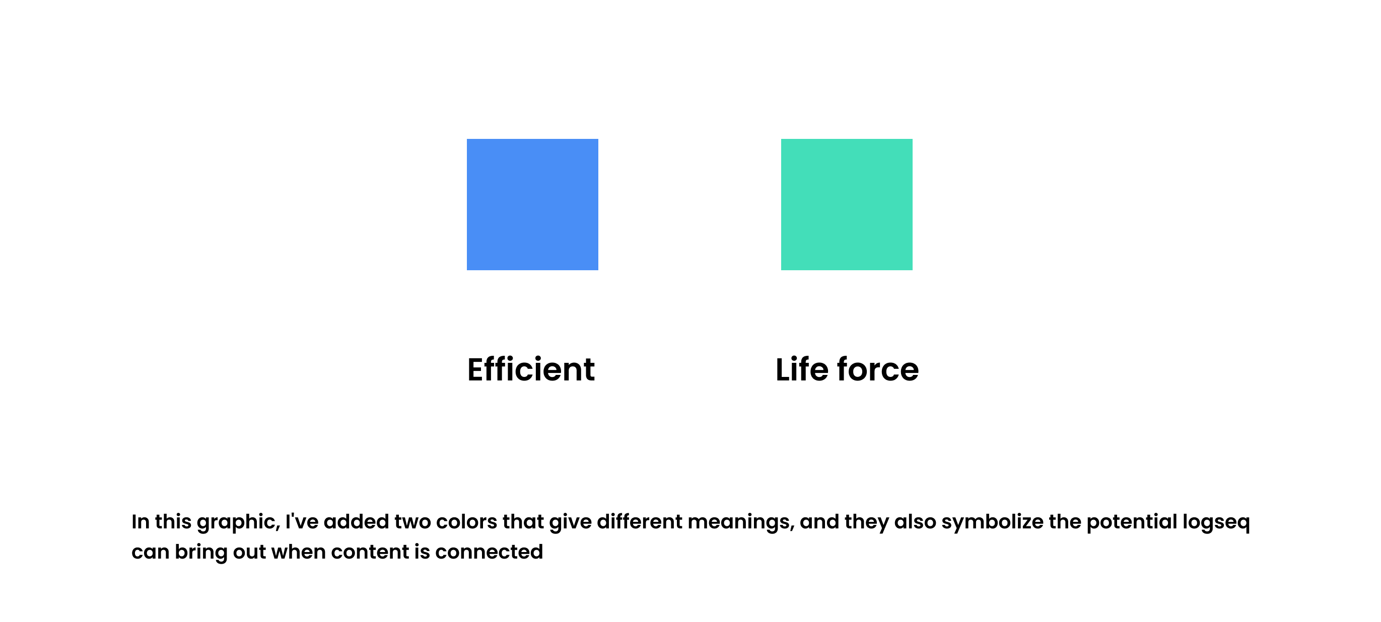
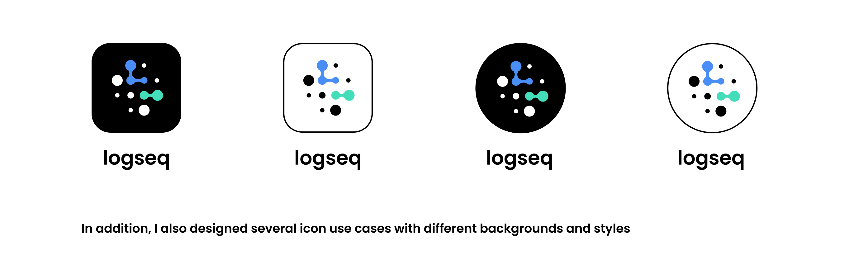
I try to design logo that have a sense of flow, logseq is dynamic to me, especially the content I create with it, and by constantly connecting them, the content becomes more imaginative

12 Likes
If you improve the contrast of the last design, white on white, it will be a strong contender. I can see the three circles independently and with a connection between them, and with better color contrast it will look very good. I didn’t like the others very much, even though they are based on the same pattern.
Well done.
2 Likes
I’m not sure if this was already posted elsewhere, but I wanted to share a logo design by a user named Vicent:
https://www.figma.com/community/file/933752127976667301
Original post:
Translation:
Related discussion:
10 Likes
Hello, designed this after I watched some analog zettelkasten videos.
Combined the note box with labyrinth.
I think it reflects well the interconnectedness and multidimensionality of the notes.
5 Likes
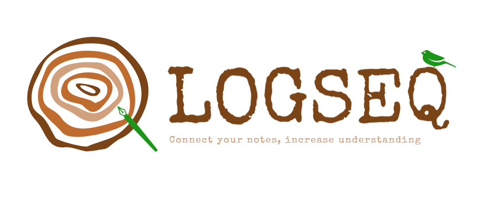
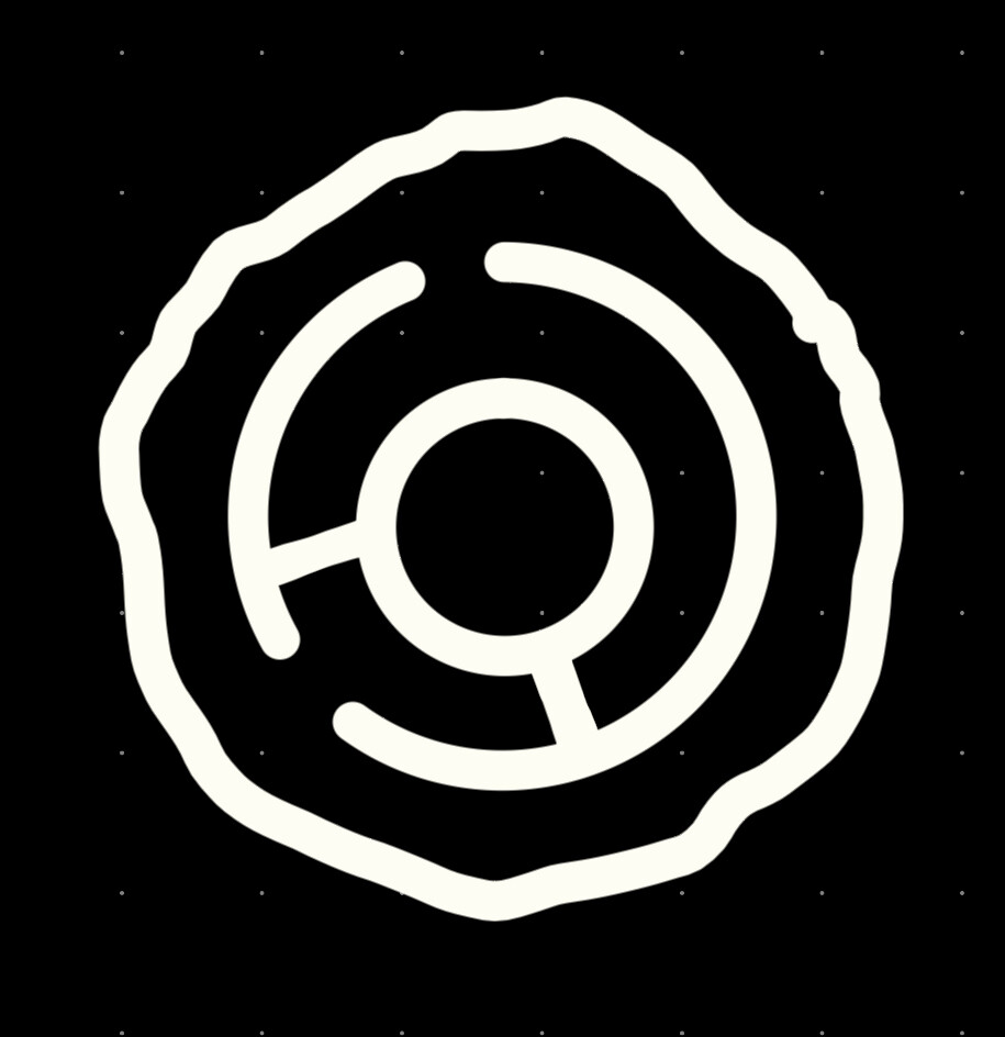
Hi, after learning about everyone’s excellent design, I got an idea wanna share with you.
Writing annual ring
Design ideas
Inspired by an old Chinese proverb『合抱之木,生于毫末;九层之台,起于累土』, ‘‘The tall oaks which can only be surrounded hand in hand, is from little acorns grow’’. it means said about organizations or plans that start off very small or simple and become extremely large or successful.
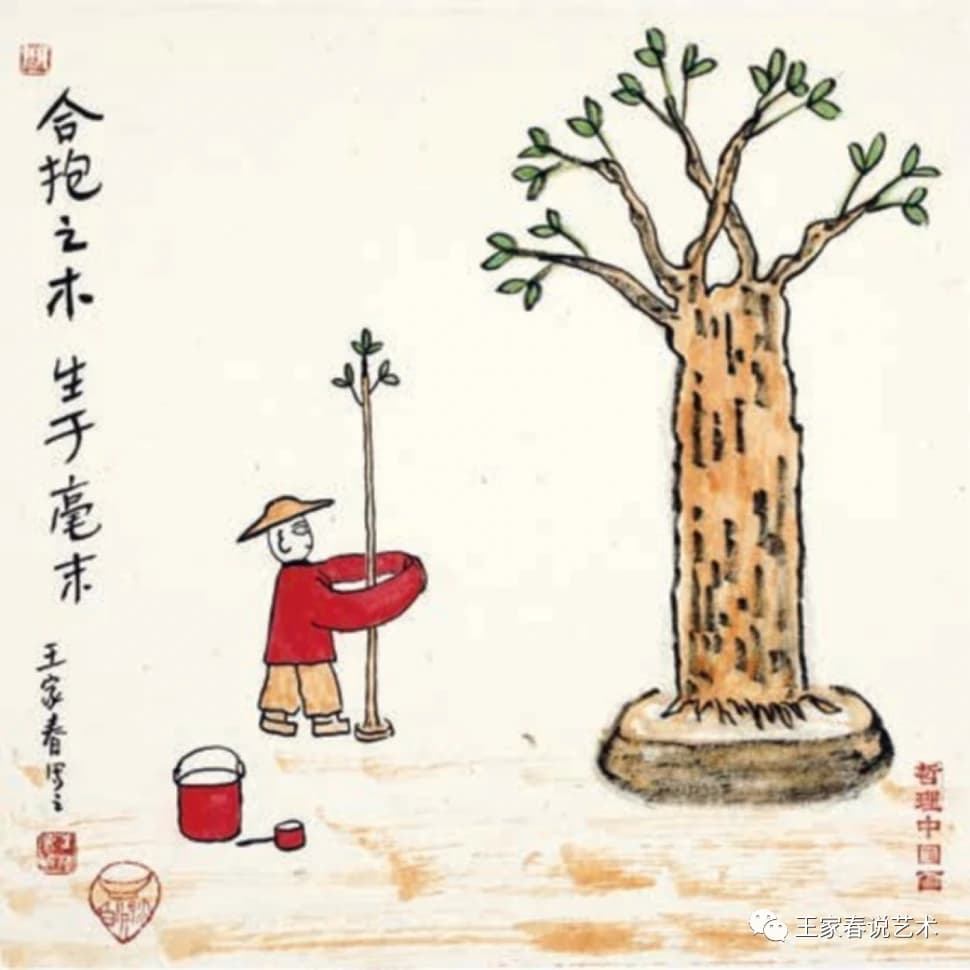
As we all know, the cross-section of a tree stump can be seen in circles of annual rings. The tree is forming the outermost annual rings all the time, the trunk keeps growing silent, until at one time point it suddenly finds that it has grown from a small sapling to a thick tree.
This reminds me of the process of using Logseq. I record simple thinks, ideas and ofc Todo list on the Journal page every day. But oneday, when I am writing a new article at a certain time, I find all the nodes recorded It has been connected together in an orderly manner, I found that I had a wealth of knowledge points and material in reserve, and an inspired article has been easily completed.
This is the magic of Logseq!! I’m sure everyone has had a similar experience in using it.
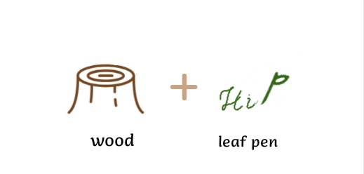
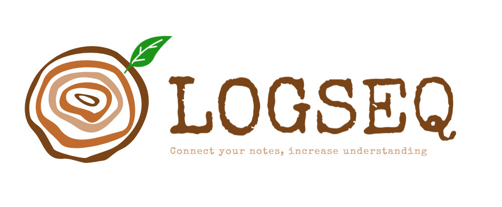
So I introduced two elements, one is stump of wood which hot on Twitter ![]() , another is leaf pen
, another is leaf pen ![]() . The leaf pen means that we can writing something quickly at anytime, whether its Windows, iOS or Android, like having a ubiquitous pen that you can touch and use it. And the wood is the carrier of our notes.
. The leaf pen means that we can writing something quickly at anytime, whether its Windows, iOS or Android, like having a ubiquitous pen that you can touch and use it. And the wood is the carrier of our notes.
Now we will take up the pen and writing annual ring! Go and let our own knowledge system or life plan management germinate and grow!
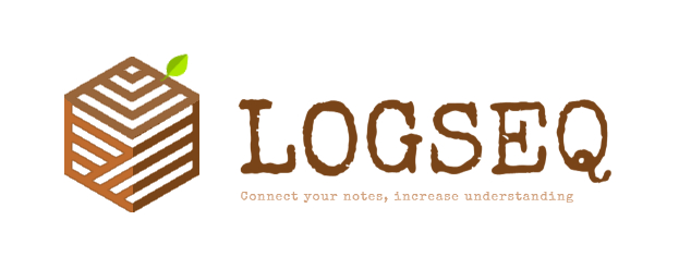
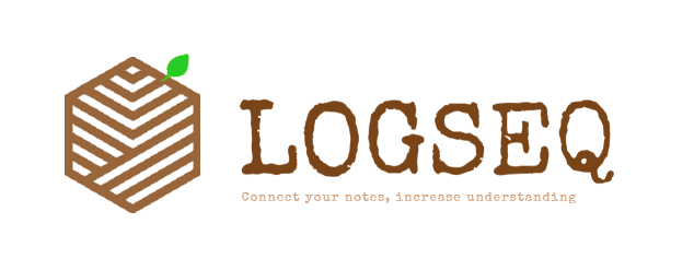
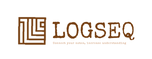
Icons
-
Normal
-
Fountain pen ( looks like the letter Q )
-
Hexagon with a little sense of technology
-
Flat hexagon
-
Flat square
renderings
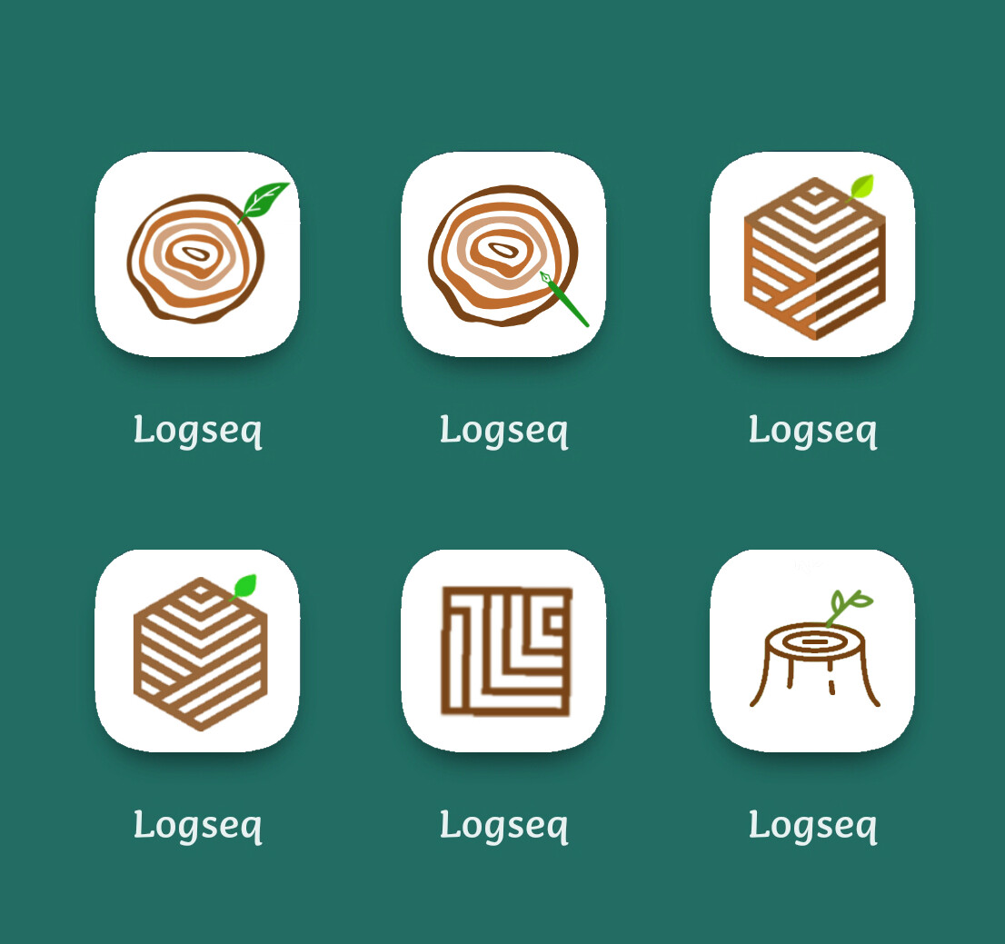
Hope you will enjoy it! ![]()
6 Likes
Hello Ben,
Thank you for the update and inspiration it is really helpful to the designer . I already submit two proposal but definitely love to submit another one based on your latest thoughts. Keep inspiring us .
1 Like
Non-designer here with very rudimentary drawing app skills. Probably someone who knows what they’re doing can snazz this up.
This is a reimagining of the “bear paw” logo as the letter lambda (for Logseq, also significant in many disciplines), with reference to organic growth of a Logseq graph as branches/roots/buds.

5 Likes
Just note that the simpler logo looks a bit similar (in principle, anyway) to anytype · GitHub
1 Like
I posted my first version before midnight, but have realized now, that the deadline had been extended. So here the edit with more details.


Alternative versions
While designing the logo, as it evolved the complexity also increased. Often, simplicity outperforms complexity. I’ll post three versions with increasing complexity. Each version will have an outlined and a non outlined variant.
Flat version
With gradients

With more gradients and colors
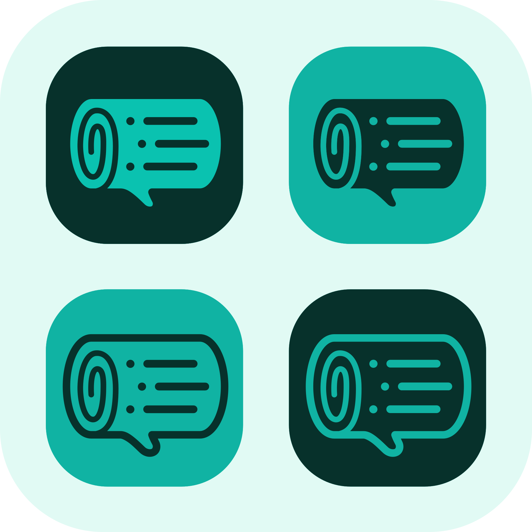
Explanation
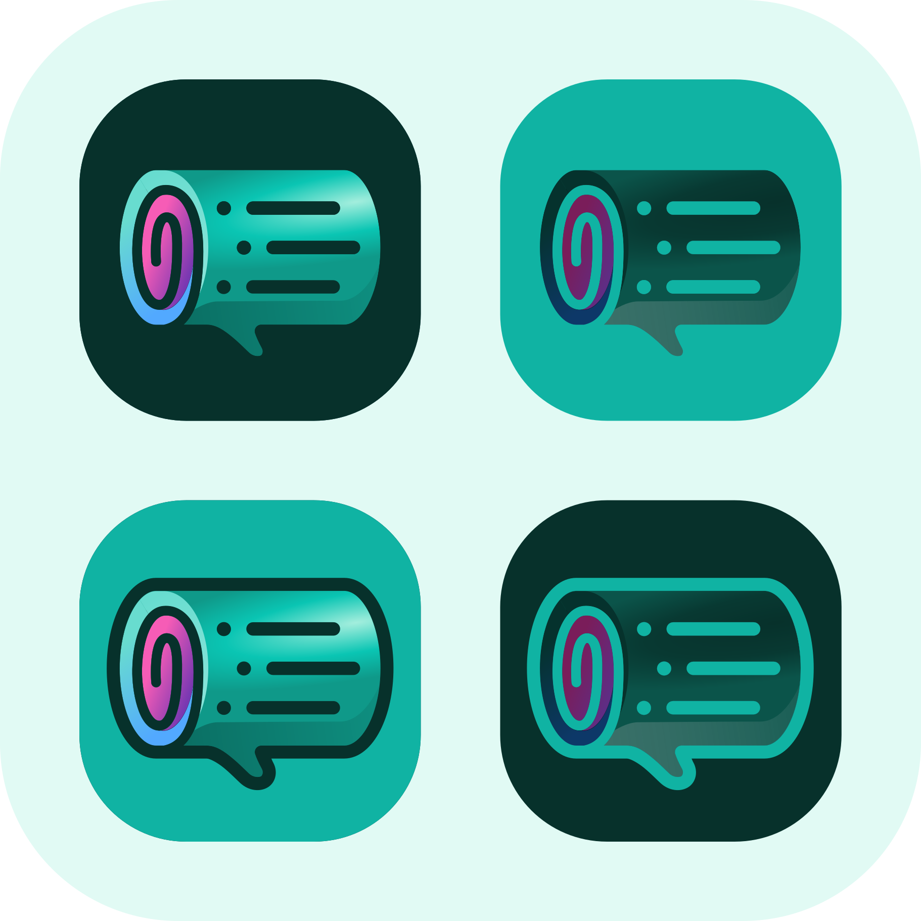
There are some different elements in the design. I tried to make the log the most obvious one. We’ll start from by the external elements and work our way in.
 Log:
Log:

A wordplay with Logseq and the developers use the wood emoji in their twitter handles.
 Speech bubble:

Reference to the community and the open-source nature of the program.
 Scroll:

Sometimes used as an icon for computer logs.
 Outline:

Three bullet points, with one of them indented, represent the powerful outline feature of Logseq. This part should also represent the bark of the log.
20 Likes
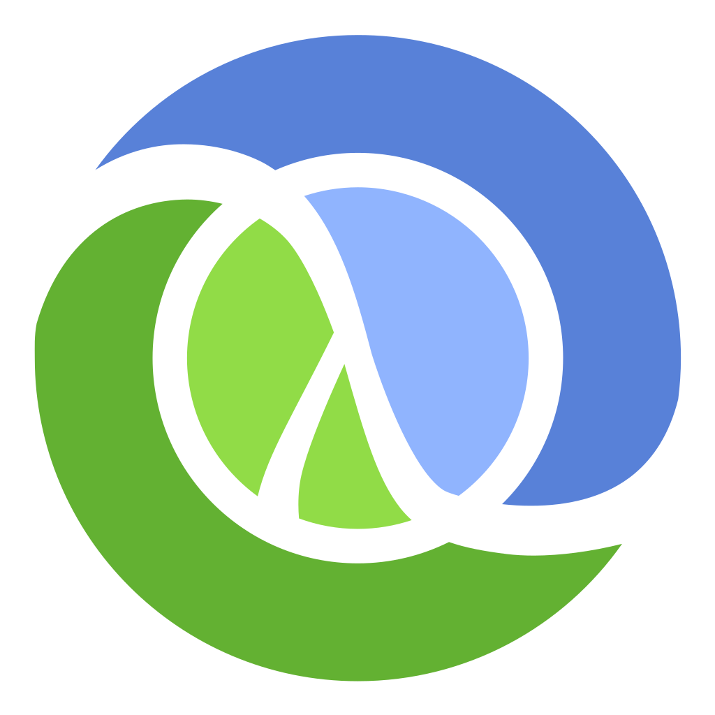
FYI the letter lambda is the symbol of functional programming paradigm and Logseq is written in a purely functional programming language, Clojure, that has a similar logo, a Yin and Yang symbol combined with a lambda ![]()
3 Likes
Submitting a second entry following the Log and the abstraction moving away from the graphs and letters:)
As mentioned, its hard to make a log visually interesting, however, we don’t just want a log and we don’t want to conflate 10 different elements in it otherwise it becomes rigid and inflexible. As such, I provide the evolution of the log:
Clear, minimal, simple logo that has potential for animations, extensions, and recognisability.
The logo itself comes from the year rings (as others have provided as well), but preserving the ordered and ‘technological/digital’ circular lines providing that all-desirable organic-technological feel to it.
Once the meaning settles, the shapes are not even as vital, the backdrop log can shift to a stone slab, a cornfield, anything really - as long as its organic or natural. Here we get the brand flexibility to expand into other stories/areas/software. In itself the brand language is the refined year rings x the organic base for it all, which translates to the compiled and compound knowledge gathered within what is the result of the human / brain / whichever metaphor you prefer.
I don’t have the skills to make the gradient so I offer here the app icon as a necessity, but with 3D effects, such as making it look like an engraving into the background or with a glow, and gradients could certainly improve it if someone had the skills:)

As mentioned before, I imagine the organic base to be able to change up with the central design language remaining consistent. For example, (I wish I had better dall-e prompting skills) a more photorealistic log could have the same engraving, or a stylised low poly log could as well:

I also vouch for a mascot, I mentioned in the Discord #design channel before, I propose the Bonobo monkey that is known for its intellect, adaptability, and collaboration:)
also my twitter handle has changed sorry its: @benjaminsearle_
much love to the community <3 so glad to see all the great ideas and enthusiasm
6 Likes
Actually, the letters are largely influenced by the “Baron” typeface which would make branding a breeze. This is available free commercially.
The logo is customized but plays well with the typeface
1 Like
Ha, didn’t know that! I was actually trying to make it look like a plant bud, and the ying-yang just came along for the ride.
1 Like
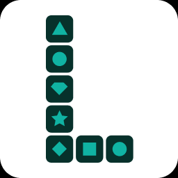
With a vision to represent the Logseq’s block concept, I have crafted a logo that shows the power of stacking and combining ideas. Inspired by the timeless joy of toy blocks, my logo design features the letter “L” fashioned as building blocks. The clean lines and simple shapes evoke a sense of order and organization, reflecting the structured nature of Logseq’s platform. Each block represents a distinct idea or piece of information, waiting to be assembled into a meaningful structure.
In the first variant of the logo, I opted for a minimalistic approach. The dots placed on each block serve as indicators within the outliner, emphasizing the building block concept in a subtle yet effective manner. This design highlights the fundamental nature of Logseq, where individual elements come together to form a coherent whole.
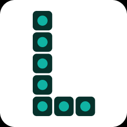
The second variant of the logo showcases the abundance and diversity of blocks, representing the vast array of content that Logseq enables its users to create, organize, and connect. The different shapes symbolize the richness of ideas and information that can be seamlessly integrated within the Logseq ecosystem.
EDIT
Here is some source of my inspiration for the second variant:
2 Likes
I kinda see Logseq as one word, not two—so the allusion to the “S” doesn’t vibe with me. The logo would look better to my eye if the loose edge, the top of the “S”, moved over and became the top of just an “L”. Or if the “L” was just left open at the top.
1 Like
I’m digging the logo (favorite so far) and the components it speaks to, esp. the speech bubble, which itself could almost feel a thought bubble.
Plus I very much like that some logos shy away from just trying to represent the brand with it’s first letter since that’s the most common way logos spring into existence. I like that the icon dismisses any notion of an “L”.
2 Likes
@alex0 - I like it a lot, but it’s too detailed for stationary and most branding. Consider how Microsoft turned it’s old product icons into more generic shapes. I would almost need a rendering which could survive when placed in all the various contexts logos are placed.
@Adam_Senese - I like the font. The logo speaks paw print to my eyes at first glance which, unfortunately, feels like a misalignment with the brand.
2 Likes
The inspiration behind my design concept is from Loseq slogan – “We are stronger together”. This provides a solid foundation as can be seen in the well laid letter blocks.
Twitter handle - twitter@jodakh440
1 Like
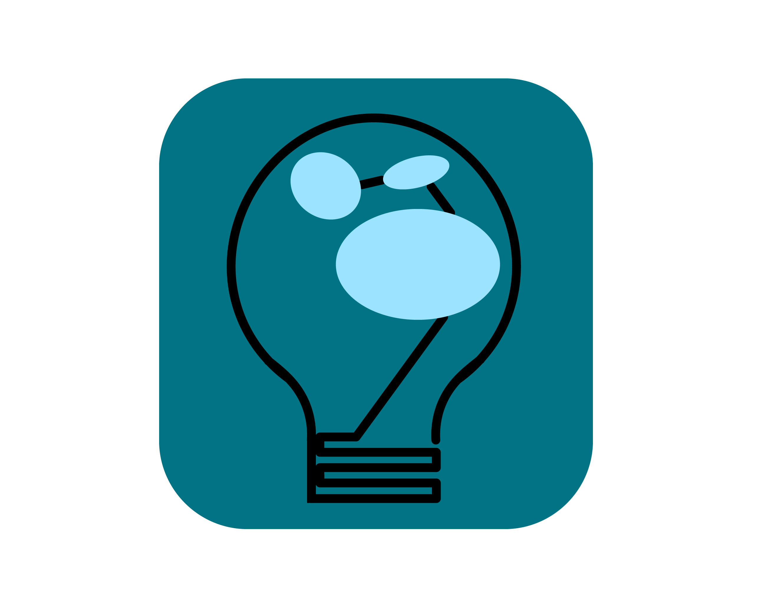
The inspiration behind my design concept is from Logseq meta skills- Providing a secured platform for content creators to learn and apply new knowledge.
The elements for the design concept are carefully laid out. The Bulb is a symbol of innovation and idea, a platform for content creators. Ideas and knowledge is embraced by thinkers and learners as represented by the three circles.
Twitter handle - @jodakh440
4 Likes