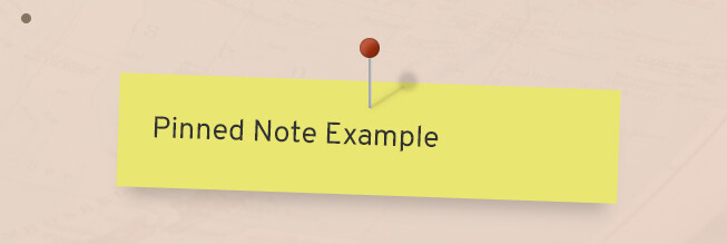
with the latest version of LS you have now a pinned note accessible thru the <pinned command
#+BEGIN_PINNED
Pinned Note Example
#+END_PINNED
and looks like this by default

the below css (done by @Piotr) will make it much cooler
thanks again @Piotr for that
.pinned {
    margin-top: 50px;
    position: relative;
  }

.pinned svg {
      display: none;
  }

.pinned {
    margin-top: 50px;
    position: relative;
  }
  .pinned > :last-child {
    color: #333;
    position: relative;
    width: 300px;
    margin: 0 auto;
    padding: 20px;
    box-shadow: 0 12px 10px -7px rgb(0 0 0 / 20%);
    background: #eae672;
    transform: rotate(2deg);
  }
  .pinned > :first-child {
    background-color: #aaa;
    display: block;
    height: 32px;
    width: 2px;
    position: absolute;
    left: 50%;
    top: -16px;
    z-index: 1;
    padding: 0;
  }
  .pinned > :first-child:after {
    background-color: #A31;
    background-image: radial-gradient(25% 25%, circle, hsla(0,0%,100%,.3), hsla(0,0%,0%,.3));
    border-radius: 50%;
    box-shadow: inset 0 0 0 1px hsla(0,0%,0%,.1),
                inset 3px 3px 3px hsla(0,0%,100%,.2),
                inset -3px -3px 3px hsla(0,0%,0%,.2),
                23px 20px 3px hsla(0,0%,0%,.15);
    content: '';
    height: 12px;
    left: -5px;
    position: absolute;
    top: -10px;
    width: 12px;
  }
  .pinned > :first-child:before {
    background-color: hsla(0,0%,0%,0.1);
    box-shadow: 0 0 .25em hsla(0,0%,0%,.1);
    content: '';
    height: 24px;
    width: 2px;
    left: 0;
    position: absolute;
    top: 8px;
    transform: rotate(57.5deg);
    transform-origin: 50% 100%;
  }