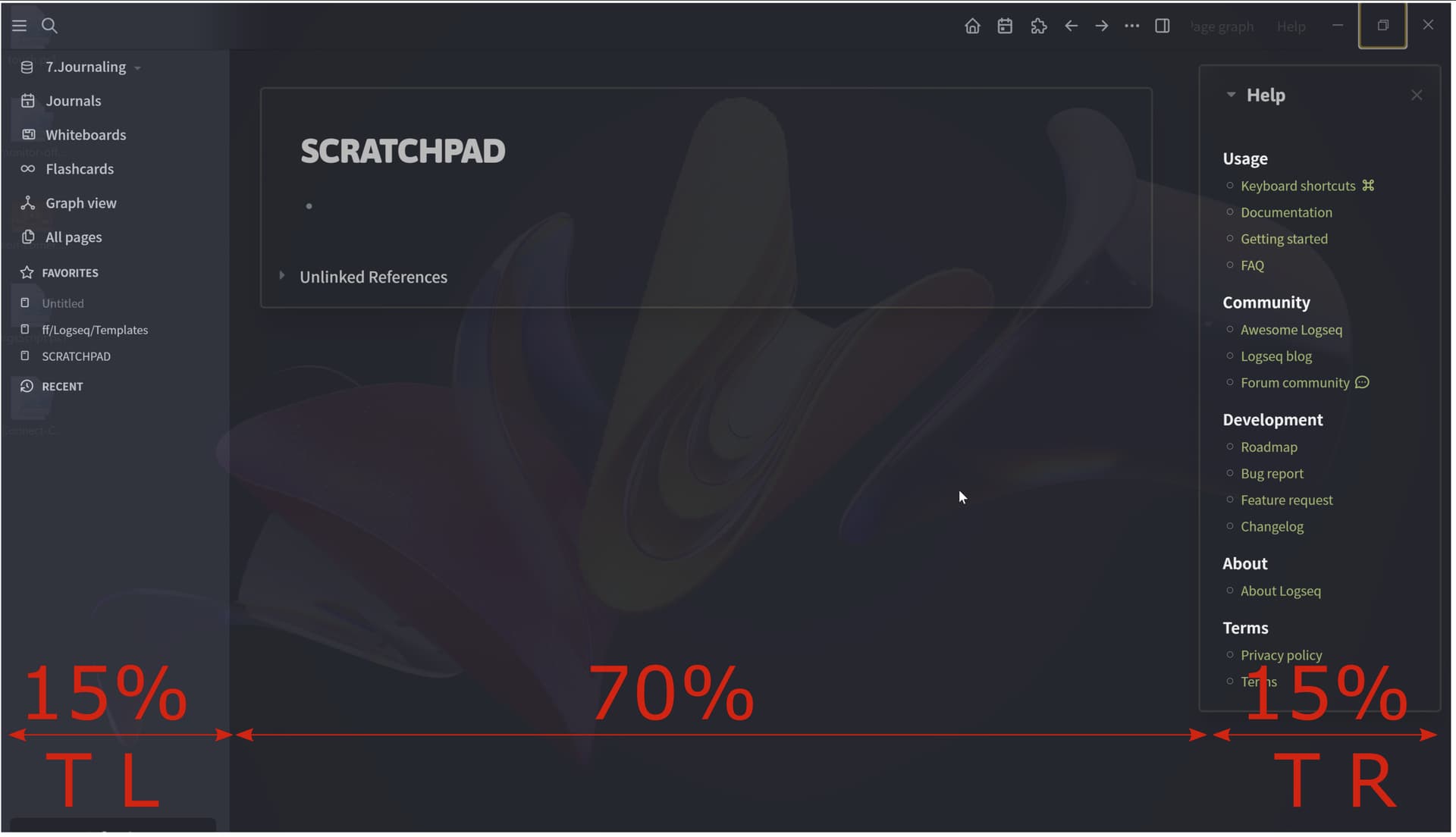
Don’t you guys feel that the right sidebar should receive some love on the UX front? Besides Functional aspects like User-Defined Right Sidebar Tabs and so on one aspect that I feel it’s lacking is a way to maximize it without using the mouse.
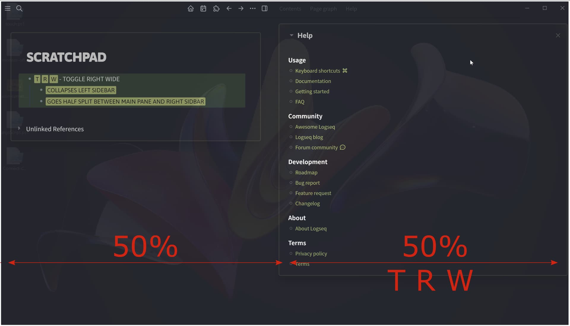
The way I see it, the Toggle Wide should get some more functionality like so: If you have the left sidebar on screen, a Toggle Right should show the right sidebar like it does now. But if you type T R W it should collapse the Left Sidebar automatically and you should have on screen, side-by side, a half-split between your center pane (main area) and the right sidebar. T R W again and the Right Sidebar goes to the default (narrow) stance. T R and it goes away.
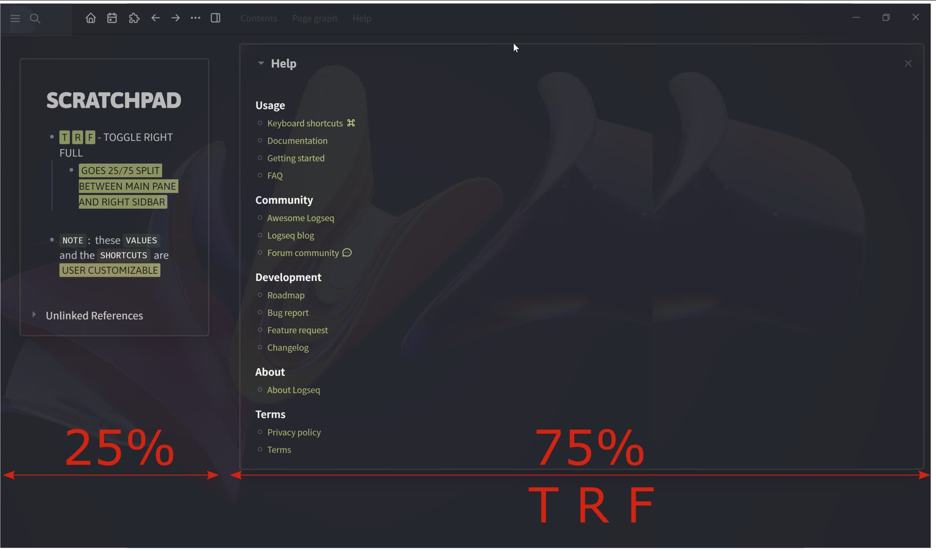
In the same way, T R F (Full) would make the Right Sidebar 75% of the screen real estate, leaving the Main area 25% and the Left Sidebar Hidden. If one does T L, then the Rifht Sidebar will go to the default width (25%).
Here’s a Visual of what I mean:
I am also contemplating on having a very narrow right sidebar collapsed state (toggled from settings, edn) that shows vertically the right sidebar tabs’ icons or vertical text like some other apps use.