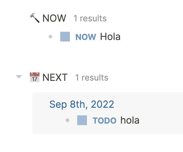
Hi all, I’m struggling to understand why the results of the two default journal queries are rendered in a different way:

Here the NOW task is from yesterday and the TODO task is for tomorrow. The source code of both queries look similar, blocks are coming from different journal pages in both cases… So why NEXT is rendered with a darker background similar to the one used for references while the NOW section has the same background than the rest of the page? Also, why there is no date in NOW even though the block is coming from yesterday while there is a date in NEXT?
Perhaps there is some CSS in place that depends on the query name, but that would be weird since the list of queries seems to be arbitrary.
It seems to be the result-transform clause. I’m not sure this behavior is expected, though. Perhaps sorting by priority should remove the context of the block, but it’s not crystal clear to me.
In case you don’t know where to find these queries, you can find them in the :default-queries key in the logseq/config.edn file. If there’s one format you prefer, you can essentially copy one over the other (but keeping the differences in keys like DOING vs. TODO).
Hi, thanks, yes, I’m relatively well-versed in advanced queries indeed, it just surprises me that results are shown in such a different way when the queries are almost the same, it probably has to be with the post-processing step (sort by priority).
I feel like a bit of a dufus, as I didn’t realize you were replying to yourself!
I’ve been slowly working through my understanding of advanced queries (and in particular rendering - like when are results grouped within pages vs. not?). I’d certainly be happy to have a study buddy.
I put a post here about what I’m trying to figure out: Working on a general approach to share a CV / Resume in Logseq
I’m actually more interested in blog-like activities at this point.
