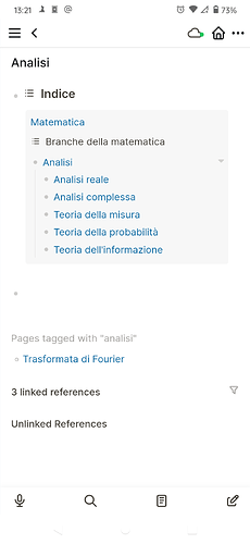
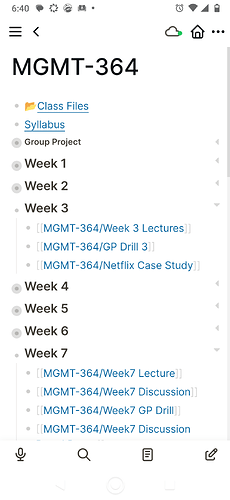
I’m also an “everything out” organizer. In a kitchen, I need either open shelves or cabinets with glass doors, in order to maintain order. I need see-through storage containers. I constantly need to see my organizational structure at a glance, in order to know where anything is, except for things I use constantly. I’m fine with messiness. I’m a messy-desk person. It just needs to be the kind of mess I can stand back and get the overview of. I rely on spatial overview first to get oriented to an information space, then after that, I can start sorting backwards in time.
Like in my email, sure I let things pile up temporally and scroll back through time to see & recall stuff, but I have (I’m almost embarassed to say) 23 email accounts, all entering my email client. Each account is one I give out for slightly different purposes, in different topical communities, and so in addition to searching back in time, I can check the inbox of any one account and get that slice of my world filtered for free.
So getting an overview of all my different reverse-chronological email streams in my unified inbox is crucial, as is my ability to select just one branch. A space-like, category-like organization needs to be primary, and then I can deal with time-based organization after that.
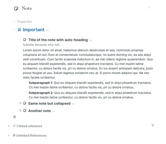
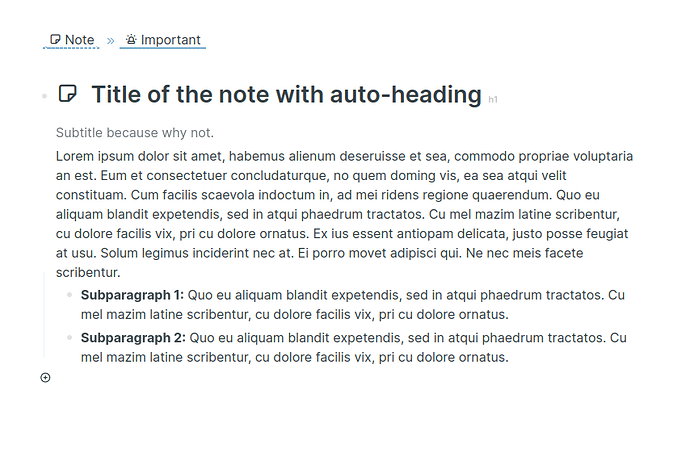
One response to this preference would be for the Logseq developers simply to assert that time-based sequences of logs is the primary navigational interface for Logseq (as per the name), and if I want a system that offers hierarchy of any sort as a primary navigational interface, I should look elsewhere.
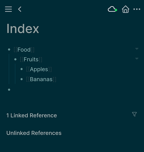
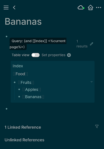
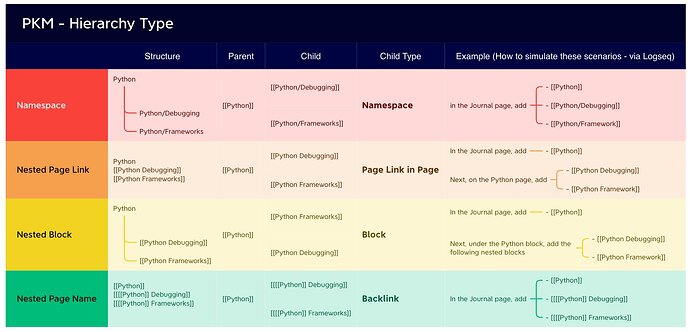
That’s fine, I guess. I will look elsewhere in that case. But I invested time and effort in Logseq over its alternatives precisely because of the “Hierarchies” section I saw on Logseq pages. I assumed that was a signal the concept would be considered important by the developers.
Also, empirical studies of PKM practices, as far as I am aware, support precisely the pattern of “some foldering, plus search and sort by time/histories”. People tend to use a few big buckets to get oriented to clumps of related information, but then check out filenames and recency of files and so on to find what they need.
So all of the many suggestions in this thread to provide better UIs for non-exhaustive, overlapping hierarchies is a very good fit for the kind of “sloppy but important” foldering that has been observed among users of classic desktop computers.
