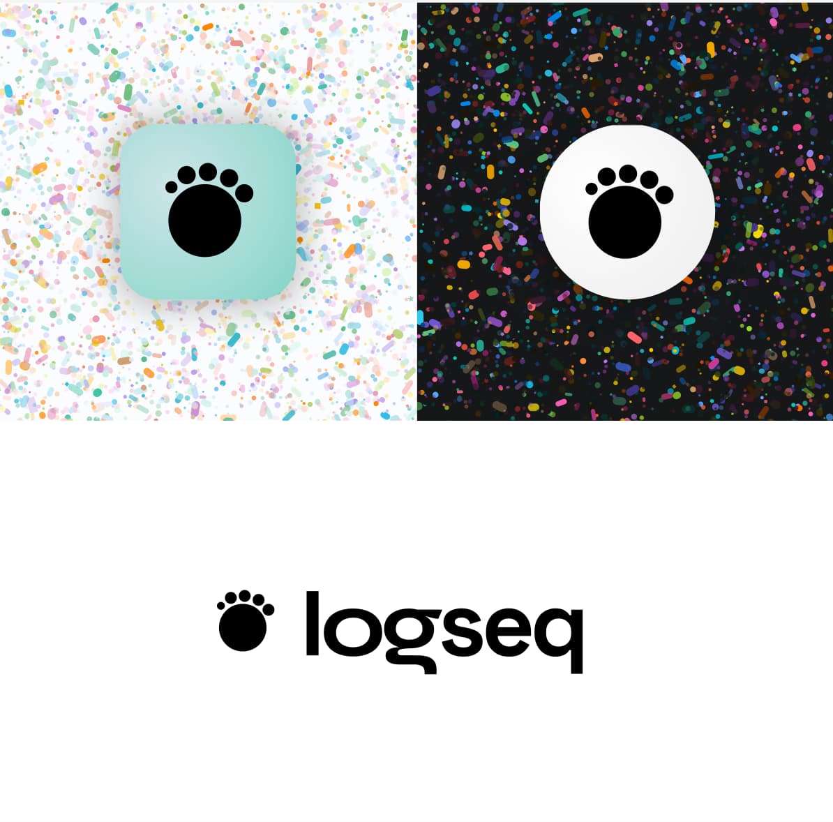
turning the paw into nodes
expanding on the bullet threading ideas from above

props
dots + line
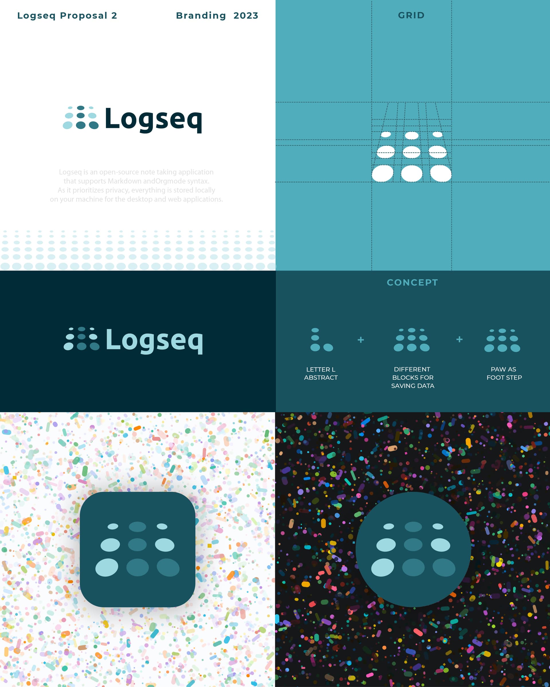
Original icon theme: The icon before Logseq is a footprint that tells the story of recording footprints and recording retained moments.
Theme of the current icon: Therefore, my icon is designed with the concept of time, stairs (the three small horizontal lines on the right are ascending steps), arrow direction, and add the initial L of Logseq.
I suggest that whichever new logo you choose, we should have the option to stay with the old logo.
Best
Derm
Hey there! ![]()
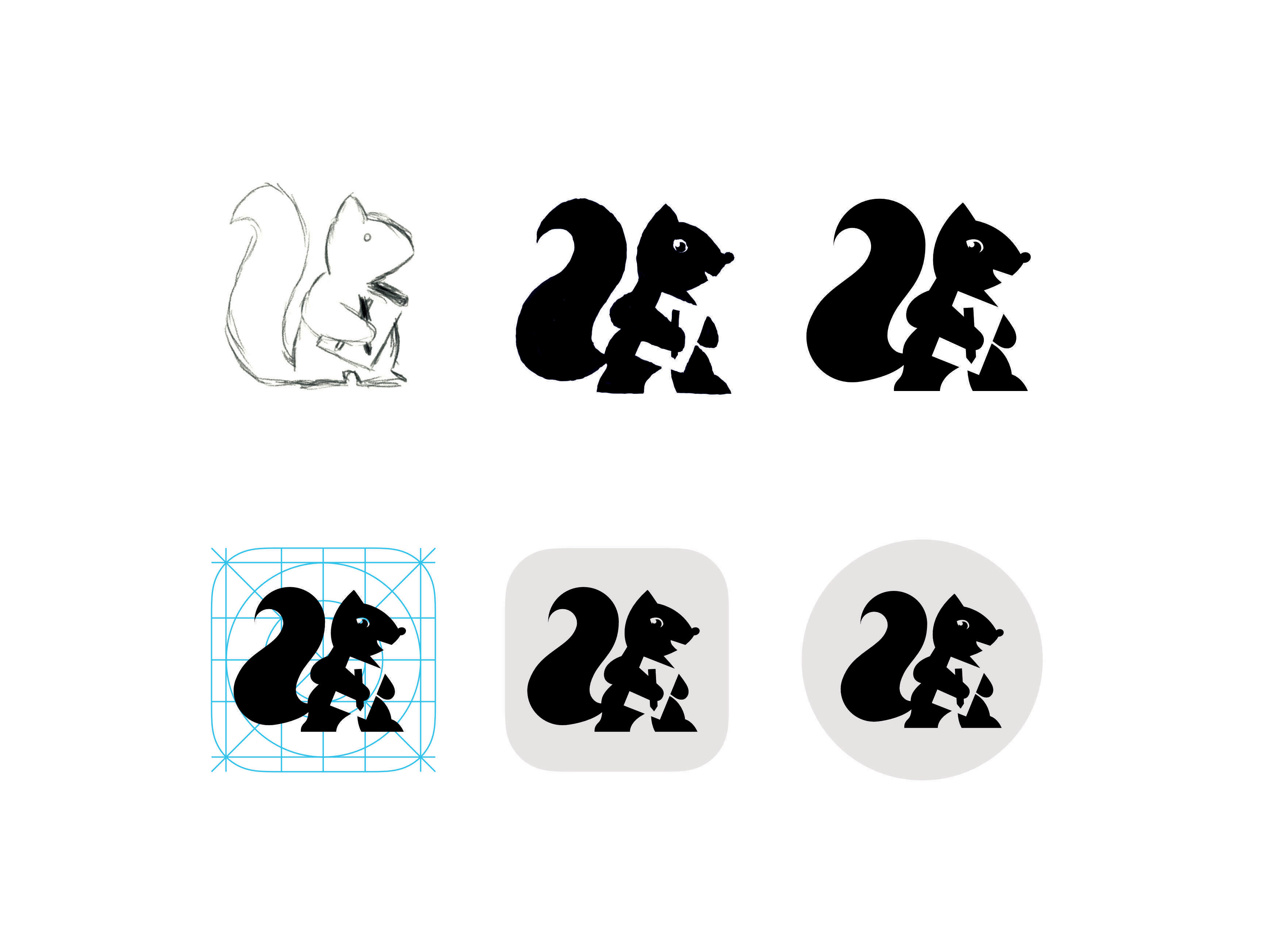
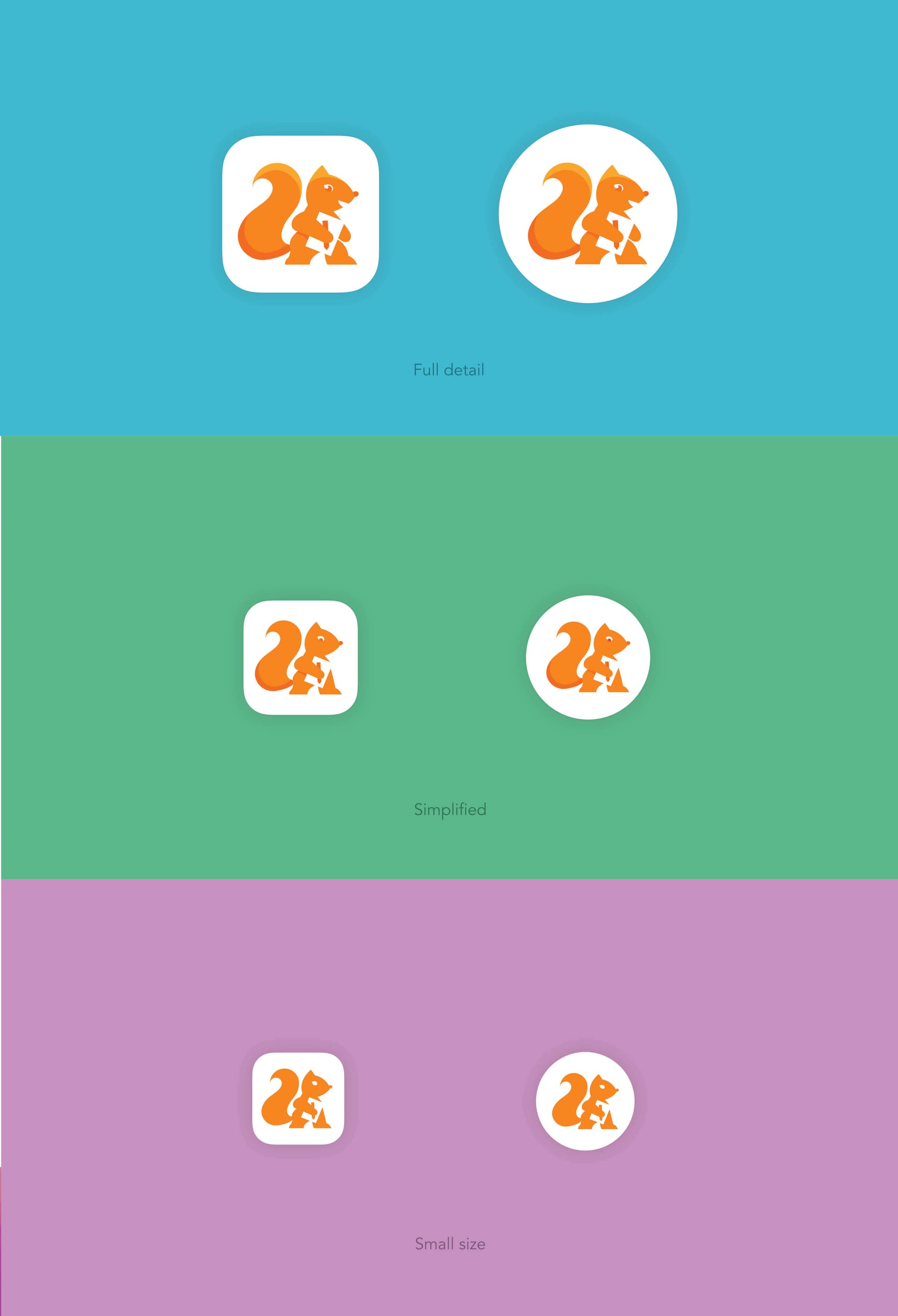
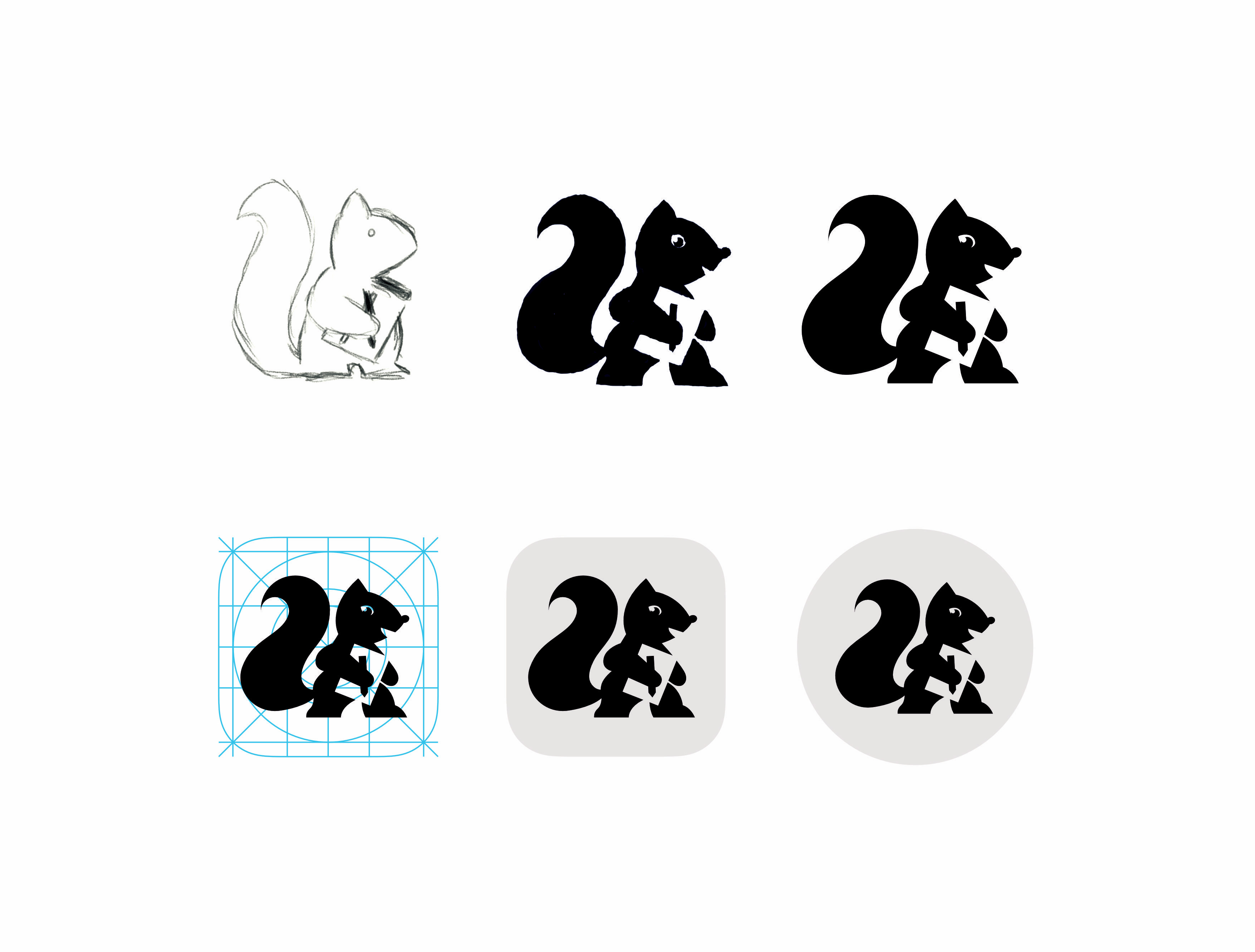
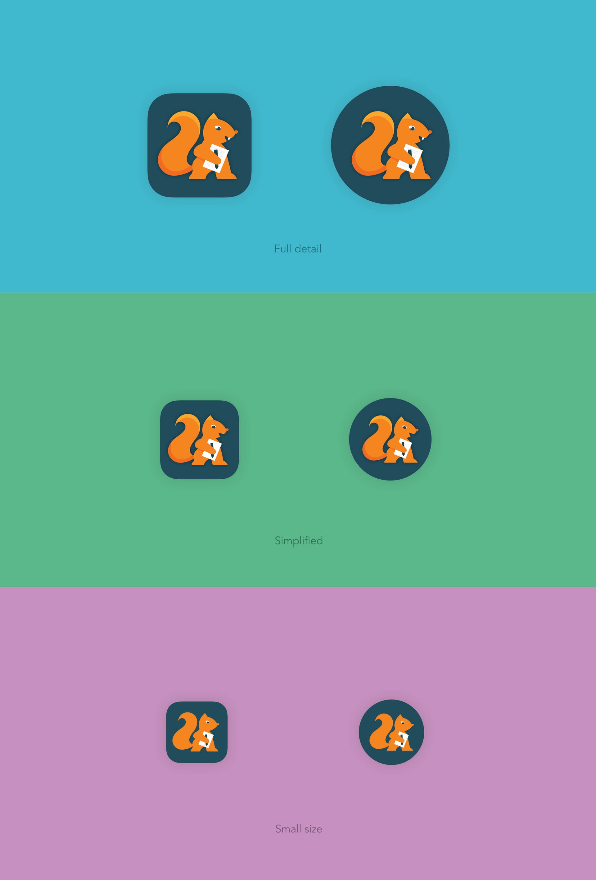
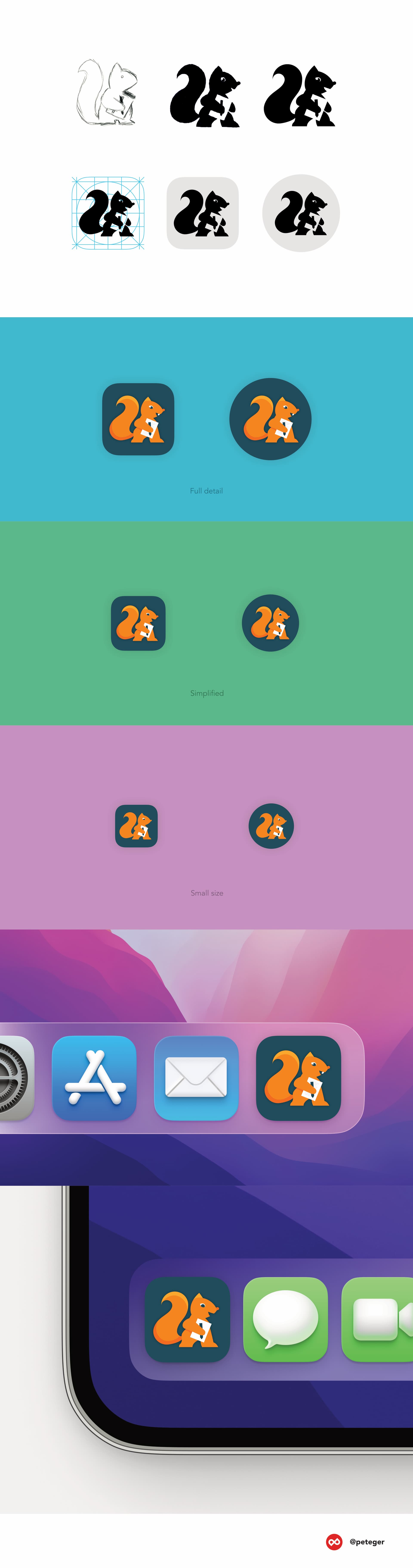
I have a suggestion for a Logseq icon: how about a mascot?
Many popular apps and platforms have one, such as Evernote (elephant), Twitter (bird), Mastodon (mastodon), Bear notes (bear), Hootsuite (owl), Ulysses (butterfly), and so on.
One of the animals that are known for their remarkable memory skills is – the squirrel. They collect and store their possessions in different places, just like we do with our notes in Logseq.
According to a BBC article, squirrels also tend to sort their nuts by type, a strategy called chunking. This helps them remember the location and quality of each nut better. Chunking is also useful for humans when we memorize lists of items by grouping them into categories or using tags.
I think squirrel is a great symbol for Logseq and its users ![]()
![]()
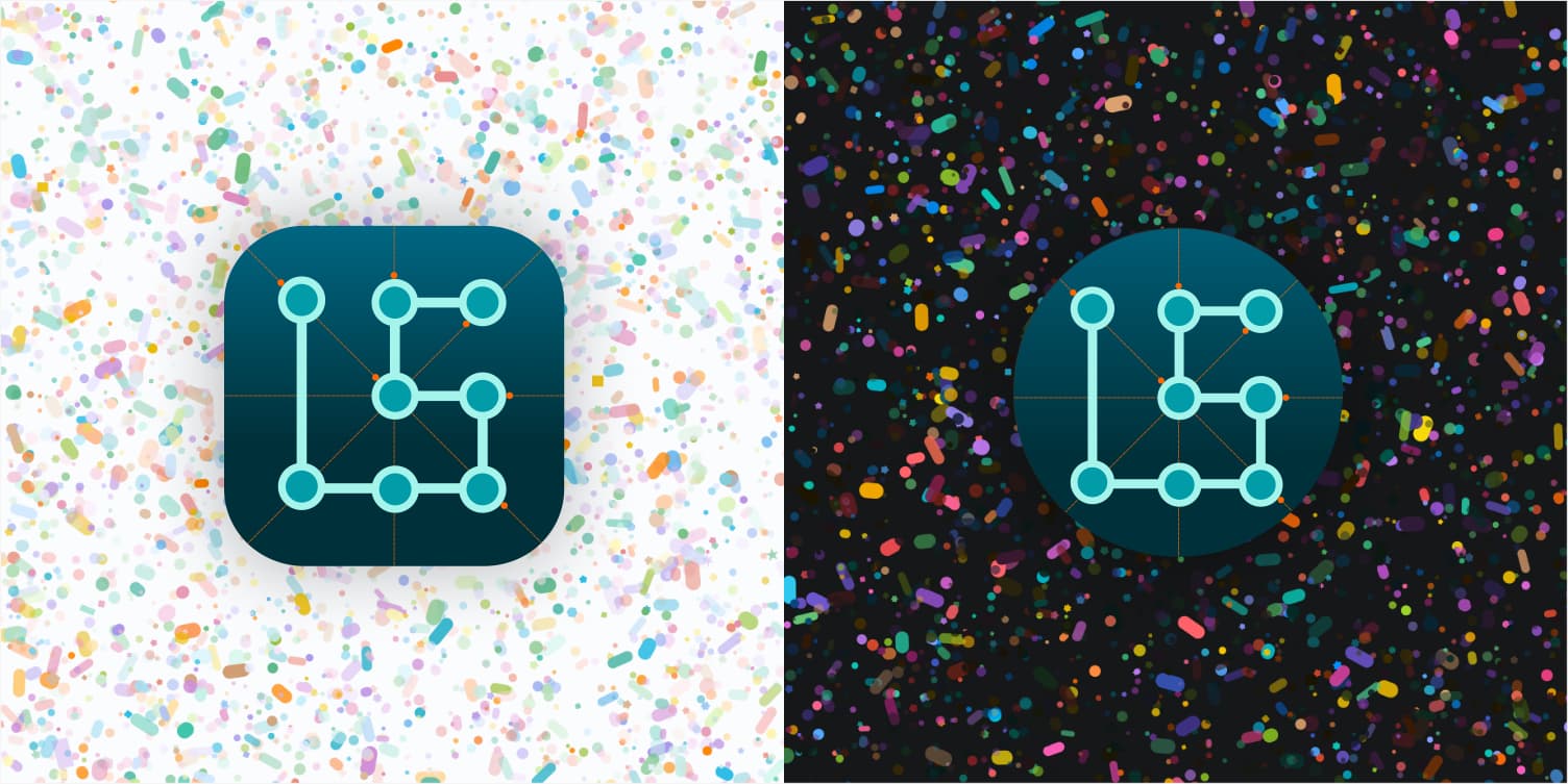
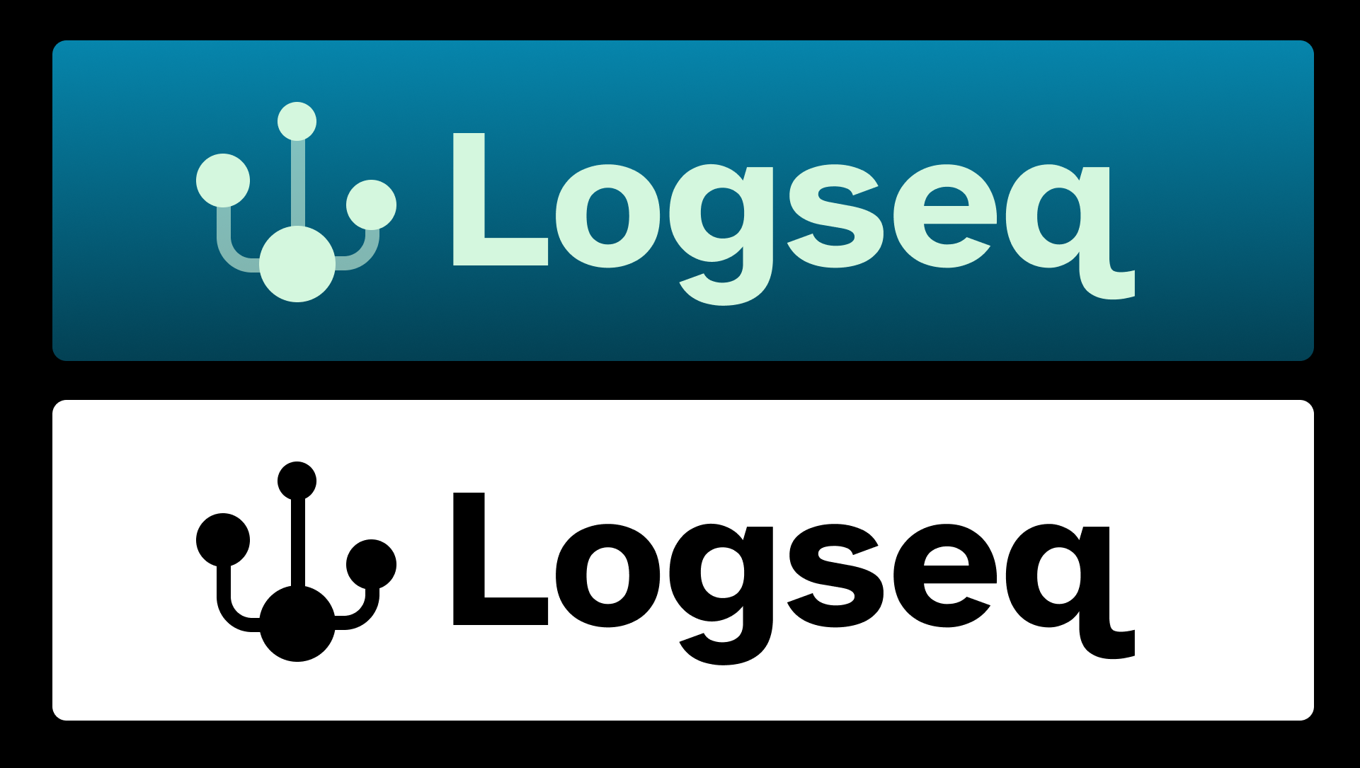
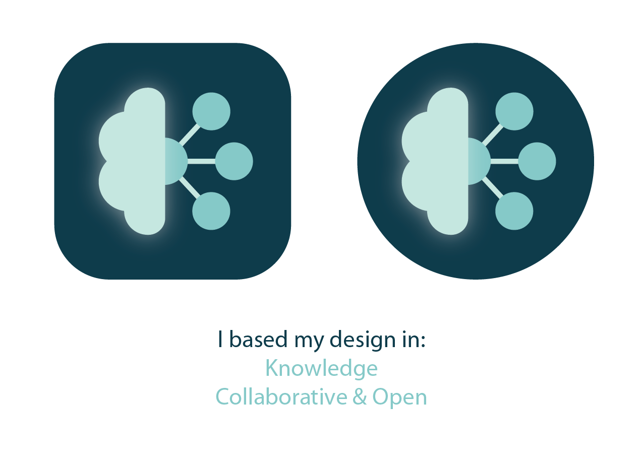
LogSeq is -at least for me- a rather difficult name; so emphasizing the name (abbreviation) seems appropriate. The path symbolizes also a linear Sequence of Logs, with some twists. The little orange dots with the dashed lines symbolize the (backlinks). With a little effort, you can see a living brain with neurons and dendrites ![]()
I feel that Logseq has a particularly challenging case for choosing a new logo. The community is eclectic and the app is rather complex to navigate. My understanding from the mentioned core values are that Logseq is heading in a direction that is truly open community-centric in its visuals - this today may be in stark contrast with the culture of power users (no issues necessarily, but the logo itself should not gatekeep).
On the other hand, the current logo is so abstract that it in itself has become part of its identity of “not quite knowing what it is” compared to other knowledge management apps.
Personally, I feel that there’s a balance to strike with honouring the current organic mark with a clear trend in this thread as well for something more refined and matching the local notation of Logseq and graphs and connections.
So here I present my entry:
The idea is to combine organic and notational elements that apply to so many of the Logseq promises and interactions.
I believe this organic-notational serves the story of intuitive knowledge management with the ‘tree’ offering structure and memory, with the variability of the elements showing adaptability, and accessibility. Well that’s it, I could go on for so much longer but I believe the point comes across: organic-notation. (sorry for repeating myself 50 times)
Lastly, I feel this logo also is pretty merch-able:)
love you all Logseq community, stay curious
Benj
@searleBenj
(+ coincidental trees → logs easter egg for the community <3)
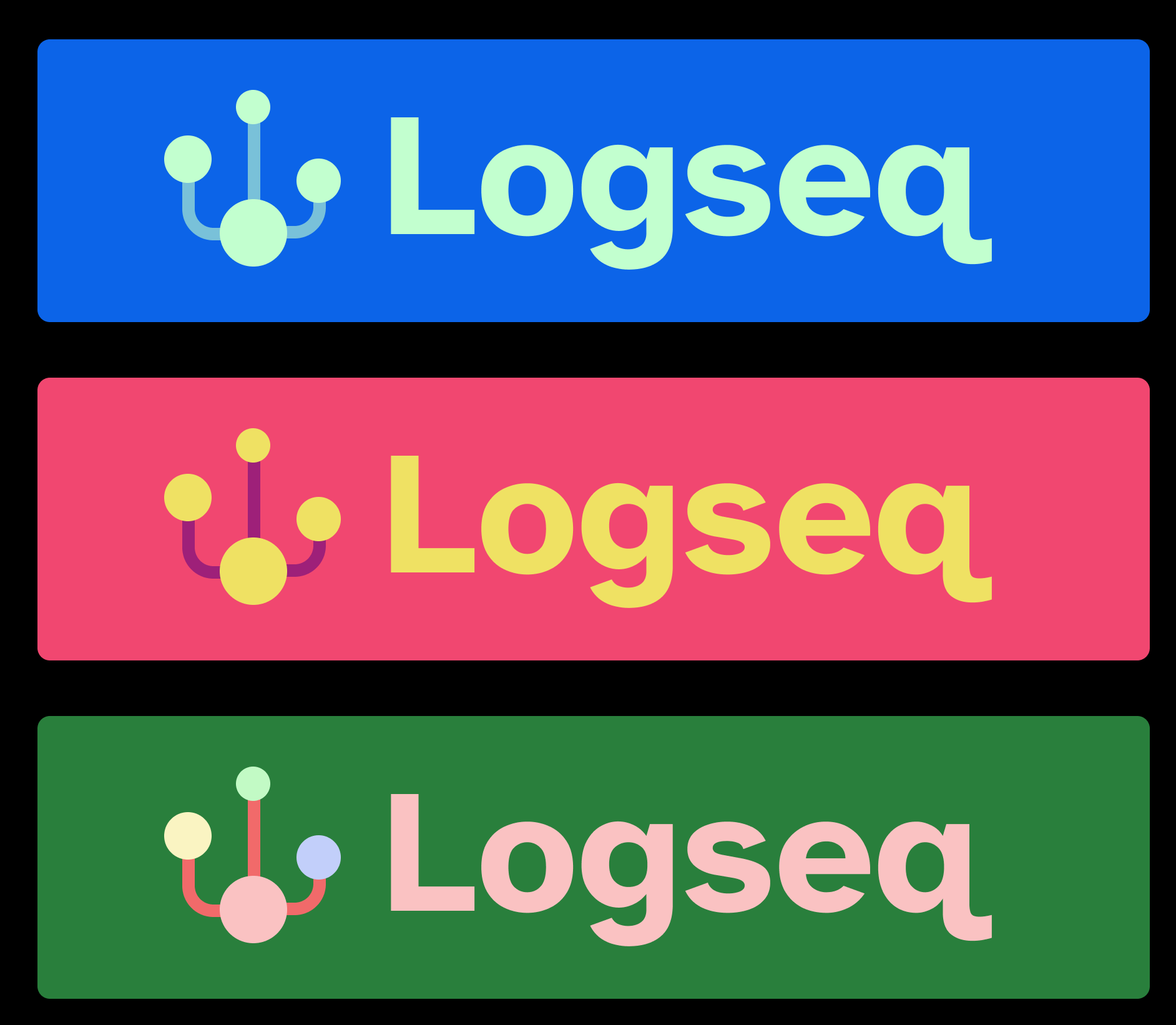
Edit: Not sure if its ok to keep editing the entry, hope it is. Just noticed a thread on the Discord about the logo being “theme-able”, so here’s a few examples of how it can be played around with! With 3 colour channels (or 6 if you consider each node being different colour!) there is a lot of space for playing with holiday or themes logos:) here are but a few to get people thinking!
Hello Bendy,
As per the Logseq user review and request, I tried to keep the old logo design concept, where I gave a new look to the footstep with a combination of the letter L and a different sector for saving data. You can see my idea in detail behind the design in the concept section of the presentation. Here, I tried to keep the logo as simple and minimal as possible, so the design could be applied in any format without losing any clarity.
I hope you will appreciate my proposal. I hope to hear from you soon.
Thank you
It’s like sticking up the middle finger ![]()
As some of you have asked, here is another take with the “traditional” LogSeq colour. ![]()
The “L” shape is great. Why not insert or even link it to a “Q” shape? The green should also be a bit brighter; pastel colours for a change!
I like the fact that it is lively and there is an emojicon we can related to as well!
In my intentions the open circle already resembles a Q and a magnifying glass as a symbol of queries

There was a dark time when everyone wondered what art was, that is, what were the properties that had to be present in something in the world for that something in the world to be considered art. This obviously implied either that those properties were already in the world and had to be discovered, or that someone in the world dictated what those properties were. So, while some dreamers and idealists were determined to make such a fantastic discovery, others, more pragmatic, took control of the situation and came to dictate the rules of art: if such and such a thing fulfills this and that, then it is art; and not otherwise. There came a day, however, when these artistic “authorities” lost their auctoritas. That day came when Arthur Danto changed the question, thus changing the paradigm:
it is not a question of knowing what art is, but of knowing why such and such a thing is art.
A paradigm shift that can be extrapolated to epistemology. In this realm of sages, Gettier’s definition according to which knowledge is a justified true belief dominates, a definition that tries to answer the question:
“What is knowledge?”
So, emulating Danto, we could change it to:
“Why is this knowledge?”
Thus: who could argue that among the range of answers to that question is the product that enables and generates Loqseq? Because, to paraphrase Mr. Ego:
“Not everyone can know, but a great connoisseur can come from anywhere”.
Our logo is a remote evolution from the primitive question “What is knowledge?”, thereby showing that this or that output is or can be knowledge regardless of what the sages say or do not say about what knowledge is.
@21213KK525 (Twitter profile)


