I like the fact that it is lively and there is an emojicon we can related to as well!
1 Like
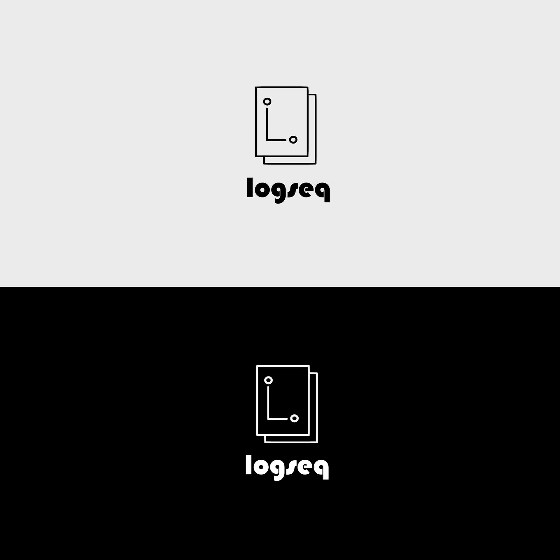
In my intentions the open circle already resembles a Q and a magnifying glass as a symbol of queries
3 Likes


There was a dark time when everyone wondered what art was, that is, what were the properties that had to be present in something in the world for that something in the world to be considered art. This obviously implied either that those properties were already in the world and had to be discovered, or that someone in the world dictated what those properties were. So, while some dreamers and idealists were determined to make such a fantastic discovery, others, more pragmatic, took control of the situation and came to dictate the rules of art: if such and such a thing fulfills this and that, then it is art; and not otherwise. There came a day, however, when these artistic “authorities” lost their auctoritas. That day came when Arthur Danto changed the question, thus changing the paradigm:
it is not a question of knowing what art is, but of knowing why such and such a thing is art.
A paradigm shift that can be extrapolated to epistemology. In this realm of sages, Gettier’s definition according to which knowledge is a justified true belief dominates, a definition that tries to answer the question:
“What is knowledge?”
So, emulating Danto, we could change it to:
“Why is this knowledge?”
Thus: who could argue that among the range of answers to that question is the product that enables and generates Loqseq? Because, to paraphrase Mr. Ego:
“Not everyone can know, but a great connoisseur can come from anywhere”.
Our logo is a remote evolution from the primitive question “What is knowledge?”, thereby showing that this or that output is or can be knowledge regardless of what the sages say or do not say about what knowledge is.
@21213KK525 (Twitter profile)
5 Likes


3 Likes

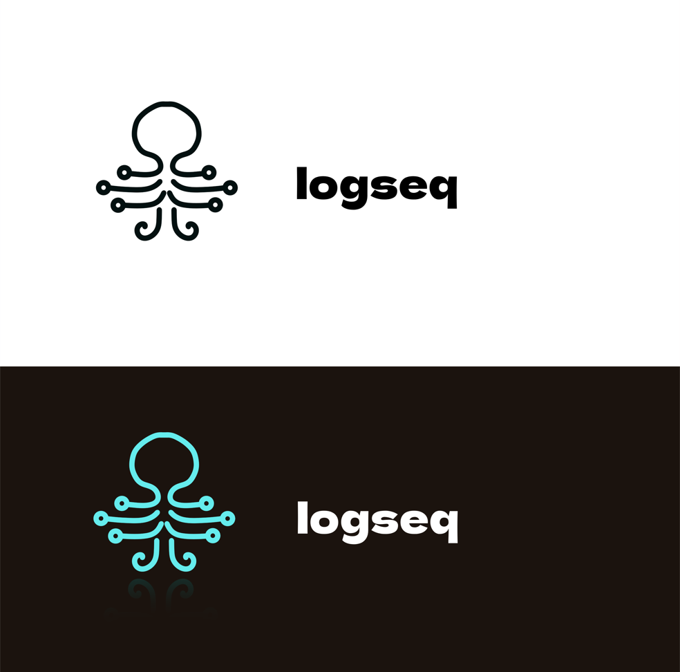
I wanted to use a minimal shape of an octopus combined with brain shape. Used bullet points at the end of it’s arms.
I think using an octopus shape is a good idea to represent adaptability, intelligence, organization and multitasking.
13 Likes
The Logo for Logseq must be simple, recognizable, and easy to expand. While the current use of deep green has improved the recognition of Logseq, I believe that the Logo could be more modern.
After reviewing feedback from many Logseq users, I have noticed that everyone appreciates the software’s compact yet powerful nature, as well as the graph feature that helps users to clarify connections and logic in their knowledge. This reminds me of the famous quote from Archimedes:
“Give me a lever long enough and a fulcrum on which to place it, and I shall move the world.”
In this proposed Logo, the letters “L” and “O” are extracted from “Logseq” and combined to represent the meaning of “accomplishing a great task with little effort by clever maneuvers” and these two letters are combined into an Sparkle of inspiration.
13 Likes
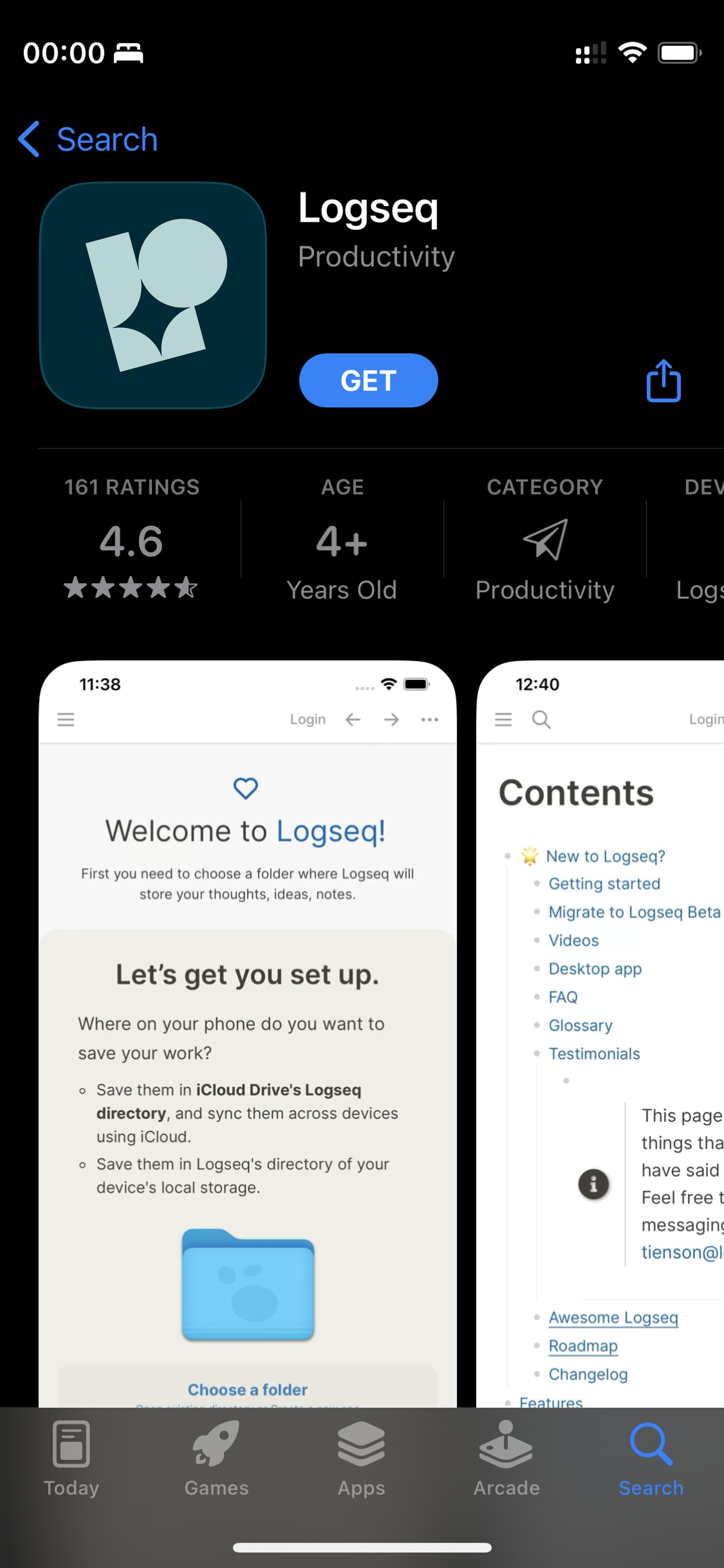
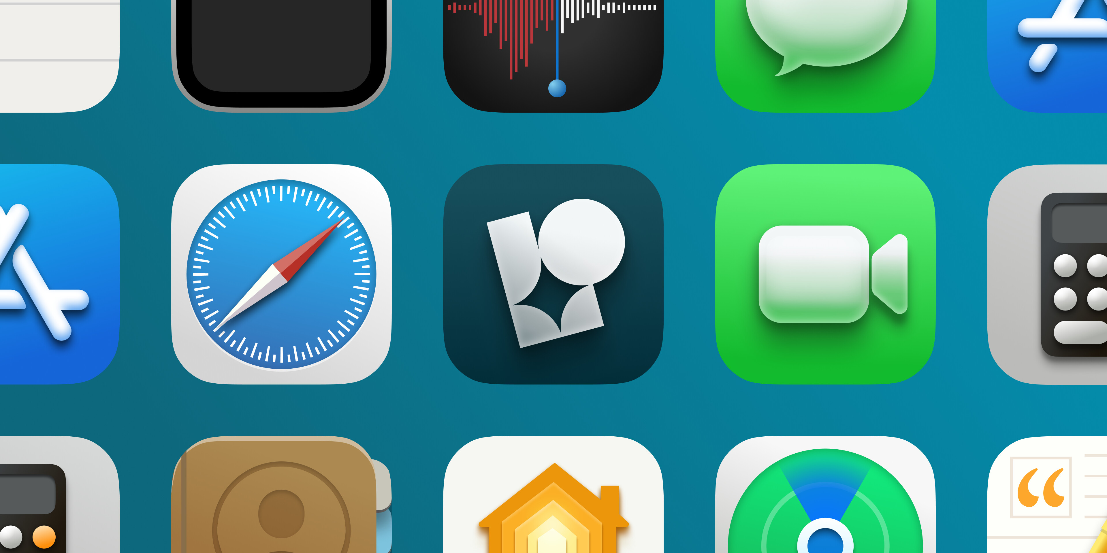
clever shape and it looks great with that gradient next to Facetime and other app icons ![]()
1 Like
cool submission! even though it’s very anorganic there is something about the simplicity of an isometric cube that i really appreciate. here is a quick riff on your direction, visually focusing more on a cutout in the cube.

4 Likes
more organic is great. i like that your graph/connected nodes metaphor doesn’t look like a virus.
1 Like
love the mascot idea and this is an adorable lil guy. here’s a lil riff on your direction of making it cute – but unfortunately the notebook is not as nicely cutout as in your approach.

4 Likes
It may be late for the contest, but if someone wants to draw a mascot (it doesn’t have to be an icon/logo, some projects like KDE have a logo and a mascot (Konqui, see below)), I suggest the Owl of Athena:
In Greek mythology, a little owl (Athene noctua) traditionally represents or accompanies Athena, the virgin goddess of wisdom, or Minerva, her syncretic incarnation in Roman mythology. Because of such association, the bird—often referred to as the “owl of Athena” or the “owl of Minerva”—has been used as a symbol of knowledge, wisdom, perspicacity and erudition throughout the Western world. (from Wikipedia)
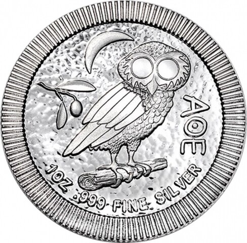


KDE mascot and logo:

5 Likes
The blog announcement is asking for “something that screams Logseq”. Simple abstract logos are very convenient, but when it comes to screaming Logseq:
- they are not loud: They capture very little compared to what Logseq is (not just a letter or shape or animal). Of course it is impossible to fit everything in a logo, but it is possible to fit a lot.
- they are not clear: They can easily resemble logos of other products (patterns, circuits, mascots etc.)
If screaming is indeed a prerequisite, something else is needed, maybe like the following:
Keep in mind that I’m not a designer myself (I’m a software engineer), so my submission doesn’t have the needed technical qualities (I’m sure that a designer can easily improve the colors, the proportions etc., to make it “pixel perfect”, “shine across all platforms” etc.), but it is shared for some other virtues that it has:
- It is made out of screen captures of Logseq itself.
- To those who have used Logseq, it should immediately feel familiar.
- It has a theoretical background created in Logseq itself (partially posted here).
- Can hardly be confused with anything else, it is most probably unique.
- It has only few chances of being imitated, it will probably remain unique.
- Contains both letters L and S (and in this order).
- Instead of using the letters themselves, imagining that they resemble something else, takes well-known things and shapes them like the letters.
- It shares some aspects with other submissions.
- This is a coincidence, but not a surprise, cause we all work with the same material.
- Comes with a rough animation as a bonus (attached lower).
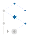
As about the explanation, this logo is meant to be read counter-clockwise:
- 2 o’clock: It all begins from a tiny isolated thought-point in the silent air of an empty whiteboard.
- Thoughts are flowing within streams of consciousness (special types of logs), forming temporary semi-coincidental patterns and relations (1 o’clock) to each other, two at a time.
- 12 o’clock: Dots get connected and the initial inkling gets gradually shaped to some heavier and more permanent liquid idea.
- Ideas are page-less symbols referenced in semantic associations of three.
- A standard association for any relation is to the point in time that it was made.
- 11 o’clock: Stronger bidirectional associations give birth to a solid crystallized concept, which begins a Logseq page (10 o’clock and down).
- At this point we leave the fluid whiteboard to enter a strict hierarchy.
- 8 o’clock: A line of blocks is gradually added to the page to keep short notes on either:
- the stream of consciousness, as a journal for future reference
- the concept, as its outline
- 7 and 6 o’clock: Notes get analyzed with deeper blocks, and enhanced with queries and other structures. The arrow in particular symbolizes:
- the ability to locate blocks
- the ability to expand blocks
- the ability to execute blocks:
- by human, as TODO items
- by automation, as code (you have seen nothing yet)
- 5 and 4 o’clock: As notes mention other ideas, often in similar ways, they become more verbose and have to reference other pages, which need their own work. Each concept contains multiple notes, thus the things that need processing start forming queues, even if more than one is worked at once with.
- At this point we leave the strict page to enter a flexible knowledge-graph.
- Center: The logical consequence of the above process is that new ideas get discovered. The asterisk in particular symbolizes:
- a newly discovered idea, either:
- a missing link or pointer that contributes to the solution of a problem
- a creative concept, full of receptors for links to other concepts
- the central fact about Logseq that it is like a wildcard, i.e. a platform that could support anything
- the multiplication of ideas described in the next step
- a newly discovered idea, either:
- Back to 10 o’clock: When a new idea is fertile enough to conceive again, the effectiveness of the process gets confirmed.
- The loop closes and further iterations may enrich the knowledge.
This logo “captures the Logseq essence”, which in my opinion is in combining the strengths of complimentary concepts:
- flexible intuitive graphs with strict logical outlines
- concept-pages with note-blocks
Of course Logseq has more strengths:
- open-source with secure privacy (maybe the hexagon, anchored on its left, but open on its right)
- human ingenuity with AI (maybe the concentric circles)
- individual persons with online community (maybe the move from one dot to a polygon of many)
In each of these pairs, each part blends with and extends the other. The key to successful knowledge management is the smooth collaboration of such pairs, so this logo is about the harmonious blending of:
- bigger picture with details
- simplicity with complexity
- symmetry with asymmetry
- balance with hanging
- stability with mobility
- strictness with flexibility
- solidity with fluidity
- L with S
The old logo and some submissions are trying to be playful. This hides the fact that Logseq can be a seriously powerful tool. Instead of being playful itself, the suggested logo ignites the playfulness of the viewer, to intuitively think that there is something awaiting to be discovered. Back to the blog announcement, it may not “make jaws drop” (hardly possible for a logo), but it does “make heads turn”. Cause when looking at it, the eye doesn’t stay idle, it keeps exploring for recognizable shapes, trying different perceptions. What do your eyes make of it? Can you see a cube under construction? Maybe an artificial crystal (better than obsidian)? What about a molecule? Organic or inorganic? Could it be the eye of a reptile? Open or closed? Or is it a rat or an underground drill? Or an anglerfish or some kind of robot? Or a rotated boat or christmas elf? It is none of them, it is just a collapsed outline on the left pane combined with a light graph on the right pane. It is very specific. And yet at the same time, because of the carefully chosen type of blending, it is a refreshing spring of all the mentioned things, and also modular enough to make it something else, just as Logseq inspires genius creativity and supports limitless extensibility. Feed it with the obvious in open-minded ways, to reward you with insight in unexpected ways.
For me Logseq is not a static knowledge base (i.e. an advanced wiki-like reference), but a dynamic intellectual process, a place where the mind not only cultivates ideas, but gets cultivated itself, while at the same time it gets exercised and stays fit. This is impossible to capture in a still image, even with the provided explanation. For that reason, I have prepared the following one-minute animation that constructs the logo by simulating the process which goes on in my mind when using Logseq:

If you watch the full animation 2-3 times, it should “leave a lasting impression”. Then if you look again at the logo, it should “scream Logseq”, both loud and clear.
4 Likes
RINGS
Design ideas
- The nodes connected by rings reflect the characteristics of logseq knowledge management,Connect everyings you think.
- Surrounded by layers, reflecting the security of logseq data storage, Local & Cloud Sync.
- Easy and minimalist patterns, deepen the impression.
Icons
- normal
- Icon centering style
- icon mixed style
Examples
3 Likes
Very cute octopus, the concept is also very reasonable, this design looks great
2 Likes
Distinct and it feels very “Logseq”! I really like it!
1 Like
Hey Everyone!
Longtime Logseq user and wanted to throw my design into the ring! My goal for this one is to employ a clean, modern, simple and sophisticated design that pays homage to the original design. You can see the old design in the circular aspect, and if you look you can see IO (as in input/output) represented in various ways, to signify the customizable, programmable nature of Logseq. The minimalist design reflects the app’s emphasis on simplicity and ease of use, while the sophisticated aesthetic conveys the app’s commitment to providing a professional and secure note-taking experience. Overall, the new logo perfectly captures the essence of LogSeq and its dedication to providing a top-notch note-taking experience for its users.
Thanks for checking it out!


13 Likes
Another idea I was playing with. Combination of the letters L and S. I wanted to give it a strong form without losing simplicity.
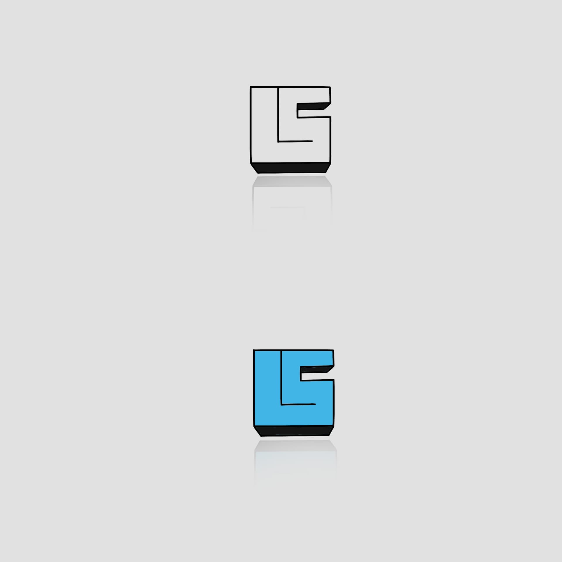
2 Likes
Hey all -
I have to say, I’ve been loving checking this thread every day. So many of these designs are incredible, and it’s been a bunch of fun to see what the community thinks of when it comes to Logseq!
We’ve been a little quiet on our front because we wanted to get an unbiased opinion of what came to your mind ~ but with the clock coming to a close, we wanted to share a few insights to inspire your designs further. We are sharing this not as a critique but as a nudge towards a shared vision ![]()
From the submissions we have received, we’ve seen many designs featuring thin lines and literal representations of the Logseq application. While we appreciate the detail and dedication these designs demonstrate, we would like to encourage exploration of a slightly different approach.
Our vision
We find ourselves leaning towards an icon that is more abstract, using bolder shapes and lines. Such an icon can create a strong visual impact and is more recognizable at smaller sizes, which is a crucial aspect for app icons. We’re also partial to bolder designs that have room to support shadows or gradients, as we start to introduce new colors and depth to our application, and are less concerned about capturing letters from “Logseq” as we’re hoping to grow this brand to enough recognizability to not need the hints.
One of our further out conversations has been about the use of the “![]() ” emoji on Twitter to refer to Logseq, and internally we’ve have quite a few spikes to try and see if there’s something there (admittedly, a log is very hard to make visually interesting and distinct
” emoji on Twitter to refer to Logseq, and internally we’ve have quite a few spikes to try and see if there’s something there (admittedly, a log is very hard to make visually interesting and distinct ![]() ).
).
Remember, none of these are strict guidelines, but just communicating some of our thoughts internally. The winners of the community prizes will be largely judged by the community anyways ~ so don’t feel you have to put too much stock in our opinion.
Contest deadline extended by one week
We will also be extending the contest by one week (more public announcement coming soon) so anyone who would like to has time to take this advice and run with it. We’ll be responding a lot more to designs, and providing more of our own thoughts, if that is alright with everyone!
We wholeheartedly encourage individual creativity and personal interpretation, and really, truly have enjoyed watching the submission come in. Thank you so much to everyone who has participated, and I hope everyone else is as excited as we are.
6 Likes