The blog announcement is asking for “something that screams Logseq”. Simple abstract logos are very convenient, but when it comes to screaming Logseq:
- they are not loud: They capture very little compared to what Logseq is (not just a letter or shape or animal). Of course it is impossible to fit everything in a logo, but it is possible to fit a lot.
- they are not clear: They can easily resemble logos of other products (patterns, circuits, mascots etc.)
If screaming is indeed a prerequisite, something else is needed, maybe like the following:
Keep in mind that I’m not a designer myself (I’m a software engineer), so my submission doesn’t have the needed technical qualities (I’m sure that a designer can easily improve the colors, the proportions etc., to make it “pixel perfect”, “shine across all platforms” etc.), but it is shared for some other virtues that it has:
- It is made out of screen captures of Logseq itself.
- To those who have used Logseq, it should immediately feel familiar.
- It has a theoretical background created in Logseq itself (partially posted here).
- Can hardly be confused with anything else, it is most probably unique.
- It has only few chances of being imitated, it will probably remain unique.
- Contains both letters L and S (and in this order).
- Instead of using the letters themselves, imagining that they resemble something else, takes well-known things and shapes them like the letters.
- It shares some aspects with other submissions.
- This is a coincidence, but not a surprise, cause we all work with the same material.
- Comes with a rough animation as a bonus (attached lower).
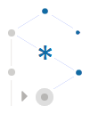
As about the explanation, this logo is meant to be read counter-clockwise:
- 2 o’clock: It all begins from a tiny isolated thought-point in the silent air of an empty whiteboard.
- Thoughts are flowing within streams of consciousness (special types of logs), forming temporary semi-coincidental patterns and relations (1 o’clock) to each other, two at a time.
- 12 o’clock: Dots get connected and the initial inkling gets gradually shaped to some heavier and more permanent liquid idea.
- Ideas are page-less symbols referenced in semantic associations of three.
- A standard association for any relation is to the point in time that it was made.
- 11 o’clock: Stronger bidirectional associations give birth to a solid crystallized concept, which begins a Logseq page (10 o’clock and down).
- At this point we leave the fluid whiteboard to enter a strict hierarchy.
- 8 o’clock: A line of blocks is gradually added to the page to keep short notes on either:
- the stream of consciousness, as a journal for future reference
- the concept, as its outline
- 7 and 6 o’clock: Notes get analyzed with deeper blocks, and enhanced with queries and other structures. The arrow in particular symbolizes:
- the ability to locate blocks
- the ability to expand blocks
- the ability to execute blocks:
- by human, as TODO items
- by automation, as code (you have seen nothing yet)
- 5 and 4 o’clock: As notes mention other ideas, often in similar ways, they become more verbose and have to reference other pages, which need their own work. Each concept contains multiple notes, thus the things that need processing start forming queues, even if more than one is worked at once with.
- At this point we leave the strict page to enter a flexible knowledge-graph.
- Center: The logical consequence of the above process is that new ideas get discovered. The asterisk in particular symbolizes:
- a newly discovered idea, either:
- a missing link or pointer that contributes to the solution of a problem
- a creative concept, full of receptors for links to other concepts
- the central fact about Logseq that it is like a wildcard, i.e. a platform that could support anything
- the multiplication of ideas described in the next step
- a newly discovered idea, either:
- Back to 10 o’clock: When a new idea is fertile enough to conceive again, the effectiveness of the process gets confirmed.
- The loop closes and further iterations may enrich the knowledge.
This logo “captures the Logseq essence”, which in my opinion is in combining the strengths of complimentary concepts:
- flexible intuitive graphs with strict logical outlines
- concept-pages with note-blocks
Of course Logseq has more strengths:
- open-source with secure privacy (maybe the hexagon, anchored on its left, but open on its right)
- human ingenuity with AI (maybe the concentric circles)
- individual persons with online community (maybe the move from one dot to a polygon of many)
In each of these pairs, each part blends with and extends the other. The key to successful knowledge management is the smooth collaboration of such pairs, so this logo is about the harmonious blending of:
- bigger picture with details
- simplicity with complexity
- symmetry with asymmetry
- balance with hanging
- stability with mobility
- strictness with flexibility
- solidity with fluidity
- L with S
The old logo and some submissions are trying to be playful. This hides the fact that Logseq can be a seriously powerful tool. Instead of being playful itself, the suggested logo ignites the playfulness of the viewer, to intuitively think that there is something awaiting to be discovered. Back to the blog announcement, it may not “make jaws drop” (hardly possible for a logo), but it does “make heads turn”. Cause when looking at it, the eye doesn’t stay idle, it keeps exploring for recognizable shapes, trying different perceptions. What do your eyes make of it? Can you see a cube under construction? Maybe an artificial crystal (better than obsidian)? What about a molecule? Organic or inorganic? Could it be the eye of a reptile? Open or closed? Or is it a rat or an underground drill? Or an anglerfish or some kind of robot? Or a rotated boat or christmas elf? It is none of them, it is just a collapsed outline on the left pane combined with a light graph on the right pane. It is very specific. And yet at the same time, because of the carefully chosen type of blending, it is a refreshing spring of all the mentioned things, and also modular enough to make it something else, just as Logseq inspires genius creativity and supports limitless extensibility. Feed it with the obvious in open-minded ways, to reward you with insight in unexpected ways.
For me Logseq is not a static knowledge base (i.e. an advanced wiki-like reference), but a dynamic intellectual process, a place where the mind not only cultivates ideas, but gets cultivated itself, while at the same time it gets exercised and stays fit. This is impossible to capture in a still image, even with the provided explanation. For that reason, I have prepared the following one-minute animation that constructs the logo by simulating the process which goes on in my mind when using Logseq:

If you watch the full animation 2-3 times, it should “leave a lasting impression”. Then if you look again at the logo, it should “scream Logseq”, both loud and clear.