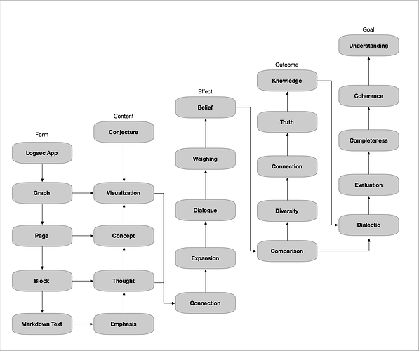
New user here. I have been working on a graph about Logseq itself. Of course Logseq can be used (and abused) in many ways, which are not always compatible with each other, so my work is primarily about my own use. Therefore, this is a disclaimer that the content of my work is subjective, not necessarily agreeing with some official description of Logseq.
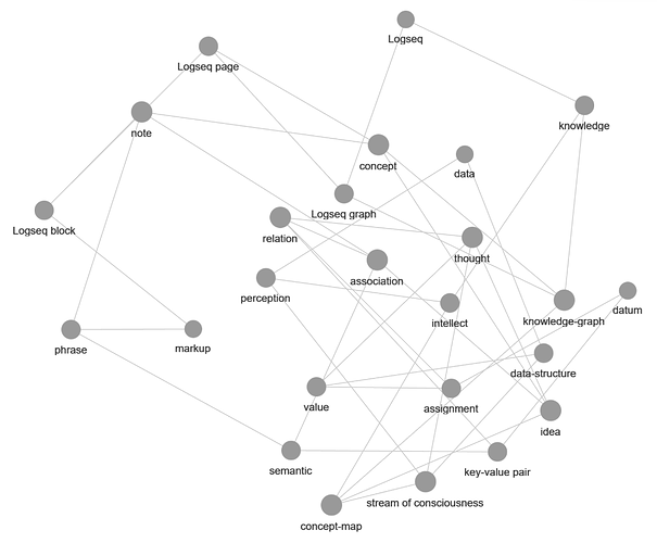
The default Graph view is pretty much unusable, even for a graph of limited connections:
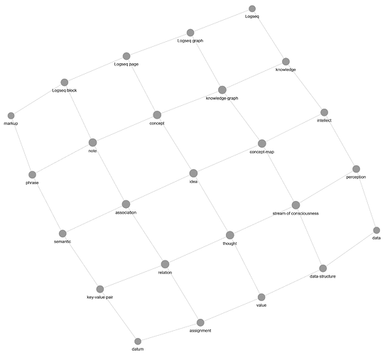
Arranging the nodes is difficult but possible, while precision is impossible and the space is used inefficiently:
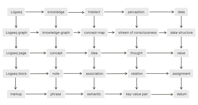
In the end I have created a whiteboard to position the nodes as intended:
This is not perfect, but does the job well. Given some conventions, it could even be automated. The arrows are a nice improvement, they clarify that this diagram has two logical dimensions. Their abstract meaning is that each node:
- is about and can be understood in terms of the nodes on its right
- contains and can be analyzed down to the nodes below it
Therefore, this diagram defines and analyzes the top-left node, which is Logseq. With that meaning in mind, I think that the result has the explanatory value of several pages of descriptive text. At the very least it can tie all that text together, especially for new users, who are typically overwhelmed and without orientation.
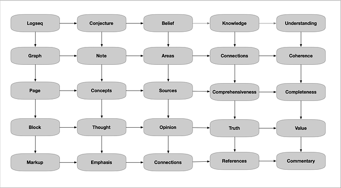
Nevertheless, with something as rich as Logseq, a single diagram cannot hold every concept, so here are some more concepts, as seen from the perspective of the knowledge column:
- phrase level: references, tags, other links
- note level: TODOs, queries, other code
- concept level: outlines, journals, files, other modules
- graph level: whiteboards, folders, other packages
- Technically, every item at this level is also a file, but conceptually it contains other files.
- between graph level and knowledge level: namespaces and other domains
Thoughts are welcome.
