I really like the playfulness of all these letters! Did you draw all the letters yourself?
Either way, well done!
I really like the playfulness of all these letters! Did you draw all the letters yourself?
Either way, well done!
hexagons are the bestagons
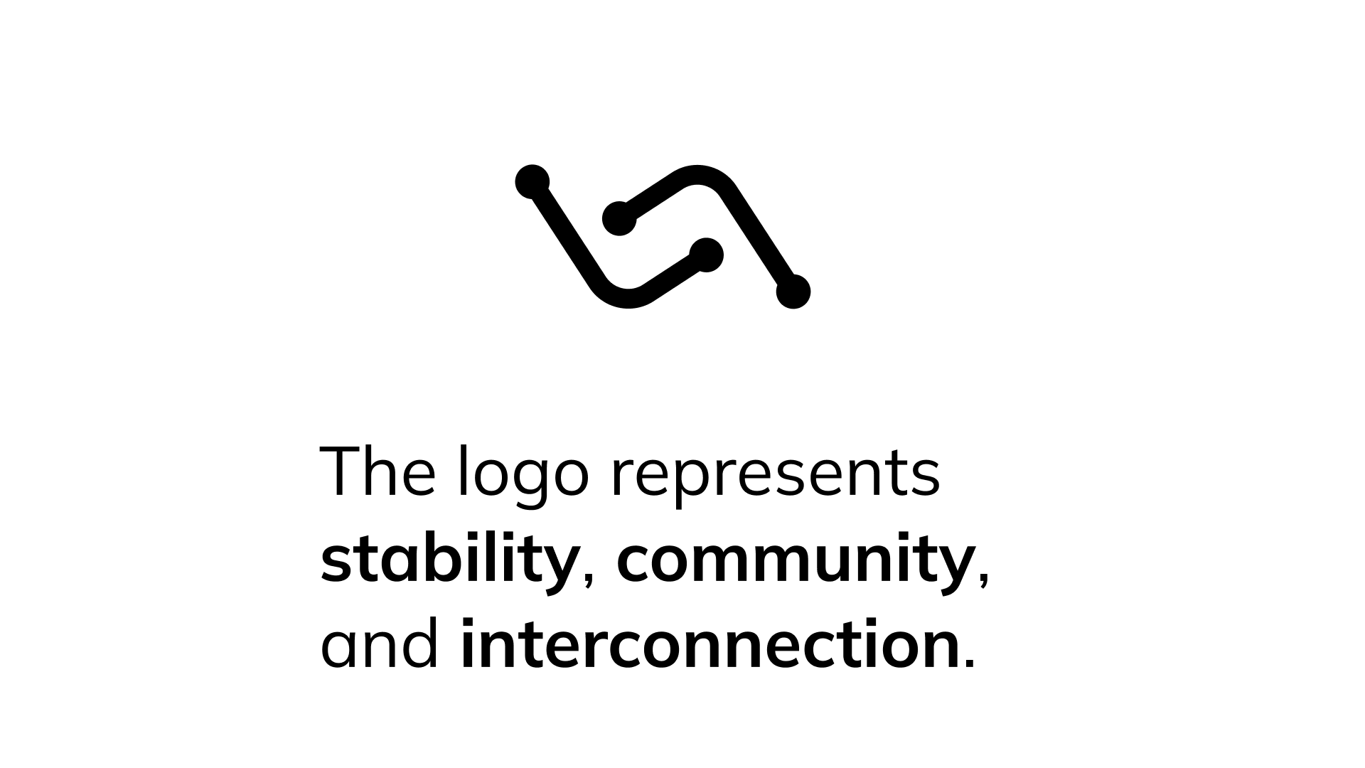
Well, I think you’ve definitely screamed Logseq the loudest, that’s for sure ![]() I love the animation and the amount of thought you’ve put into it
I love the animation and the amount of thought you’ve put into it
Can I just say ![]() without any other comment?
without any other comment?
I love the story, and this is such a unique logo! ![]()
I have a lot of favorites on this thread, but I have to say, this is definitely one of them ![]()
Thanks Ben, for sharing this update! I’d like to add that while we certainly value and appreciate impeccably polished designs, as anyone would, I’d also encourage everyone to share their napkin sketches or raw concepts. After all, the main intent of this contest from my perspective is to gather a diverse range of metaphors and form language inspirations for an updated Logseq brand. So for the last week, do not hesitate to share your Logseq logo ideas in their nascent stages!
Hi all, here’s a quick sketch. Yeah, it’s based on the boring bullet points. But I really like the minimalism of Logseq, and I think it has a very distinct color scheme (see: logos of other note taking apps)
For the lovers of the ![]() :
:
Feel free to improve the idea!
Edit:
but I’d use this version only when strictly needed:
We could say that the formation of knowledge consists of two phases:
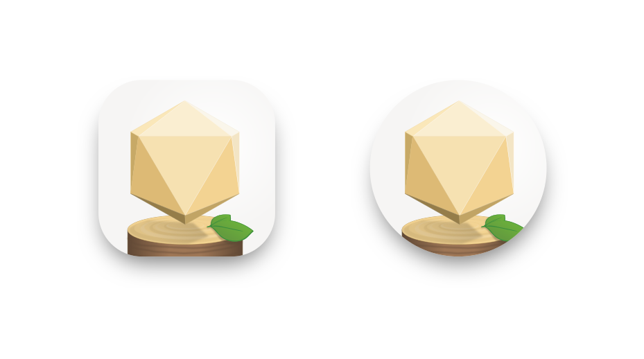
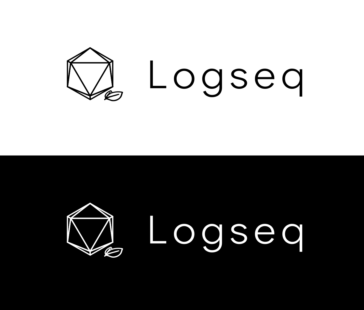
The icosahedron can resemble both:
It evokes Cthulhu, which is probably why I like it.
Inspired by alex0, provide an old draft.
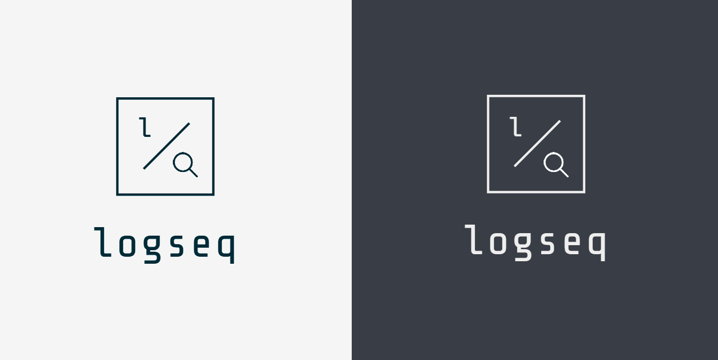
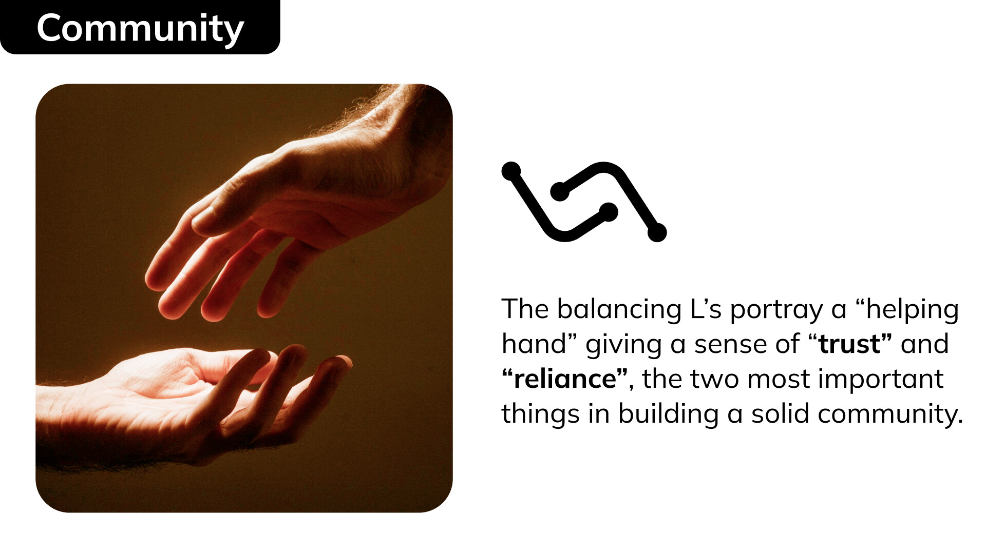
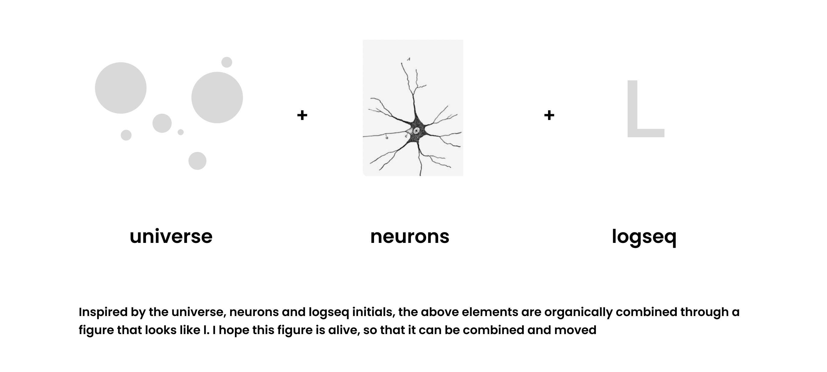
L is log, which is the accumulation of journals.
q is magnifying glass, which means to use “query” to build a knowledge system and make it more organized.
L+Q, its logseq.
Hi my name is Danica! I’m pretty new to doing designing and stuff hehe i saw the post and i thought i’d give it a shot ![]() i’m also very new to this community hahah anyways i hope you guys like it
i’m also very new to this community hahah anyways i hope you guys like it ![]()
Hey all ![]()
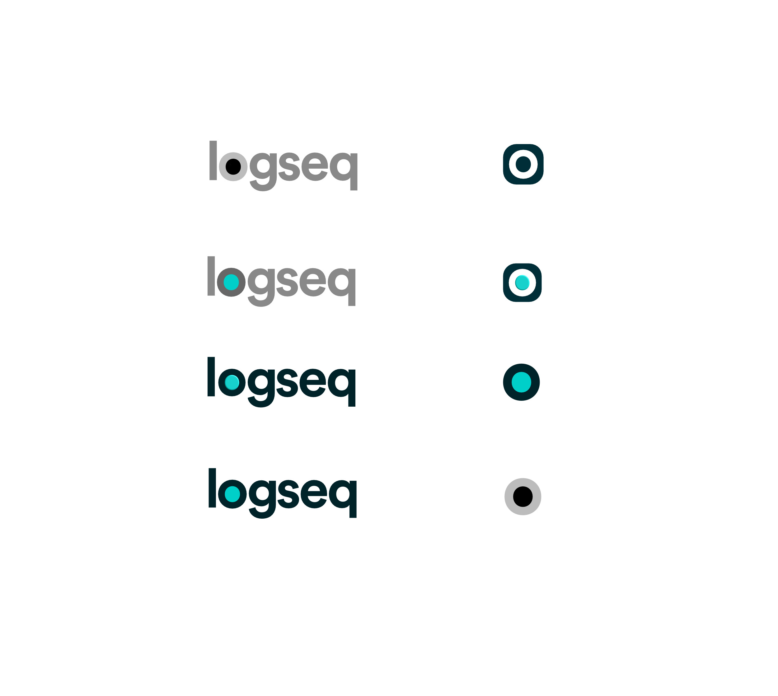
Circles are simple geometric shapes ![]()
Could an O from Open?
Apple made their “collaborative working environment” like a circle. The small circle in the middle could represent us, stronger together, inside the bigger circle (the world/community).
The small circle in the middle is protected by the surroundings of the bigger circle. Private, from “the outside world”.
Kinda looks like a bull’s eye @Problem solving.
And of course, the node ![]()
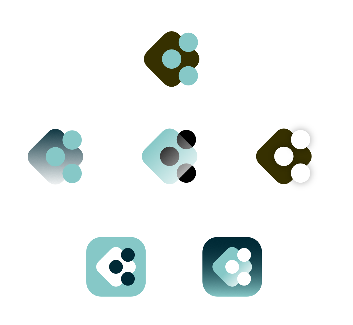
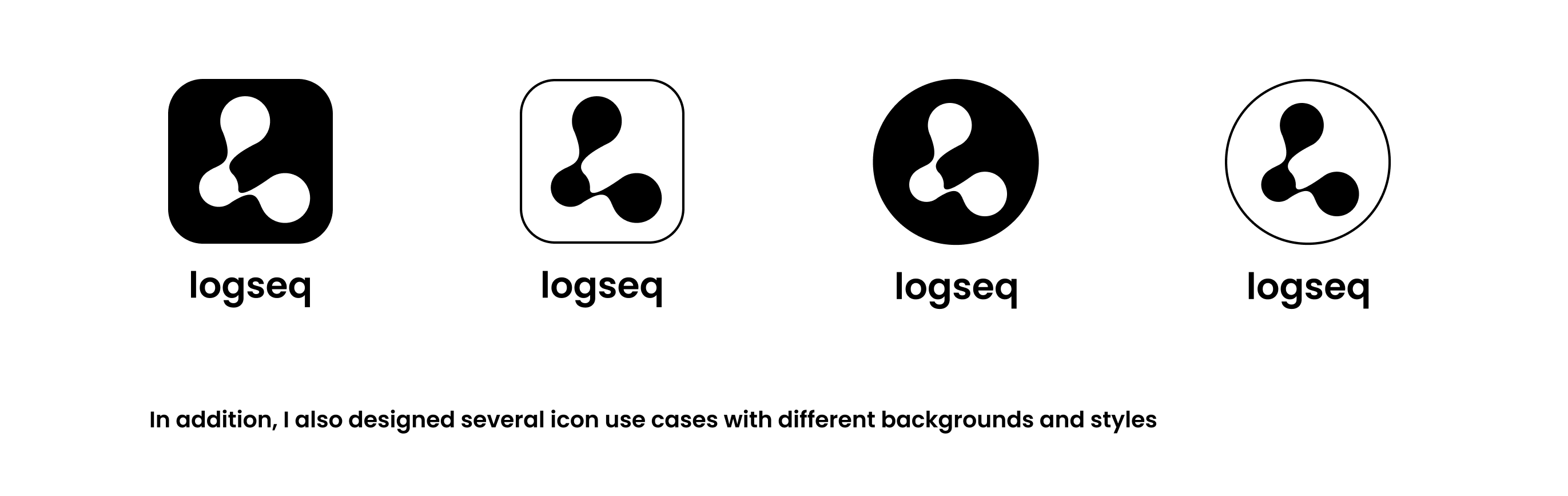
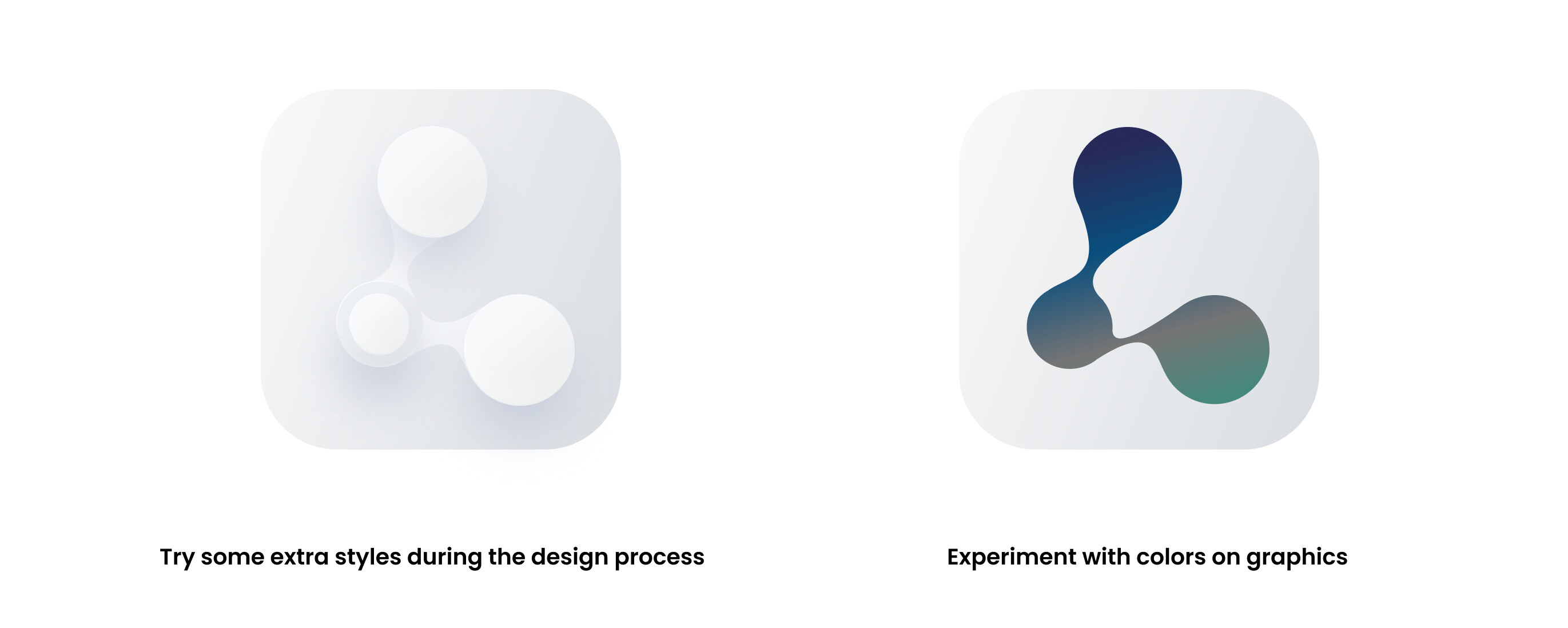
Hello everyone, I tried to make several different ICONS, using modernism and organic as my inspiration, I hope you like it
Hello, I am very happy to participate in this design event. I have prepared three different icons. I hope Daji likes them. This post is the first one.
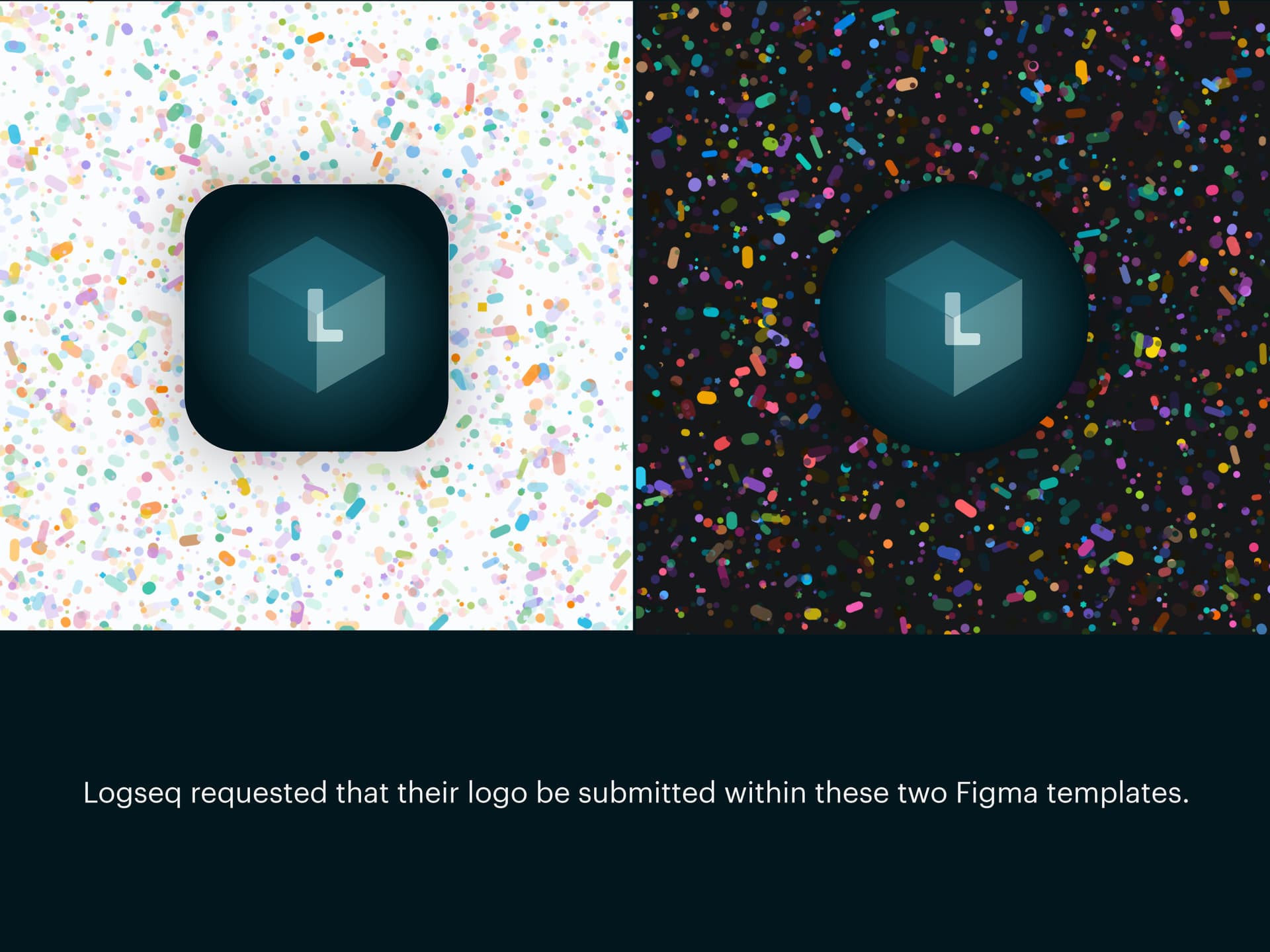
Uploading: image.png…
Uploading: Frame 49.png…
I really like this one, but I’m not sure about the circle around it. I think the magnifying glass metaphor is better, and the stem should maybe be made more prominent.
Hi guys, here is my submit — The Mushroom Planter.
Self-explanatory, a log and some mushrooms are “seeking” (growing, will be more of course haha), I know, it’s kind of forcing LOL. I also just fingered out the original meaning of seq is sequence, but I feel like log already means that, so I like how people put it as seek.
I posted a comment with a hope that somebody might brainstorm some cool ideas with it, and I didn’t realize that person is myself ![]()
I don’t know why but I have always assumed the Logseq’s logo should be a log, every time I looked at the current logo I just see a cut of a log, but you know it didn’t really make sense, so I just kind of saw it in an abstract way, later on I realized that it was a paw ![]() , stupid me…
, stupid me…
It’s good that I have managed to turn that into reality, the 3 eclipses as the bark, sapwood and finally, the heartwood. But I still not really like my implementation though, so yeah, let’s treat it more of an idea, and forget perspective ![]()
Previously, my original idea was to have a budding branch with some leaves, until I saw this wonderful video from @Bader that sparked by @Luhmann and I decided to go along with the idea.
So here it is, the log is for the Journals and them mushrooms are for Pages.
BTW I used the colors from Radix, but I really suck at this, that why I think the colors could be better! It really sucks though ![]()
P/S: Actually I suck at absolutely everything, I know nothing about any of this (well some, but very little) from sketching, painting to modeling, sculpting and design but all of ideas that I have I think it’s worth it!
Also the fact that this is 3D rendered, it would be better to treat it more of a concept. But still, I think it has the potential of be turned into flat designs with ease! And besides, why not have multiple versions of the logo for each purpose, right?
Finally, thanks everybody, I am really grateful for the experience! BTW, hope I make it on time still not pass 16 now, nah I was late 10m LOL!