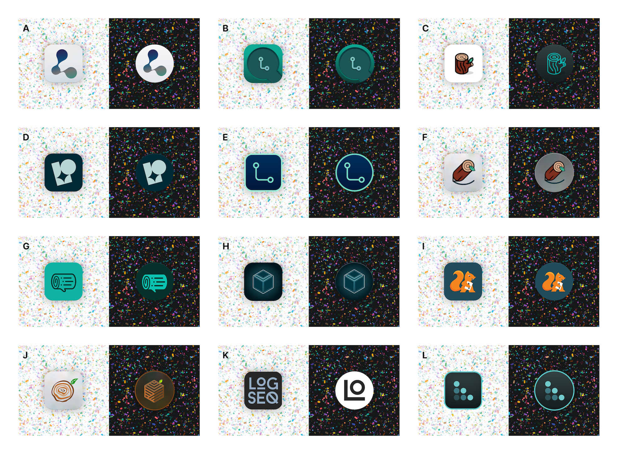
The submissions are in, the clock has stopped, and the finalists have been chosen. With over 50 amazing designs, we’ve paired it down to the top 12. Now we want you, the community, to decide who wins the big prize: being immortalized in time as the official winners of the Logseq Logo Community Contest
Oh and of course, there are the cash prizes. Remember:
1st place will receive $1000
2nd place will receive $500
3rd place will receive $300
The vote will run until and through Sunday July 9th (it will close midnight GMT+2). Everyone can vote on up to 3 items, and you’ll be seen the results of the poll after you vote.
Share this post with friends, family, and followers and let the best logo win!
Sorry to be so blunt, but anything besides E or L feels pretty unacceptable to me. A is well meant, but just not clean and crisp. Looking very forward that this fantastic app gets the representation it deserves!
In order to make it easier for people to vote (I believe there were almost 100 submissions by some counts) we paired it down based on a mix of internal voting and community engagement, as outline in the original Submissions Thread post
Winning the Community Contest does not guarantee that we will use the logo, and nor would we likely use it out of the box. With any logo, we would internally (or with the original designer if they prefer) to get the logo to match our own internal vision for Logseq
I like and appreciate your sentiment about winning the Community Contest doesn’t guarantee the logo being used. Not to be a nay-sayer but I was wondering if it might have made sense to pick a “broader” selection of logo concepts and styles to gauge what the community feels? There’s for example B and E that feel quite similar as well as C and F. Just a thought . Anyway good job on the whole process!
Glad you like the current logo! As stated before, this is a community contest, and winning it does not guarantee the logo will become our logo. Personally I felt it would have been a little bit nepotistic to include any internal logos in the community contest. Even if the current logo won, then we would still pay out the prizes to places 2-4, which would mean that the logo only stole votes from the contenders.
We wanted to challenge the community to see what they could come up with, and we’re sticking with the spirit of that!
But your appreciation of and votes for the current logo are noted and appreciated
Those submissions are from the same contestant, so if you like either version then vote for it. This vote is determining the winner of the contest - likely any logo we will assume will go through many revisions, so they will not end up looking like exactly as they appear in the poll.
If you have preferences on which variants you like, feel free to drop a comment!
This was actually something we suggested! Naturally (without our intervention) using a on twitter became an indicator for logseq, so we thought it would be a nice nod to the burgeoning internet culture.
Personally I think a lot of the log logos came out really nice!